The best company logos. Famous Brands: Logo
Every day a person comes across hundreds of logos. They are so familiar that few people think what they mean. But in fact, even the simplest logos often take months and millions of dollars to create, and almost every one of them has some subtext. In our review of 10 famous logos with a decoding of their meaning.
1. Fedex

The logo of an American logistics company consists of 2 parts: the inscription "Fed" in purple and "Ex" in orange. It seems to be nothing special, so why did such a modest logo win dozens of awards? The answer is simple - the space between the letters "Ex" forms an arrow, which on a subconscious level is associated with the speed and professionalism of the company.
2. McDonald's

Most people think that the logo of the McDonalds fast food restaurant chain is nothing more than the first letter of the company's name, painted in golden color. However, fans of Freud's theory argue that this form of the letter evokes associations with a nursing mother's breast.
3. Museum of London

The Museum of London is dedicated to the history of this city from the time of its founding to the present day. In 2010, the museum management decided to update its image in order to become more attractive to a younger audience. The new logo was made in bright colors and is sure to attract attention. At first glance, the new logo immediately presents a map of London. And each of the colored contours is the boundaries of the city limits of the British capital in different historical eras.
4. Adidas

The name of the famous manufacturer of sportswear and accessories arose from a combination of the first and last name of its founder, Adolf Dassler. Over the 66 years of the company's existence, its logo has changed several times, but it has always had three stripes. Today, the logo has three slanted stripes in the shape of a triangle, which symbolizes the mountain. This metaphor means conquering new heights.
5.Mitsubishi

Mitsubishi was founded in 1873 as a result of the merger of two shipbuilding companies. The company's logo appeared by combining the coats of arms of its creators - the three-leaf crest of the Tosa clan and three diamonds of the Iwasaki family. The three diamonds symbolize reliability, integrity and success, while the red represents trust and attracts customers to the brand.
7. Google

The Google logo looks very simple - just a regular inscription, the letters in which have different colors. In fact, when creating the Google logo, the designers wanted to capture a sense of the company's "rebellious spirit". The secret of the logo lies in the colors of the letters: the primary colors (blue, yellow and orange) are suddenly interrupted by a green letter that is out of the scheme. So Google decided to highlight its non-standard and unwillingness to play by the rules.
7. Animal Planet

Previously, the Animal Planet logo featured an elephant stretching its trunk towards a miniature Earth. However, in 2008 the channel was rebranded in order to increase its appeal to a wide audience. The channel had to get rid of long and boring documentaries and move on to captivating reports. The new logo, as Animal Planet explained, should represent instincts, the jungle and primal emotions. Quite a lot of emotion for an emblem that had one letter upside down.
8. NBC

It's no secret that the NBC logo symbolizes a peacock, but few people know why this is so. It was actually a marketing gimmick to get people to buy color TVs. At the time the logo was created, NBC was owned by the electronics company Radio Corporation of America (RCA). RCA wanted to show the public that the relatively high price of a TV was entirely due to the ability to view pictures in color.
9. Amazon
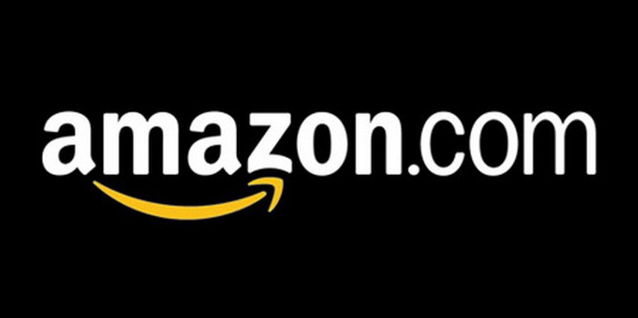
At first glance, the Amazon.com logo is very simple - the name is in bold black with a curved yellow arrow underneath. But what does this arrow symbolize? First, it represents the smile of a satisfied customer. And secondly, the yellow arrow goes from the letter "A" (the first letter in the Latin alphabet) to the letter "Z" (the last letter of the alphabet), which symbolizes the diversity of Amazon products.
10. Pepsi

The Pepsi logo is a simple circle with the top half red and the bottom half blue, with a wavy white line between them. At first glance, these are the colors of the American flag. But in fact, Pepsi has spent hundreds of millions on its current logo. The branding agency that designed the logo for Pepsi released a 27-page report outlining the many meanings behind the logo. It symbolizes the Earth's magnetic field, feng shui, Pythagoras, geodynamics, probability theory, and more.
We have collected examples of best company logos, and not entirely successful. We will tell you why they became so and what they can teach us. But before we get started, here are a few important things about the company's logos and business. These basic principles will help you navigate the value of a logo in an organization's business, its relationship to success, and the cost of logo development:
The success of the company as a whole does not depend on the quality and thoughtful design. If there were any other sign in place of the Apple logo, would the company become less successful? Hardly.
By itself, no one needs a logo. What matters is how and where you use it. Successful organizations use the logo at all points of contact with the customer. In this way, customers have an ongoing association with the company's products and the experiences they get from interacting with the company.
- Profitable successful business / high-quality expensive design - excellent!
- Profitable successful business / bad cheap design - bad!
- Unstable unprofitable business / high-quality expensive design - terrible!
- Unstable unprofitable business / bad cheap design - bad!
- A young business / inexpensive logo is fine!
So, now is the time to move from general principles to specific examples. Let's start with samples, you can familiarize yourself with them in the next section of the article.
The best logos of firms and companies
We have selected for you the most striking examples of quality logos that have helped a number of companies become global leaders in their industries. These include brands such as:
General Electric
The logo of General Electric, one of the leading manufacturers of equipment, has remained virtually unchanged since the company was founded in 1892.
And why was it necessary to change it? The 'GE' initials, written in intricate script and framed by arcuate strokes, combine simplicity and efficiency - exactly the qualities that consumers expect from General Electric products. What's more, the emblem, built around an art nouveau ornament, is reminiscent of the spinning drum of a washing machine, one of the company's most popular products.
JPMorgan Chase
JPMorgan Chase is one of the leading financial conglomerates and the largest bank with an asset value of a whopping $2.35 trillion.
Moreover, JPMorgan Chase is the sixth largest public company in the world. In other words, it is a brand that speaks for itself.
Admittedly, the bank managed to accurately convey its dominant position with the help of the logo.
What makes the JPMorgan Chase logo recognizable and effective?
With a simple, bold typeface and minimal use of graphics, the JPMorgan Chase emblem conveys power and authority, as if to say, "If you don't pay on time, we'll charge you more late fees than you ever dreamed possible." Harsh, right? But one should not expect another attitude from such a serious organization.
If you are at least a little familiar with, then you do not need to explain what Facebook is.
![]()
Notably, Mark Zuckerberg's company was originally called The Facebook. But the article in the name did not last long, and the company itself made a real revolution in the Internet community, rapidly becoming the most popular social platform in the world.
The Facebook logo has the most valuable quality in graphic design - it allows you to instantly identify a brand. Concerned about maintaining a recognizable visual image, the company made only minor stylistic changes to its logo, leaving the main elements intact.
ExxonMobil
ExxonMobil is the largest oil company in the world, generating astronomical profits for its owners and shareholders. Exxon and Mobil were once two different firms that decided to combine their knowledge and resources in 1998 (perhaps with the ambitious goal of establishing world domination).

Such a successful and reputable organization should have an appropriate logo! But in this case, as they say, something went wrong. The ExxonMobil logo, with its simple, uninteresting design, fails to capture the character of such a powerful brand.

Unfortunately, the logos of individual companies before their merger often look more distinctive and original than the emblem of the merged company.
What conclusion can be drawn from this story? Less is not always better.
I think millions of people will subscribe to my words if I say: “THANK YOU, AMAZON!”. Thanks to the Amazon Prime service, I can order absolutely anything and receive it within 48 hours (or even faster). And all this with free (well, almost free) shipping.

Knowing its strengths perfectly, the online store skillfully reflected them in its emblem. See the arrow that stretches from A to Z? Symbolizing directional traffic, the arrow indicates that Amazon will deliver your order from its warehouse directly to your door. But that's not all the meanings contained in this simple icon. The arrow also resembles a smile, indicating that the company guarantees a high quality of service, making sure that its customers are satisfied.
Microsoft
Despite some missteps that have accumulated over the past few years (yes, Zune and Windows 10, we are talking about you!), Microsoft did a great job redesigning its logo in 2012.
![]()
The logo, which lasted from 1987 to 2012, was pretty good (I especially liked the O, which looked like Pac-Man), but left a lot to be desired in terms of design.
In terms of color, the new emblem looks much friendlier. And the one who came up with the idea to present the main products of the company in the form of four square windows is a real genius! The blue window represents the Windows operating system, the red one represents the Office suite, the green one represents the Xbox, and the yellow... Yellow doesn't mean anything, but since the window can't have three panels, we'll assume it's necessary.
And it's also worth noting that of all the companies on this list, Microsoft has the most trouble building a sustainable visual identity. Judge for yourself: every time the computer giant makes changes to its logo, it looks completely new, as if it has nothing to do with the company's previous logos.
Nike is known not only for its sports shoes, but also for one of the best logos in the business world. The iconic Nike swoosh is a prime example of how a visual identity can play a huge role in establishing a reputation and transforming an ordinary company into a trusted, respected brand. If the Nike emblem was not considered something remarkable before, over time it has become a visual identification of sports culture.

In English-speaking countries, Nike's "swoosh" is known as the "swoosh". "Swoosh" is the sound we hear when an object rushes past us. Thus, this word denotes a sharp sound, speed and movement, which is successfully reflected in the curved shape of the logo.
The history of the Nike tick is notable because it shows the logo's evolution from an ugly duckling that no one liked to a "beautiful swan" that draws admiring glances.
The "parents" of the legendary BMW logo are the round Rapp-Motor emblem with a black silhouette of a horse and the Bavarian flag with its characteristic blue and white checkerboard pattern. This is how the familiar black circle appeared, inside which blue and white quadrants are located.

After the First World War, which ended with the Peace of Versailles, the company switched from aircraft production to the production of motorcycles and cars. The BMW emblem has remained virtually unchanged since 1917. The most noticeable transformation took place in 2000, when the logo gained volume due to the 3D effect.
mastercard
Back in 1966, Mastercard was known as Master Charge, and its first logo featured two intersecting circles (bright orange and yellowish red) with the words "Master Charge: The Interbank Card".
![]()
In 1979, the company shortened its name to the capacious MasterCard. New name - updated logo! The colors on the emblem have become brighter, and the font has become more solid. In 1996, the logo became voluminous: now "slits" appeared in the area where the two circles intersect.
FedEx
In 1971, the postal service's logo featured the company's full name, "Federal Express", slanted.
![]()
The emblem was made in patriotic red and blue colors, which evoked associations with the American government. Having gained popularity due to its original logo, the brand decided to say goodbye to it in 1994. The new design was as ingenious as the old one: hidden between the letters E and X is an arrow that indicates speed and accuracy as the main advantages of the postal company.
The first IBM logo was created in 1924 when Computing-Tabulating-Recording was renamed International Business Machines.
![]()
So the company's name acquired a more modern sound, and the 1924 logo became an updated version of the 1911 emblem, which was previously used by CTR. The sophisticated CTR logo, with its airy, ornate typeface, was replaced by a cumbersome "International Business Machines" lettering (with an emphasis on the word "International"), which was placed inside a circle symbolizing the globe. In 1947, when the brand carried out a significant modernization of its technologies, the round emblem was replaced by the abbreviation "IBM", which was destined to become a symbol of the company. In 1956, graphic designer Paul Rand redrawn the letters, making them black and more massive. The new design emphasized the brand's qualities of stability and resilience. In 1972, Rand was commissioned to rework the look he had created. To create a dynamic and flexible image, the designer made "slots" on the abbreviation. This is how the famous "striped" emblem turned out, which IBM is pleased with to this day.
Despite the external diversity of all the above signs, they were all designed according to similar criteria, which made them so successful. These are the factors we will discuss next.
What can you learn from these logos?
What conclusions can an entrepreneur draw from reading the stories behind these logos?
Decide what your logo should communicate about the brand
The emblem should reflect the essence of your brand, emphasizing its most characteristic features. For example, looking at the logo of JPMorgan Chase, you immediately understand that we are talking about an influential company with a reputation that has been developed over the years. How does your logo characterize your business?

In just a couple of minutes, you can create and download a logo for your organization. The small logo is available for free.
What is the most important lesson you learned from this article on good and bad logo examples? Do you have some more tips for entrepreneurs who are working on their corporate branding? Share your ideas in the comments!
Each logo is unique, but no one has canceled the general trends that unite designers around the world. We have collected 15 techniques based on examples of logos offered on the service that managed to gain popularity in 2016. By the way, all examples can be bought for 9500 rubles, including the adaptation of the name and 3 edits.
——————————————————————————
——————————————————————————
1-
handwritten
Uniqueness is especially vividly conveyed through the logo in the style of "handmade" or modern handwriting. Such logos speak of honesty, simplicity, sometimes naturalness, look a little naive and therefore endearing. Often they are used by companies in which products are made in a piece copy or with their own hands.


2-
Polygons
In such logos, instead of right angles, polygon shapes are used, most often triangles. The trend looks fresh and spectacular. The logos symbolize energy, strength, openness and the desire for everything new.


3-
negative space
The technique of negative space does not lose its relevance. Such a logo often hides a deeper meaning than it might seem at first glance. Logos with negative space are more memorable because they are not only pleasing to the eye but also food for the mind.


4-
Stacks of letters
The trend is represented by letter blocks compactly placed in a rectangle. This is a rather complex creative solution: the designer converts the text into a short readable form, while as if encrypting the message in the block. This technique is suitable for fashionable youth brands.


5-
guiding thread
It may seem that the technique is confusing in execution, but it, like the threads of Ariadne, will lead you to the goal - an unbanal means of expression that will distinguish the brand from many others, simple and obvious.


6-
Coloring
The coloring technique is ideal when paired with monolines or a simple, minimalist design. Places bright accents, gives the logo originality and relieves boredom.


Dramatic typography
Have you noticed that sometimes there is not enough drama in life? The latest dramatic typography technique comes to the rescue, in which the logo is simplified to the name and encrypts the message in an exciting way. Here the text becomes the visual part of the brand. Particular attention is paid to fonts that reflect individual style. A little rocker touch sometimes doesn't hurt.


8-
Yablonism
The famous Apple Corporation has influenced not only the world of high technology, but also the creative environment. Designers adopt corporate identity, imitating and sometimes even surpassing the progenitor. In addition, every company that is more or less self-respecting already comes up with its own mobile application, so designers are faced with the task of inscribing a logo into an icon. The "mobile" style is very modern and will definitely remain in trend for a long time to come.
It is by the logo that many recognize a well-known brand. For some, the history of creating a logo is mysterious, and for some, everything was simple and clear. Some of them have changed, some have never changed.
The founder of this brand, Rene Lacoste, was once one of the best and most famous tennis players in the world. There are several versions of why he was nicknamed "alligator" (later changed to "crocodile"). The first version, due to his behavior on the court, that he, like no one else, managed to exhaust the opponent on the court.
René Lacoste, founder of the Lacoste clothing brand. 
The second version, and it is more common, is that he made a bet that he would win a certain match. The stake was, a suitcase made of crocodile (or alligator) skin. Later, his friend, Robert George, drew a crocodile for him, which was embroidered on his blazer, in which he began to perform, and later became the company's logo.

John Warnock and Charles Geschke left Xerox to form their own software company. And they named the company after Adobe Creek, which flows in California.
Founders John Warnock and Charles Geschke. 

"I'll call Apple if you don't come up with something better by 5 o'clock"
I think everyone knows perfectly well that the apple was the favorite fruit of the founder of the company, Steve Jobs. Initially, the creators wanted to beat the legend of an apple that fell on Newton's head, which is known to every schoolchild, which allowed him to discover the law of universal gravitation. But the logo was cumbersome, and later the “bitten apple” logo appeared. But why, is it bitten? There are many versions, one that Steve wanted the company to be associated with an apple, which Adam once could not resist, i.e. and you will not resist the products of this company; the other, because of the similarity of the English words "byte" ("byte") and "bite" ("bite").
Founder Steve Jobs. 
The first company logo. 
But there is another version that this is a hint at the suicide of Alan Turing, a scientist who had a huge impact on the development of computer science and computer technology. He was gay, in 1953 he was accused of homosexual relations, and by court order he was offered two sentences to choose from: imprisonment or suppression of libido with estrogen injections. He chose the latter, and there is a version that in 1954 he committed suicide by biting off a poisoned apple soaked in cyanide, unable to withstand the persecution of society.

In 1958, Enrique Bernat created the first lollipop (wooden at the time) that could be sucked without getting your hands dirty. And the logo itself was drawn by the famous artist Salvador Dali, and it was he who suggested placing the logo not on the side, but in the center.
Founder Enrique Bernat. 

Five multi-colored rings connected together were invented by Pierre de Coubertin, it was he who revived the Olympic Games, which took place in the summer of 1896. But the rings were invented in 1913 (according to some references in 1912), and presented in 1920. The most common version is that the rings represent the five parts of the world whose countries participate in the Olympic Games: America - red, Asia - yellow, Africa - black, Australia - green and Europe - blue. Including the white color of the canvas, they represent the colors that are contained in all the flags of the countries of the world.
Pierre de Coubertin. 
In 1862, the Cuban vintner Facundo Bacardi, along with his brother José, bought a distillery in Santiago de Cuba, under which many fruit bats lived. In Cuba, the fruit bat is a symbol of good luck, so Facundo decided to take the image of this mouse as the company's logo.
Founder of Facundo Bacardi. 

The company's logo is a horse rider in armor and a spear in his hand. The spear is a symbol of the protection of tradition, and the Latin word "Prorsum", translated as "Forward", reflects the company's desire for progressive innovation.
Founder Thomas Burberry. 

The Italian company was founded by the Greek Sotirio Bulgaris, and in modern Greek his surname was written as Bvlgaris. The last letter was dropped, and it turned out to be Bvlgari.
Founder Sotirio Bulgaris. 

In 1962, the famous designer Karl Lagerfeld created the equally famous logo of the Fendi fashion house. The double letter "F" symbolizes the Fendi spouses, who created the fashion house.
Eduardo and Adele Fendi are married. 

There are several versions of the designation of the Chanel fashion house logo. One of them is that two crossed horseshoes denote a symbol of good luck and success. Another version, which is more inclined to everyone, is the initials of Coco Chanel, which she drew before opening her first mono-brand store.
Founder of the fashion house Coco Chanel. 

The logo of the 70% German digestif is based on a very old tale about Saint Hubert, the patron saint of hunters. The tale tells how Hubert violated the ban on hunting and met a deer, which turned around and a cross shone between its horns. The animal forgave Hubert and then he became a saint.

The prancing horse first appeared not on a car, but on a military aircraft flown by Francesco Baraka, an aviator and hero of the First World War. In 1923, Enzo met Francesco's parents, and it was they who suggested that he use the image of a prancing horse on his racing car, for good luck and in memory of Francesco, who died shortly before the end of the war. Enzo added a yellow background, the official color of his hometown of Modena, and swept his ponytail up. The emblem in the form of a triangular shield is used by the Italian racing team; and a rectangular emblem, a sign of the Ferrari factory.
Founder Enzo Ferrari. 

The emblem was invented by Gianni Versace himself in 1978. According to the idea, the head of the Medusa Gorgon symbolizes that Gianni turns the audience into stone with his collections. It was she who he considered "the epitome of fatal attraction."
Founder Gianni Versace 

In 1930 in Japan, Goro Yoshida and his half-brother Saburo Uchida formed a company under the name "Precision Optical Instruments Laboratory in Japan". Four years later, they created their first 35mm camera, which they named Kwanon, after the Buddhist deity of mercy, and trademarked a plethora of words similar in sound to Kwanon. One of which was, Canon.

The history of the company began in 1837, when Thierry Hermès founded a firm for the production of harnesses and bridles for horses, which is why the company logo depicts a horse with a cart. To date, the company is known for its leather bags, which are processed with a special "saddle" seam.
Founder Thierry Hermès. 

Volvo means “I roll” in Latin, and the trademark was originally registered for a special series of ball bearings. The logo also denotes the ancient symbol of iron, representing a circle with an arrow. In the Roman Empire, this sign personified the warlike and invincible god Mars, who fought only with iron weapons.
Founders Assar Gabrielson and Gustaf Larson. 

Everyone knows what the “SK” logo means, but not everyone knows that the dark color emblem is used only on High Fashion clothing, the gray emblem is on regular clothing items, and the white emblem is for sportswear. But it seems that the white emblem is going to be cancelled.
Founder Calvin Klein. 

Phew, this playful hare is known to everyone, but for some reason, many people think that this is a rabbit. But it was a hare in a bow tie that was drawn for Hugh Hefner, because it is him that Hugh considers funny, playful and at the same time very sexy.
| 31.07.2014
Almost every popular company has redrawn its logo at least once during the entire period of its existence. The reasons for this could be different - a change in direction of activity, rebranding, the need to keep up with the times, a way to keep up with competitors.
Each of these enterprises certainly has its own interesting story about the evolution of the trademark. We have prepared an interesting assembly, which shows the development of the symbols of global companies that are recognizable all over the world today. You will see how very different the very first logos were from the ones we are used to today.
Engineering and IT
Canon
Founders: Saburo Uchida and Goro Yoshida.
Year: 1937.
Country: Japan.
The global company for the production of photographic equipment and other devices was originally called Precision Optical Instruments Laboratory in Japan. The first camera was released under the Kwanon brand. The emblem was the image of the Buddhist god of mercy. Soon the brand name was changed to Canon.
In 1947, Precision Optical Instruments Laboratory was renamed Canon Camera Co. This was an important step in its development.
The improved Canon logo we see today was introduced back in 1956. It is noteworthy that after 58 years he looks just as stylish and presentable.
Nokia
Founder: Knut Frederik Idestam.
Year: 1865.
Country: Finland.
Nokia got its name from the river Nokianvirta, which flowed next to the factory (then, in 1868, it was a simple paper mill). Then the first emblem with fish was applied to all products.
In the early 1920s, Nokia Corporation, Finnish Rubber Works (rubber products) and Finnish Cable Works (cable) merged. The latter in the 60s launched a new department of electronics, after which, in 1963-1965, two devices were released - the first radiotelephone and a modem.
Over the next 30 years, the company's logo was modified several times. The current logo is the word Nokia with the slogan "Connecting people".
![]()
Intel
Founders: Robert Noyce and Gordon Moore.
Year: 1968.
Country: USA.
When Gordon Moore, one of the founders of the largest electronics company, proposed the name Integrated Electronics, his friend, Robert Noyce, agreed, but recommended shortening the name to Intel.
During the entire existence of the enterprise, the logo has changed twice. The current version was approved in 2005.
![]()
Microsoft Windows
Developer: Microsoft Corporation.
Year of release: 1985.
Country: USA.
The corporate graphic symbol of the first versions of Windows, which, by the way, were not full-fledged operating systems, but were only extensions for MS-DOS, outwardly resembles a blue window.
Starting with Windows 3.x, in the early 90s, 4 new colors appear in the sign - red, green, blue and yellow, and its shape becomes wavy, which adds dynamism to the drawing.
With the release of Windows XP in 2001, the symbol again undergoes impressive changes. Although the idea of four colors remained intact, the drawing became more understandable and not as cumbersome as the previous one. In addition to being associated with windows, this sign resembles a flag in many ways.
But the last symbol, designed for Windows 8, has sharply departed from the usual framework. Swiss style, simplicity and lightness, lack of realistic graphics - these are the main rules that guided the designers when creating it.
![]()
Apple
Founders: Steve Jobs, Steve Wozniak and Ronald Wayne.
Year: 1976.
Country: USA.
The first emblem of the future global corporation was proposed by one of the founders of Apple - Ronald Wayne. An engraving of Newton under a tree, wrapped in a massive ribbon with the inscription "Apple Computer Co.", looks quite interesting, but only from the point of view of art.
Soon, Steve Jobs decided to change the Apple logo. A designer named Rob Yanov helped him in this. The "rainbow" bitten apple served the company faithfully from 1977 to 1998.
Subsequent Apple symbols changed only their color - at first the apple was repainted in laconic black, and since 2007 it was made metallic and reflections were added. The form remains intact.
![]()
Samsung
Founder: Lee Byungchul.
Year: 1938.
Country: South Korea.
The word "samsung" in Korean means "three stars". In the first corporate blocks of the company, the image of stars was used in several versions.
The new logo, which is still relevant today, was introduced in 1993. Then the company celebrated its 55th anniversary. The stylized Samsung inscription inside a blue ellipse has become a well-known and recognizable logo all over the world.
![]()
LG
Founder: Ku In Ho.
Year: 1947 (opening of the first company of the conglomerate LG Group - Lak Hui Chemical).
Country: South Korea.
LG Electronics (Lucky Goldstar) was formed in 1995 as a result of the merger of two companies - Lucky Chemical Ind. (formerly Lak Hui Chemical) and Goldstar.
The slogan of the company is the phrase "Life is Good". The letters "LG" in the logo are painted in gray, and the logo is made in the form of a kind of red smiley face.
![]()
Auto and Moto
mercedes benz
Founders: Karl Benz, Gottlieb Daimler and Wilhelm Maybach.
Year: 1926.
Country: Germany.
In 1909, the well-known and still three-pointed star became the trademark of the Daimler Motoren Gessellschaft (DMG) for the first time. What does this symbol mean? There are several legends, one of which is the most common. Since the company was engaged in the production of not only cars, but also engines - ship and aircraft, a star with three rays indicated the success of this brand in three directions - on land, on water and in the air.
At the same time, Karl Benz, the creator of the first gasoline-powered vehicle, used a laurel wreath with the words "Benz" inside it as an emblem.
In 1926, after surviving World War I, DMG and Benz merged to form the Daimler-Benz concern. The new emblem also appeared as a result of the merger of the signs of these two enterprises - a three-pointed star was placed in a laurel wreath, and after a while the wreath was replaced with a regular circle.
![]()
Volkswagen
Manufacturer: Volkswagen AG.
Year of foundation: 1937.
Country: Germany.
The first brand name for Volkswagen, according to one version, was developed by a Porshe employee, Franz Xavier Reimspiss. In appearance, the symbol can be seen with the naked eye, at what time and where it was invented.
Years passed, Nazi features were removed from the brand name, the frame was replaced with a circle, then a square, and the color was changed to blue. But one thing has remained unchanged until now - the letters “V” and “W” recognizable all over the world.
![]()
Peugeot
Founder: Armand Peugeot.
Year: 1810.
Country: France.
The first sign with the image of a lion standing on an arrow was registered in 1850. Its author is the jeweler Julien Belezer.
Over the years, Peugeot has modified the lion more than once, adding to it either a mane or a muscular body. The symbol of the lion is firmly entrenched in the Peugeot brand, where the king of beasts means reliability and success.
![]()
fiat
Founder: Giovanni Agnelli.
Year: 1899.
Country: Italy.
When the Fabbrica Italiana Automobili Torino company was created in the Italian city of Turin in 1899, the first emblem was created for it in the form of a sheet of parchment with the same inscription.
In 1901-1904, the logo changed dramatically, having received a new, corporate font. He wrote the word Fiat, framed by a decorative pattern.
The next significant redesign took place in 1931-1932. The emblem was given the shape of a kind of shield, all decorating elements were removed, the letters were stretched in height, and the background was made red. In this form, the sign was used until 1968, after which it was again thoroughly altered.
Today, the Fiat logo has a chrome rim and a rich red background, on which the letters FIAT are located, written in a familiar font.
![]()
Ducati
Founders: Andriano and Marcello Ducati.
Year: 1926.
Country: Italy.
Initially, the direction of the Ducati company was the production of radio equipment, which the brothers Marcello and Andriano were very fond of.
Demand for radio equipment declined significantly after the Second World War, and Ducati, which came under state control, began to create engines and vehicles.
In the period from 1949 to 1975, the company, which already produced full-fledged motorcycles, added two wings, then one to its graphic sign.
The modern Ducati logo is a triangular red emblem with a white stripe track inside, a reminder that Ducati motorcycles were born for speed.
![]()
Harley-Davidson
Founders: William S. Harley; Arthur, Walter and William Davidson.
Year: 1903.
Country: USA.
Throughout the existence of the Harley-Davidson company, their motorcycles have changed countless times, as well as emblems. They came in different shapes and colors, but the Harley-Davidson inscription was invariably present on each of them. We will look at just a few.
In 1940, the company introduced the metal logo, which was used until 1946.
In 1955, a large “V” appears in the background of the classic Harley-Davidson lettering, in honor of the famous V-twin engine.
After 6-7 years, the Harley emblem becomes like a sight and a four-pointed star.
But the most recognizable logo of the legendary motorcycle manufacturer called "Bar and Shield" is covered with a halo of mystery, since its author, alas, is unknown. However, this sign was invented in 1910, after which, in 1911, it was patented.
![]()
Yamaha
Founder: Thorakusu Yamaha.
Year: 1897.
Country: Japan.
Phoenix with a tuning fork in its beak is the first symbol of the world famous Japanese company Yamaha. In 1927, a brand name appeared in the form of three crossed tuning forks, resembling a three-beam star. It is used to this day. It is believed that this pattern means a strong relationship between the three main ways of the company - technology, production and sales.
Today, Yamaha produces sound equipment and a huge number of musical instruments, and the Yamaha Motor Company, as part of the Yamaha Corporation, is the largest manufacturer of motorcycles.
![]()
Food
Twix
Manufacturer: Mars Inc.
Year of release: 1967.
Country: UK, USA.
In 1967, the first bars called Raider were released in the UK. 12 years later, in 1979, the name was changed to Twix, and the product itself was imported to the United States of America. The name Twix was formed from two words - twin and bicsuits. Today these bars are known all over the world, and in some European countries they are still sold under the original name Raider.
![]()
Nestle
Founder: Henri Nestle.
Year: 1866.
Country: Switzerland.
The name of the largest food production company is also the name of its founder. The family coat of arms has become a trademark - a small nest with birds, where the mother feeds three chicks. Patented in 1868, this symbol has remained virtually unchanged to this day. Only 20 years later, in 1988, one chick disappeared from the drawing. There is an opinion that this was done in order to adjust the sign to certain standards, because in those days American and European families for the most part preferred to have two children.
![]()
McDonald's
Founders: Brothers Richard (Dick) and Maurice (Mac) McDonald.
Year: 1940.
Country: USA.
The first McDonald's logo featured a chef named Spedee. The modern version of the brand name in the form of golden arches was invented in the early 60s by Jim Schindler. And for more than half a century, people from all over the world have recognized the popular chain of fast food restaurants by just one stylized yellow letter M.
![]()
La Vache Qui Rit
Founder: Leon Bel.
Year: 1921.
Country: France.
The first design for the processed cheese La Vash Kee Ree (French for “Laughing Cow”, known in Ukraine as “Vesela Korivka”) was invented by the owner of the company, Leon Bel. But the symbol that we know now is different from the original. Only 3 years after its appearance, the company showed the public a brand name in the form of a red cow with earrings in its ears. In this illustration, the so-called Droste effect is used - the same cow with earrings is depicted on the earrings of a cow, on which, in turn, a cow with earrings is also drawn, and so on ad infinitum.
Initially, the drawing looked rather creepy for many consumers, which they tried to fix over time. The almost demonic features of the cow's muzzle were smoothed out, after which the cow became more like a kind and smiling one.
![]()
Chupa Chups
Founder: Enric Bernat.
Year: 1958.
Country: Spain.
The trademark and name of the most popular lollipops were registered in 1962. Fans of the Spanish artist Salvador Dali will be pleasantly surprised by the fact that the entire image for Chupa Chups, which is still used today, was designed by him. It happened in 1969. The new Chupa Chups logo looks like a camomile with eight petals.
![]()
Coca Cola
Founder: Asa Griggs Candler.
Year: 1893.
Country: USA.
The legendary Coca-Cola logo, written in calligraphy, was coined back in 1886. Since then, it has remained virtually unchanged. The trademark was registered at the end of January 1893.
In the early 1980s, the company, focused on a marketing battle with competitor Pepsi, launched a new re-formulated drink called New Coke and… failed. Few expected that the reaction of American consumers would be so negative - Coca-Cola was sued numerous times to keep the classic drink on the shelves. Naturally, New Coke did not last long on the market, and the usual Coca-Cola was returned to the market.
![]()
Pepsi
Founder: Caleb Bradham.
Year: 1903.
Country: USA.
The Pepsi-Cola trademark was registered in the summer of 1903. After nearly 10 years of bankruptcy and crisis, during the Great Depression of the 1930s, Pepsi first showed the Coca-Cola company that it was a strong competitor for it, selling its drink at the same price, but in bottles twice as large. In the 50s, Pepsi confidently took second place in the market after Coca-Cola.
The three-color circle version of the brand name that we are used to seeing now was first presented to the public in 1962, along with the exclusion of the “Cola” prefix from the brand name. In 1991, the word "Pepsi" was decided to be removed from the circle and written next to it. It's funny that a modern person can easily recognize this company from just one drawing, without a signature.
![]()
The history of logos of famous brands is very entertaining and interesting, it will be extremely useful to get acquainted with it for those who are planning to open their own company and want to do everything correctly. After all, there are several rules for successful brand development that should be taken into account. And then a positive result is guaranteed!
If you need to create a logo, seek the help of professionals.
We also recommend
 Smartphone xperia z5 premium black
 Download toilet paper business plan
 Description Nokia X2 dual sim on the Android platform, powerful processor and support for two sim cards
 Is it possible to open a hostel in an apartment?
 Services to the public: the most promising business ideas
 How to start farming?