Drawing alphabet. A font is a uniform outline of all letters of the alphabet and numbers, which gives them a common characteristic appearance. Drawing font should be easy to read and easy to use.
Introduction date 01.01.82
This International Standard specifies drawing fonts for use on drawings and other technical papers all branches of industry and construction.
1. TERMS AND DEFINITIONS
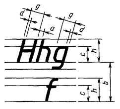
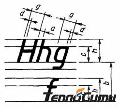
1.1. Font size h - value determined by the height of capital letters in millimeters.1.2. The height of capital letters h is measured perpendicular to the base of the line. Height lowercase letters c is determined from the ratio of their height (without processes k) to font size h, for example, c = 7/10 h (Fig. 1 and 2).|
|
|
2. TYPES AND SIZES OF FONT
2.1. The following types of font are installed: type A without inclination (d = 1/14 h) with the parameters given in Table. 1; type A with an inclination of about 75° (d = 1/14 h) with the parameters given in Table. 1; type B without slope (d = 1/10 h) with the parameters given in Table. 2; type B with an inclination of about 75° (d = 1/10 h) with the parameters given in Table. 2.Table 1
Font type A (d = h/14)
|
Font options |
Designation |
Relative size |
Dimensions, mm |
|||||||
| Font size - | ||||||||||
| capital letter height | ||||||||||
| lower case height | ||||||||||
| Letter spacing | ||||||||||
| Font Line Thickness | ||||||||||
table 2
Type B font (d = h/10)
|
Font options |
Designation |
Relative size |
Dimensions, mm |
||||||||
| Font size - | |||||||||||
| capital letter height | |||||||||||
| lower case height | |||||||||||
| Letter spacing | |||||||||||
| Minimum row spacing (auxiliary grid height) | |||||||||||
| Minimum spacing between words | |||||||||||
| Font Line Thickness | |||||||||||
2.4. Limit deviations of the sizes of letters and numbers ± 0.5 mm.
3. RUSSIAN ALPHABET (CYRILLIC)
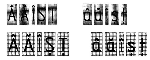
3.1. Font type A with a slope is shown in Fig. 5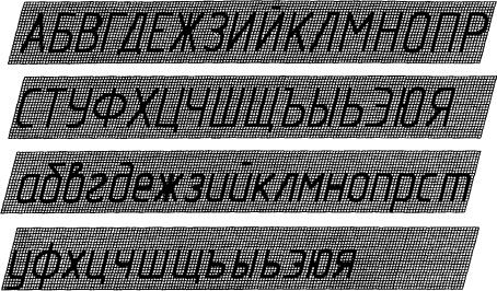
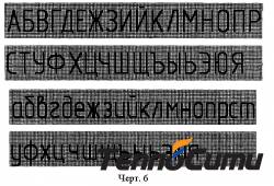
3.2. Font type A without tilt is shown in Fig. 6.
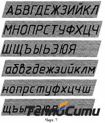
3.3. Font type B with a slope is shown in Fig. 7.
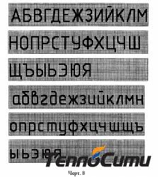
3.4. Font type B without tilt is shown in Fig. eight.
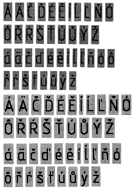
4. LATIN ALPHABET
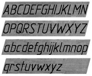
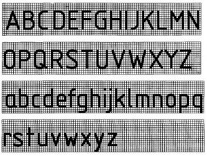
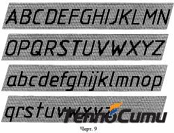
4.1. Font type A with a slope is shown in Fig. nine.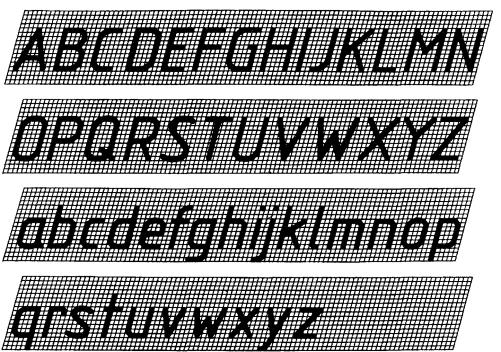
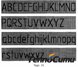
4.2. Font type A without tilt is shown in Fig. ten.
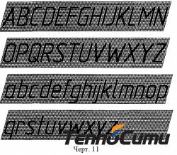
4.3. Font type B with a slope is shown in Fig. eleven.
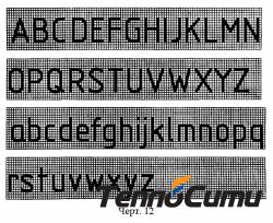
4.4. Font type B without tilt is shown in Fig. 12.
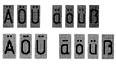
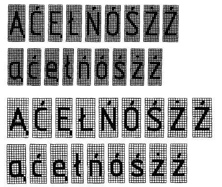
4.5. Types, shape and arrangement of diacritical marks for fonts of types A and B without italics are given in the reference appendix. Diacritical marks for fonts with italics should follow the same rules.
5. GREEK ALPHABET
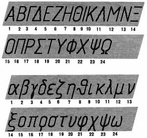
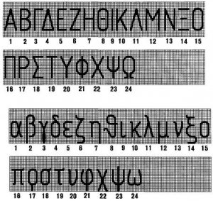
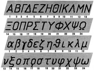
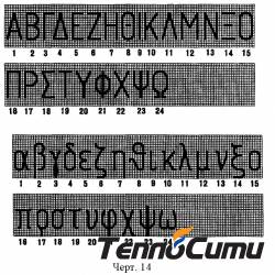
5.1. Font type A with a slope is shown in Fig. thirteen.![]()
5.2. Font type A without tilt is shown in Fig. fourteen.
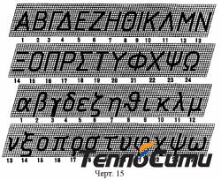
5.3. Font type B with a slope is shown in Fig. fifteen.
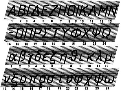
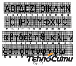
5.4. Font type B without tilt is shown in Fig. sixteen.
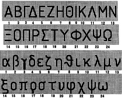
5.5. The name of the letters of the Greek alphabet shown in Fig. 13 - 16:
6. ARABIC AND ROMAN NUMBERS
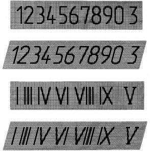
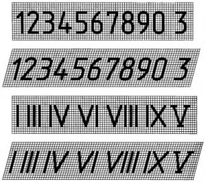
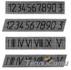
6.1. Font type A is shown in Fig. 17.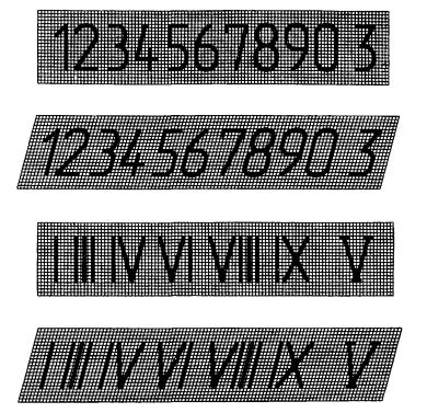
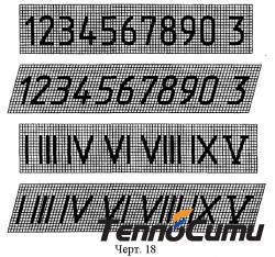
6.2. Font type B is shown in Fig. eighteen.
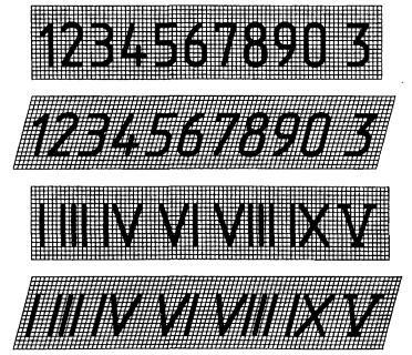
Notes: 1. Roman numerals L, C, D, M should be performed according to the rules of the Latin alphabet. 2. Roman numerals are allowed to be limited horizontal lines.
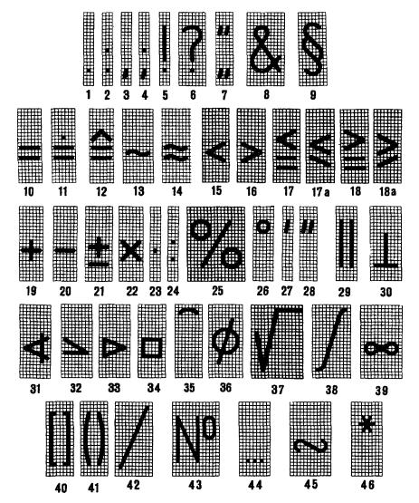
7. SIGNS
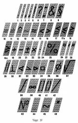
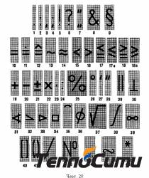
7.1. Font type A with a slope is shown in Fig. nineteen.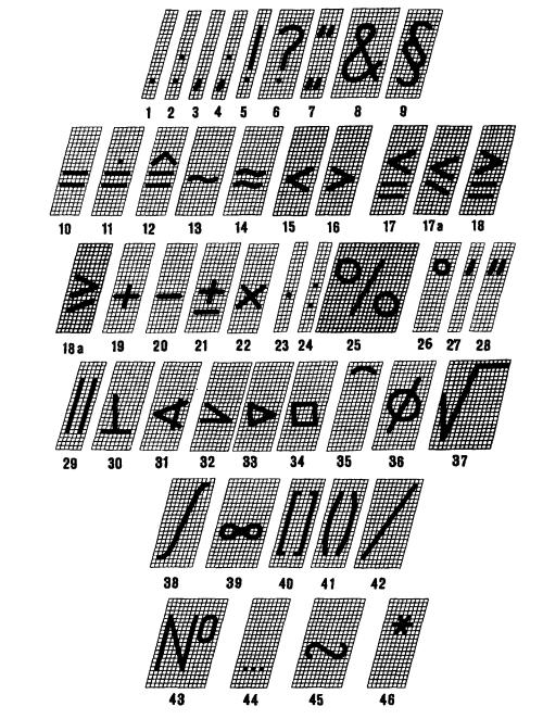
7.2. Font type A without tilt is shown in Fig. 20.
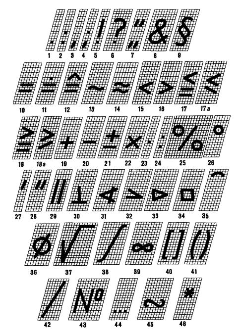
7.3. Font type B with a slope is shown in Fig. 21.
7.4. Font type B without tilt is shown in Fig. 22.
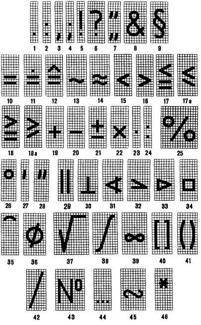
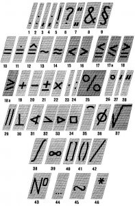
7.5. The names of the signs are given in Table. 3.
Table 3
|
Numbers of characters in the drawings |
Name of signs |
Numbers of characters in the drawings |
Name of signs |
| 1 | Dot | 25 | Percent |
| 2 | Colon | 26 | Degree |
| 3 | Comma | 27 | Minute |
| 4 | Semicolon | 28 | Second |
| 5 | Exclamation point | 29 | Parallel |
| 6 | Question mark | 30 | Perpendicular |
| 7 | Quotes | 31 | Injection |
| 8 | And | 32 | slope |
| 9 | Paragraph | 33 | Taper |
| 10 | Equality | 34 | Square |
| 11 | Value after rounding | 35 | Arc |
| 12 | Corresponds | 36 | Diameter |
| 13 | Asymptotically equal to | 37 | Radical |
| 14 | Approximately equal to | 38 | Integral |
| 15 | Smaller | 39 | Infinity |
| 16 | More | 40 | Square brackets |
| 17 and 17a | Less or equal | 41 | Round brackets |
| 18 and 18a | More or equal | 42 | Fraction dash |
| 19 | Plus | 43 | Number |
| 20 | Minus, dash | 44 | From to |
| 21 | plus or minus | 45 | Similarity sign |
| 22,23 | Multiplication | 46 | Star |
| 24 | Division |
8. RULES FOR WRITING FRACTIONS, INDICATORS, INDICES AND MAXIMUM DEVIATIONS
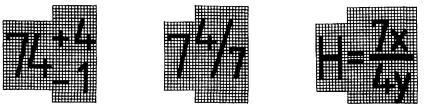
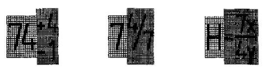
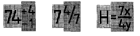
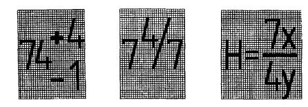
8.1. Fractions, indicators, indices and limit deviations are performed in accordance with Table. 4 font size: one step smaller than the font size of the main size to which they are assigned; the same size as the font size of the main size.Table 4
|
Implementation options |
Execution examples |
||
|
basic quantities |
fractions, indicators, etc. |
||
| The font size is one step smaller than the base size |
|
||
|
|
|||
|
|
|||
| The font size is the same as the size of the main value |
|
||
|
|
|||
APPENDIX
Reference
DIACCRITICS
Hungarian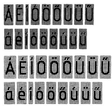
German
Polish language
Romanian language
Czech and Slovak
INFORMATION DATA
1. DEVELOPED AND INTRODUCED State Committee USSR according to standards2. APPROVED AND INTRODUCED BY Decree of the USSR State Committee for Standards No. 15623 dated March 28, 1981. (Excluded, Amendment No. 2)4. INSTEAD OF GOST 2.304-685. Edition (July 2001) with Amendment No. 1 approved in March 1989 (IUS 7-89)
INTERSTATE STANDARD
UNIFIED SYSTEM OF DESIGN DOCUMENTATION
DRAWING FONTS
Moscow
Standartinform
2007
(Changed edition, Rev. No. 2).
1. TERMS AND DEFINITIONS
1.1. Font size h - a value defined by the height of capital letters in millimeters.
1.2. Capital letters height h measured perpendicular to the base of the string.
Lower case height with determined from the ratio of their height (without processes k) to font size h, For example: with = 7/10h(Fig. 1 and 2).
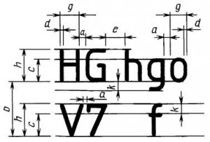
1.3. Letter width g- the largest width of the letter, measured in accordance with fig. 1 and 2, determined in relation to the font size h, For example, g = 6/10h, or in relation to the line thickness of the font d, For example: g = 6d.
1.4. Font Line Thickness d - thickness, determined depending on the type and height of the font.
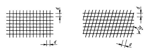
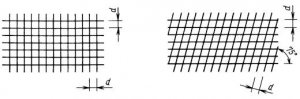
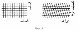
1.5. Auxiliary grid- a grid formed by auxiliary lines into which letters fit. The step of the auxiliary grid lines is determined depending on the thickness of the font lines d(Fig. 3).
type B without slope ( d = 1 / 10 h) with the parameters given in Table. 2;
type B with an inclination of about 75° ( d = 1 / 10 h) with the parameters given in Table. 2.
Table 1
Font type A (d = h/ 14)
|
Font Options |
Designation |
Relative size |
Dimensions, mm |
|||||||
|
Font size: |
||||||||||
|
capital letter height |
(14 / 14) h |
|||||||||
|
lower case height |
(1 / 14) h |
|||||||||
|
Letter spacing |
(2 / 14) h |
|||||||||
|
(22 / 14) h |
||||||||||
|
(6 / 14) h |
||||||||||
|
Font Line Thickness |
(1 / 14) h |
|||||||||
table 2
Type B font (d = h/ 10)
|
Font Options |
Designation |
Relative size |
Dimensions, mm |
||||||||
|
Font size: |
|||||||||||
|
capital letter height |
(10 / 10) h |
||||||||||
|
lower case height |
(7 / 10) h |
||||||||||
|
Letter spacing |
(2 / 10) h |
||||||||||
|
Minimum row spacing (auxiliary grid height) |
(17 / 10) h |
||||||||||
|
Minimum spacing between words |
(6 / 10) h |
||||||||||
|
Font Line Thickness |
(1 / 10) h |
||||||||||
Notes:
1. Distance a between letters whose adjacent lines are not parallel to each other (for example, GA,AT) can be halved, i.e. for thickness d font lines.
2.3. The construction of the font in the auxiliary grid is shown in Fig. 4.
2.4. Limit deviations of the sizes of letters and numbers ± 0.5 mm.
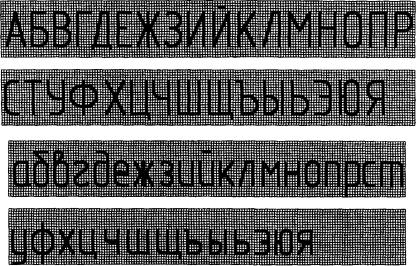
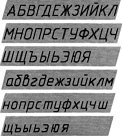
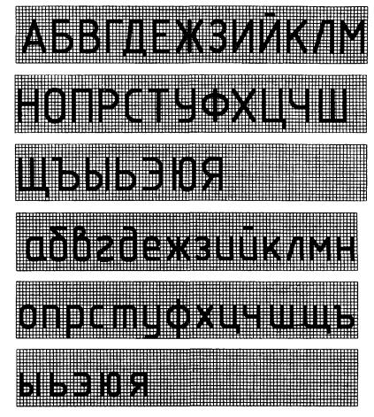
3. RUSSIAN ALPHABET (CYRILLIC)
3.1. Font type A with a slope is shown in Fig. 5
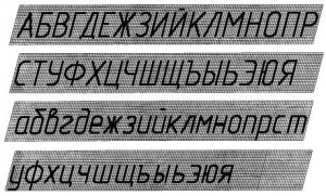
3.2. Font type A without tilt is shown in Fig. 6.
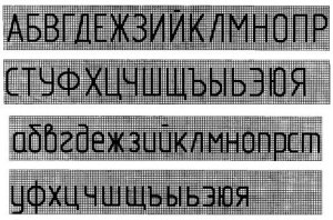
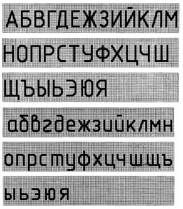
3.3. Font type B with a slope is shown in Fig. 7.
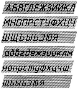
3.4. Font type B without tilt is shown in Fig. eight.
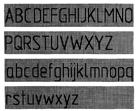
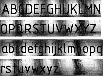
4. LATIN ALPHABET
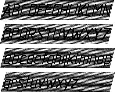
4.1. Font type A with a slope is shown in Fig. nine.
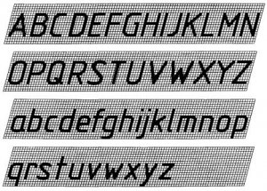
4.2. Font type A without tilt is shown in Fig. ten.
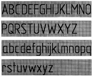
4.3. Font type B with a slope is shown in Fig. eleven.
4.4. Font type B without tilt is shown in Fig. 12.
4.5. Types, form and arrangement of diacritical marks for fonts of types A and B without italics are given in the reference appendix.
Diacritics for italic fonts should follow the same rules.
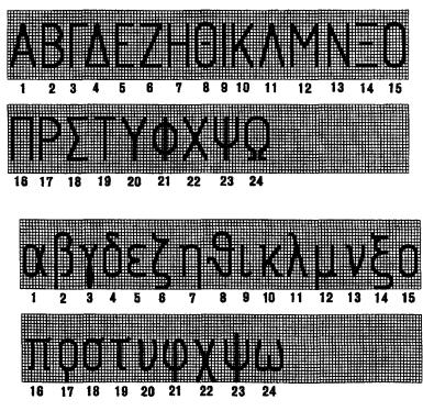
5. GREEK ALPHABET
5.1. Font type A with a slope is shown in Fig. thirteen.
5.2. Font type A without tilt is shown in Fig. fourteen.
5.3. Font type B with a slope is shown in Fig. fifteen.
5.4. Font type B without tilt is shown in Fig. sixteen.
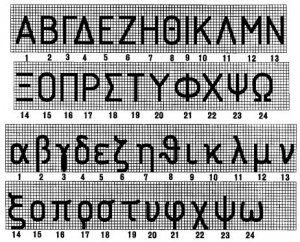
5.5. The name of the letters of the Greek alphabet shown in Fig. 13 - 16:
6. ARABIC AND ROMAN NUMBERS
6.1. Font type A is shown in Fig. 17.
6.2. Font type B is shown in Fig. eighteen.
Notes:
1. Roman numerals L, C, D, M should be performed according to the rules of the Latin alphabet.
2. Roman numerals may be limited to horizontal lines.
7. SIGNS
7.1. Font type A with a slope is shown in Fig. nineteen.
7.2. Font type A without tilt is shown in Fig. 20.
7.3. Font type B with a slope is shown in Fig. 21.
7.4. Font type B without tilt is shown in Fig. 22.
7.5. The names of the signs are given in Table. 3.
Table 3
|
Numbers of characters in the drawings |
Name of signs |
Numbers of characters in the drawings |
Name of signs |
|
Colon |
|||
|
Semicolon |
|||
|
Exclamation point |
Parallel |
||
|
Question mark |
Perpendicular |
||
|
Paragraph |
Taper |
||
|
Equality |
|||
|
Value after rounding |
|||
|
Corresponds |
|||
|
Asymptotically equal to |
|||
|
Approximately equal to |
Integral |
||
|
Infinity |
|||
|
Square brackets |
|||
|
Less or equal |
INTERSTATE STANDARD
UNIFIED SYSTEM OF DESIGN DOCUMENTATION
DRAWING FONTS
GOST 2.304-81
IPPUBLISHER STANDARDS
Moscow
INTERSTATE STANDARD
| Unified system of design documentation FONTSDRAWING Unified system for design documentation. | GOST |
Introduction date 01.01.82
This standard establishes drawing fonts applied to drawings and other technical documents of all branches of industry and construction.
1. TERMS AND DEFINITIONS
1.1.Font size h- the value determined by the height of capital letters in millimeters.
1.2. Capital letters height h measured perpendicular to the base of the string.
Height of lowercase letters with is determined by the ratio of their height (without processes k) to font size h, For example, with = 7/10 h(hell and).
1.3.Letter width g- the largest width of the letter, measured in accordance with fig. and , is defined in relation to the font size h,For example, g = 6/10 h, or in relation to the line thickness of the font d, For example, g = 6 d.
1.4.Font Line Thickness d-thickness, determined depending on the type and height of the font.
1.5.Auxiliary grid- a grid formed by auxiliary lines into which letters fit. The step of the auxiliary grid lines is determined depending on the thickness of the font lines d(heck. ).
type A with an inclination of about 75° ( d = 1/14 h
type B without slope ( d = 1/10 h) with the parameters given in Table. ;
type B with an inclination of about 75° ( d = 1/10 h) with the parameters given in Table. .
Table 1
Type A font (d = h/14)
| Designation | Relative size | Dimensions, mm |
||||||||
| Font size - | ||||||||||
| capital letter height | h | (14/14) h | l4 d | 10,0 | 14,0 | 20,0 |
||||
| lower case height | with | (10/14) h | 10 d | 10,0 | 14,0 |
|||||
| Letter spacing | a | (2/14) h | 2 d | 0,35 | ||||||
| b | (22/14) h | 22 d | 11,0 | 16,0 | 22,0 | 31,0 |
||||
| e | (6/14) h | 6 d | ||||||||
| Font Line Thickness | d | (1/14) h | d | 0,18 | 0,25 | 0,35 | ||||
Table 2
Type B font (d = h/10)
| Designation | Relative size | Dimensions, mm |
|||||||||
| Font size - | |||||||||||
| capital letter height | h | (10/10) h | 10 d | 10,0 | 14,0 | 20,0 |
|||||
| lower case height | with | (7/10) h | 7 d | 10,0 | 14,0 |
||||||
| Letter spacing | a | (2/10)h | 2 d | 0,35 | |||||||
| Minimum row spacing (auxiliary grid height) | b | (17/10)h | 17 d | 12,0 | 17,0 | 24,0 | 34,0 |
||||
| Minimum spacing between words | e | (6/10)h | 6 d | 12,0 |
|||||||
| Font Line Thickness | d | (1/10)h | d | 0,18 | 0,25 | 0,35 | |||||
Notes :
1.Distance a between letters whose adjacent lines are not parallel to each other (for example, GA, AT) can be halved, i.e. for thickness d font lines.
2.Minimum spacing between words e, separated by a punctuation mark, is the distance between the punctuation mark and the word that follows it.
When executing documents in an automated way, it is allowed to use fonts used by computer technology. In this case, their storage and transfer to users of documents should be ensured.
2.2. The following font sizes are set: (1,8); 2.5; 3.5; 5; 7; ten; fourteen; 20; 28; 40.
Note .The use of a font size of 1.8 is not recommended and is only allowed for type B.
2.3. The construction of the font in the auxiliary grid is shown in Fig. .
Heck. 4
2.4. Limit deviations of the sizes of letters and numbers ± 0.5 mm.
3. RUSSIAN ALPHABET (CYRILLIC)
3.1. Font type A with a slope is shown in Fig.
3.2. Font type A without tilt is shown in Fig. .
3.3. Font type B with a slope is shown in Fig. .
3.4. Font type B without tilt is shown in Fig. .
4.2. Font type A without tilt is shown in Fig. .
4.3. Font type B with a slope is shown in Fig. .
4.4. Font type B without tilt is shown in Fig. .
4.5. Types, shape and arrangement of diacritical marks for fonts of types A and B without inclination are given in the reference appendix.
Diacritics for italic fonts should follow the same rules.
5. GREEK ALPHABET
5.1. Font type A with a slope is shown in Fig. .
![]()
5.2. Font type A without tilt is shown in Fig. .
5.3. Font type B with a slope is shown in Fig. .
5.4. Font type B without tilt is shown in Fig. .
5.5. The name of the letters of the Greek alphabet shown in Fig. - :
| 1 - alpha | 9 - iota | 17 - ro |
| 2 - beta | 10 - kappa | 18 - sigma |
| 3 - gamma | 11 - lambda | 19 - tau |
| 4 - delta | 12 - mu | 20 - upsilon |
| 5 - epsilon | 13 - nude | 21 - fi |
| 6 - zeta | 14 - xi | 22 - hee |
| 7 - this | 15 - omicron | 23 - psi |
| 8 - theta | 16 - pi | 24 - omega |
6. ARABIC AND ROMAN NUMBERS
6.1. Font type A is given in outline. .
6.2. Type B typeface is inscribed. .
Heck. eighteen
Notes :
1.Roman numerals L, C, D , M should be performed according to the rules of the Latin alphabet.
2. Roman numerals may be limited to horizontal lines.
7. SIGNS
7.1. Font type A with a slope is shown in Fig. .
7.2. Font type A without tilt is shown in Fig. .
7.3. Font type B with a slope is shown in Fig. .
7.4. Font type B without tilt is shown in Fig. .
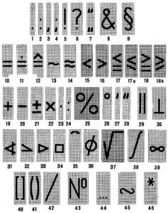
7.5. The names of the signs are given in Table. .
Table 3
| Name of signs | Numbers of characters in the drawings | Name of signs |
|
| Dot | Percent |
||
| Colon | Degree |
||
| Comma | Minute |
||
| Semicolon | Second |
||
| Exclamation point | Parallel |
||
| Question mark | Perpendicular |
||
| Quotes | Injection |
||
| slope |
|||
| Paragraph | Taper |
||
| Equality | Square |
||
| Value after rounding | Arc |
||
| Corresponds | Diameter |
||
| Asymptotically equal to | Radical |
||
| Approximately equal to | Integral |
||
| Smaller | Infinity |
||
| More | Square brackets |
||
| 17 and 17a | Less or equal | Round brackets |
|
| 18 and 18a | More or equal | Fraction dash |
|
| Plus | Number |
||
| Minus, dash | From to |
||
| plus or minus | Similarity sign |
||
| 22,23 | Multiplication |
INTERSTATE STANDARD
Unified system of design documentation
Drawing fonts
GOST 2.304-81
IPK publishing house of standards
Moscow
INTERSTATE STANDARD
Introduction date 01.01.82
This standard establishes drawing fonts applied to drawings and other technical documents of all industries and construction.
1. TERMS AND DEFINITIONS
1.1.Font size h- the value determined by the height of capital letters in millimeters.
1.2. Capital letters height h measured perpendicular to the base of the string.
Lower case height with determined from the ratio of their height (without processes k) to font size h, For example, with = 7/10 h(Fig. 1 and 2).
|
|
|
1.3.Letter width g- the largest width of the letter, measured in accordance with fig. 1 and 2, determined in relation to the font size h, For example, g = 6/10 h, or in relation to the line thickness of the font d, For example, g = 6 d.
1.4.Font Line Thickness d- thickness, determined depending on the type and height of the font.
1.5.Auxiliary grid- a grid formed by auxiliary lines into which letters fit. The step of the auxiliary grid lines is determined depending on the thickness of the font lines d(Fig. 3).
Heck. 3
2. TYPES AND SIZES OF FONT
2.1. The following font types are installed:
type A without slope ( d = 1/14 h
type A with an inclination of about 75° ( d = 1/14 h) with the parameters given in Table. one;
type B without slope ( d = 1/10 h) with the parameters given in Table. 2;
type B with an inclination of about 75° ( d = 1/10 h) with the parameters given in Table. 2.
Table 1
Type A font (d = h/14)
|
Font Options |
Designation |
Relative size |
Dimensions, mm |
|||||||
|---|---|---|---|---|---|---|---|---|---|---|
|
Font size - |
||||||||||
|
capital letter height |
(14/14) h |
|||||||||
|
lower case height |
(10/14) h |
|||||||||
|
Letter spacing |
(2/14) h |
|||||||||
|
(22/14) h |
||||||||||
|
(6/14) h |
||||||||||
|
Font Line Thickness |
(1/14) h |
|||||||||
table 2
Type B font (d = h/10)
|
Font Options |
Designation |
Relative size |
Dimensions, mm |
||||||||
|---|---|---|---|---|---|---|---|---|---|---|---|
|
Font size - |
|||||||||||
|
capital letter height |
(10/10) h |
||||||||||
|
lower case height |
(7/10) h |
||||||||||
|
Letter spacing |
|||||||||||
|
Minimum row spacing (auxiliary grid height) |
(17/10)h |
||||||||||
|
Minimum spacing between words |
|||||||||||
|
Font Line Thickness |
|||||||||||
Notes:
1. Distance a between letters whose adjacent lines are not parallel to each other (for example, GA, AT) can be halved, i.e. for thickness d font lines.
2. Minimum spacing between words e, separated by a punctuation mark, is the distance between the punctuation mark and the word following it.
When executing documents in an automated way, it is allowed to use fonts used by computer technology. In this case, their storage and transfer to users of documents should be ensured.
(Changed edition, Rev. No. 2)
2.2. The following font sizes are set: (1.8); 2.5; 3.5; 5; 7; ten; fourteen; 20; 28; 40.
Note. The use of font size 1.8 is not recommended and is only allowed for type B.
2.3. The construction of the font in the auxiliary grid is shown in Fig. 4.
2.4. Limit deviations of the sizes of letters and numbers ± 0.5 mm.
3. RUSSIAN ALPHABET (CYRILLIC)
3.1. Font type A with a slope is shown in Fig. 5
3.2. Font type A without tilt is shown in Fig. 6.
3.3. Font type B with a slope is shown in Fig. 7.
3.4. Font type B without tilt is shown in Fig. eight.
4. LATIN ALPHABET
4.1. Font type A with a slope is shown in Fig. nine.
4.2. Font type A without tilt is shown in Fig. ten.
4.3. Font type B with a slope is shown in Fig. eleven.
4.4. Font type B without tilt is shown in Fig. 12.
4.5. Types, form and arrangement of diacritical marks for fonts of types A and B without italics are given in the reference appendix.
Diacritics for italic fonts should follow the same rules.
5. GREEK ALPHABET
5.1. Font type A with a slope is shown in Fig. thirteen.
![]()
5.2. Font type A without tilt is shown in Fig. fourteen.
5.3. Font type B with a slope is shown in Fig. fifteen.
5.4. Font type B without tilt is shown in Fig. sixteen.
5.5. The name of the letters of the Greek alphabet shown in Fig. 13 - 16:
6. ARABIC AND ROMAN NUMBERS
6.1. Font type A is shown in Fig. 17.
Heck. 17
6.2. Font type B is shown in Fig. eighteen.
Heck. eighteen
Notes:
1. Roman numerals L, C, D, M should be performed according to the rules of the Latin alphabet.
2. Roman numerals may be limited to horizontal lines.
7. SIGNS
7.1. Font type A with a slope is shown in Fig. nineteen.
Heck. nineteen
7.2. Font type A without tilt is shown in Fig. 20.
7.3. Font type B with a slope is shown in Fig. 21.Percent
Colon
Semicolon
Exclamation point
Parallel
Question mark
Perpendicular
Paragraph
Taper
Equality
Value after rounding
Corresponds
Asymptotically equal to
Approximately equal to
Integral
Infinity
Square brackets
Less or equal
Round brackets
More or equal
Fraction dash
Minus, dash
plus or minus
Similarity sign
Multiplication
Star
8. RULES FOR WRITING FRACTIONS, INDICATORS, INDICES AND MAXIMUM DEVIATIONS
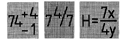
8.1. Fractions, indicators, indices and limit deviations are performed in accordance with Table. 4 font size:
one step smaller than the font size of the main value to which they are assigned;
the same size as the font size of the main size.
A font is a uniform outline of all letters of the alphabet and numbers, which gives them a common characteristic appearance. drawing font should be easy to read and easy to write. On the drawings and other design documents of all industries and construction, a drawing font is used, which establishes GOST 2.304-81 (ST SEV 851 - 78-ST SEV 855-78). GOST sets the following font sizes: (1.8); 2.5; 3.5; 5; 7; ten; fourteen; 20; 28; 40. The use of font size 1.8 is not recommended and is only allowed for font type B.
The font size is determined by the height of the capital letters in millimeters. The height of the h letters is measured perpendicular to the base of the line.
GOST established the following font types: type A with an inclination of about 75°; type A without slope. AT educational institutions usually use type B type with an inclination of 75 °.
To study the construction of letters and numbers and acquire the skills of writing them, several inscriptions should be made using an auxiliary grid. The grid consists of thin horizontal and oblique lines drawn at an angle of 75° to the horizontal line and is drawn with a 2T pencil. The distance between the parallel lines of the grid is equal to the thickness of the lines of the font selected for writing (Fig. 40). The thickness of the font lines d (Fig. 41) is determined depending on the type and height of the font h (font size).
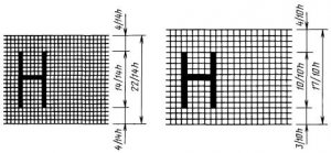
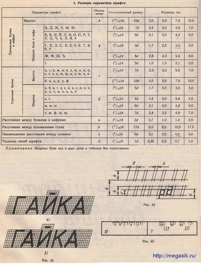
The sizes of such parameters as the distance between letters in words a, the width of letters and numbers g, minimum distance between words e, the distance between the bases of the lines b (Fig. 41), for the most used font sizes of type B should be taken from Table. 5.
If the sentence contains punctuation marks, then the distance between words is determined by the distance from the punctuation mark to the first letter of the next word (Fig. 41).
If the inscription begins with an uppercase letter, and the rest of the letters are lowercase, then the height of the lowercase letters, except for the letters b, c, e, p, y, f, is equal to the previous font size (Fig. 41). For example, if the inscription is made in font size 10, then the height of lowercase letters is 7 mm. The height of lowercase letters b, c, d, p, y, f is equal to the height of uppercase letters of the font size used for the inscription.
The thickness of the stroke of uppercase and lowercase letters in the same word must be the same according to the accepted font size. If the inscription is made only in capital letters, then the first letter is not highlighted in height; all letters are the same height.
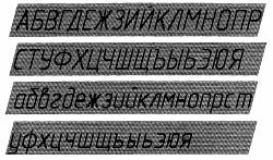
The constructions of numbers and letters of the Russian alphabet for type B font are shown in fig. 42. For clarity, the rectilinear sections are shaded, and the fillets and sloping elements are left light. The gaps between two adjacent letters that have non-parallel boundary lines visually appear to be enlarged, therefore, in combinations of letters L, GL, AD, AL, KA, HC, the gap between letters is halved, and in combinations GA and TA they are not done at all. Compare two spellings of the same word (Fig. 43). The first word is made with the same spaces between all letters (Fig. 43, a). In the second word (Fig. 43, b), the gap between the letters K and A is reduced by half, and between the letters G and A it is completely absent.
All inscriptions on the drawings are made by hand. When studying the construction of letters and numbers, it is necessary to use the auxiliary grid shown in Fig. 40, having mastered the skills of writing a font, you should use a simplified auxiliary grid (Fig. 44), which limits the height and width of letters, the spaces between letters and words. It is better to plot the dimensions of the elements of letters and numbers using a home-made marking ruler made of paper, since due to the thickness of a regular ruler, the dimensions are transferred inaccurately.
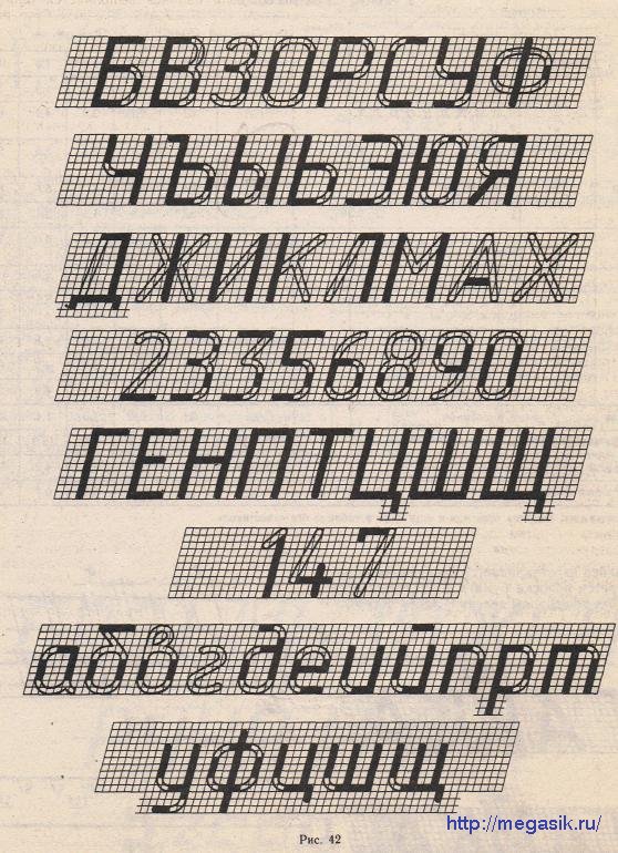
This line is made as follows. A strip of paper is taken and superimposed on the ruler from the division side. Then, with a sharpened pencil on a strip, mark the width of the letters and the spaces between them with strokes and set the size (Fig. 45). These marking lines are made for different sizes font and put down the font size on each, so as not to confuse.
With sufficient skill in making inscriptions, a more simplified marking grid is used (Fig. 46), on which horizontal lines are drawn for sizes L; c and b and a few 75° slanted lines to keep the letters and numbers in line with the predetermined slant.
An example of writing letters and numbers using a simplified auxiliary grid is shown in fig. 47. Two thin lines are drawn at the distance of the font size, which limit the height of letters and numbers. Between them, in the middle, a third auxiliary line is drawn. On fig. 47, and letters are shown, the middle elements of which are located above the line, in fig. 47, b letters, the middle elements of which are under the middle line. Horizontal-
The main elements of the letter A and the number 4 are made using a line that is drawn at a distance "YES" from the base of the line (Fig. 47, b and e) i The spelling of some numbers is shown in Fig. 47, c. The number 3 has two spelling designs.
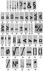
The designs of the letters of the Latin alphabet are shown in fig. 48, and Roman numerals - in fig. 49. GOST allows limiting Roman numerals to horizontal lines (Fig. 49, / and V).
On fig. 50 made the most commonly used signs. Their names are given in Table. 6.
We also recommend
 How to make a healthy banana smoothie
 Harvesting asparagus for the winter recipes for cooking at home
 Chicken pie with zucchini and cottage cheese Dukan's recipes zucchini pie with cottage cheese
 Gingerbread with icing
 How to cook a salad with crab sticks and carrots
 Cabbage salad with bell pepper - the best recipes