Color theory: color mixing. Optical color mixing Color is divided into emitted and reflected
The purpose of the lesson: to give an idea of the two main methods of optical color mixing.
Lesson plan:
1. The essence of optical color mixing.
2. Subjunctive color mixing.
3. Subtractive color mixing.
The student must:
know: two main methods of optical color mixing.
Answers to the lesson plan questions:
1. Optical color mixing is based on the wave nature of light. It can be obtained with a very fast rotation of the circle, the sectors of which are painted in the required colors. Remember how you rotated a spinning top in childhood and watched with surprise the magical transformations of color. It is easy to make a special top for experiments on optical color mixing and carry out a series of experiments. You can make sure that the prism decomposes the white beam of light into its component parts - the colors of the spectrum, and the top mixes these colors back into white. In the science of "Color Science" (coloristics), color is considered as a physical phenomenon. Optical and spatial color mixing is different from mechanical color mixing. The primary colors in optical mixing are red, green and blue. Primary colors in mechanical color mixing are red, blue and yellow. Complementary colors (two chromatic colors) when optically mixed give an achromatic color (gray). If you carefully follow the three beams of spotlights: red, blue and green, you will notice that as a result of the optical mixing of these beams, a white color will be obtained. You can also conduct such an experiment on obtaining a multi-color image by optical color mixing: take three projectors, put color filters on them (red, blue, green) and, simultaneously crossing these rays, get almost all colors on a white screen. Areas of the screen illuminated both blue and green will appear blue. When blue and red radiation are added together, a purple color is obtained on the screen, and when green and red are added, a yellow color is unexpectedly formed. Adding all three colored beams, we get white. If black and white slides are installed in the projectors, then you can try to make them colored using colored beams. Without such experience, it is hard to believe that a variety of color shades can be achieved by mixing three rays: blue, green and red. Of course, there are more sophisticated devices for optical color mixing, such as a TV. Every day, when you turn on a color TV, you get on the screen an image with many shades of color, and it is based on a mixture of red, green and blue radiation.
2. Subjunctive mixing(or additive). The physical essence of this type of mixing is the summation of light fluxes (rays) in one way or another. Types of subjunctive mixing: spatial- this is a combination in one space of differently colored light rays (monitors, theatrical ramps); optical mixing- this is the formation of a total color in the human organ of vision, while in space the terms of the colors are separated (pointilistic painting); temporary - this is a special mixture, it can be observed when mixing the colors of the discs placed on the Maxwell "turntable" special device; binocular - this is the effect of multi-colored glasses (one lens of one color, the second of another).
Primary colors with subjunctive mixing: Red Green. Blue. Rules of subjunctive mixing: when mixing two colors located along the chord of a 10-step circle, the color of the intermediate hue is obtained. Example: Red + Green = Yellow; when opposite colors are mixed in a 10-step circle, an achromatic color is obtained.
3. Subtractive mixing(or subtractive). Its essence lies in the subtraction of any part of the light flux by absorption, for example, when mixing colors, when applying translucent layers to each other, with all types of overlay or transmission. Basic rule: any achromatic body (paint or filter) reflects or transmits rays of its own color and absorbs the color complementary to its own.
Primary colors in subtractive blending: Red, Yellow, Blue.
Review questions:
1. What is optical color mixing based on?
2. Describe the subjunctive color mixing.
3. Describe subtractive color mixing.
Literature:
1. Mironova L.N. Color science, Minsk. 1984.
2. Kirtser Yu.M. Drawing and painting / Yu.M. Kirtser. - M., Higher school. 1992.
Here's what I dug up in the bins: I once helped my husband prepare an article for publication. In fact, very valuable information from books that are included in the secret list of teachers of the St. Petersburg Academy is presented in this article in an accessible and popular way. And the books are rare: fourteen years ago they could only be reviewed in the reading room of the amazing academic library. And I remember what I read. It was amazing - many things in my head immediately fell into place. I feel that I simply have to continue to carry knowledge to the masses.
If anything, I studied at the Academy, much like Gatsby studied at Oxford - it was a three-month faculty development course. Exceptionally rewarding experience, amazing people.
Here is a photo of that time:
And here is the article itself:
Optical color mixing and lighting effects in painting
One of the main problems of the current state of affairs in the teaching of painting is a tangible decline in the technical skills of painters, which cannot but affect the artistic merits of their works. The reason for this is poor theoretical awareness and lack of practical experience in mastering various traditions of constructing a pictorial image. Hence the straightforward approach to solving color problems, a rough and monotonous manner of writing. An appeal to a deeper study of the properties of color and colorful material, the opportunity to enrich the pictorial language with additional possibilities is gaining undeniable relevance.
Optical color mixing is one of the powerful expressive means of painting, expanding the boundaries of the palette and giving new dimensions to the perception of depth and luminosity of space.
There are two systems of painting based on optical mixing of colors and two main types of such mixing. In this case, the colorful substance of different colors is not mixed on the palette, but is located in the picture in such a way as to have a special, joint effect on visual perception.
Optical mixing of paints according to the principle of the old masters implies multiple translucence of different colored layers through each other: the color of the ground, underpainting, the actual painting and glazing play a role.
Another method of optical mixing of colors, developed in the nineteenth century by French artists of such trends as impressionism, pointillism, divisionism, relies on the property of color spots placed side by side to merge at a distance into a single colorful tone.
Both methods require a certain amount of eye training and practice. Knowledge of the theoretical foundations of physical and physiological laws, which make it possible to classify optical phenomena, can also be of great help to the artist.
This knowledge is important for any artist, even those who prefer to mix colors on a palette and work in a manner far from the two named traditions, and allow them to improve and enrich the painting technique.
The colorful effect of ancient painting is made up of translucence of colorful layers and ground. The soil plays an important role. The choice of ground color depends on the light and color effect of the painting. Light painting requires white ground; painting, which is dominated by deep shadows - dark. Light ground gives warmth to paints applied to it in a thin layer, but deprives them of depth; dark ground communicates depth and cold.
Colored primers obtained by coating a white primer with some kind of transparent paint absorb light and therefore do not become too dark, colored primers with body paint reflect and therefore can be taken darker. Light gray neutral primer is considered the most versatile for various artistic tasks.
Underpainting is of great importance in classical painting. On white ground, underpainting is done with transparent brown paint. This is followed by the registration of forms with white and black paints so that the brown preparation shines through everywhere, except for highlights. In the underpainting, the shadows are made much lighter than they should be in the finished form, taking into account subsequent glazing. If underpainting is done on gray ground, then the shadows of objects are shaded with brown paint, the light passes through white, and gray ground is left in the halftones.
On colored ground, underpainting is carried out with additional color paint, for example, on red ground - in a greenish-gray tone, etc.
Next comes the main painting layer. Lights and midtones are prescribed in local tones much lighter than they should be in their finished form. Shadows often glaze right through the underpainting.
If the painting is carried out on a dark basis, then its tones are made up without black and generally dark colors, since the latter are already laid in a dark ground. Paints are applied thickly in highlights and thinly in halftones, where they allow the ground to shine through, which in this case makes it possible to reproduce cold transitions in body tones without resorting to the introduction of blue, black and green colors into the palette.
Painting ends with glazes, which are applied to a well-dried layer of paint.
Glazes are called thin, transparent and translucent layers of paints applied to other paints to give the latter the desired intense and transparent tone.
Paints have varying degrees of transparency; almost all of them, except for the most covering ones, are suitable for glazing.
Paints for glazing are thinned with oils and varnishes. You can glaze with solid colors or by mixing them. With the help of glazing, you can enhance or, on the contrary, extinguish the strength and brightness of the tone. Under glazing, the painting becomes darker and warmer, especially if there are numerous glazings in the picture.
Painting, filled with glazing, acquires, on the basis of the laws of optics, an extraordinary richness and sonority of colors, giving it a special beauty that is unattainable in painting with body paints, but it also has weaknesses.
Glazes, due to their physical structure, strongly absorb light, and therefore a picture executed by them requires much more light for its illumination than a painting aged in body paints, which reflect light more than they absorb. Painting with glazing lacks the airiness that is achieved in painting with a matte surface that strongly reflects and scatters light.
For these reasons, glazing painting does not always meet the tasks of a modern artist. Of greater interest at present are semi-glazing.
Semiglazing is applied in a thin translucent layer. From an optical point of view, such a layer of colors is one of the types of so-called "muddy environments" to which some of the visible colors of nature (the blue or red sunset color of the sky, etc.) are due. On the same optical basis, light translucent tones of paints, when applied to a dark surface, will give tones with a cold tint; the same colors on a white surface will look much warmer. In nature, this effect can be observed in the example of a plume of smoke: against the background of black earth, it looks blue, but becomes yellowish when a bright sky shines through it. So the old masters got their gray transitional tones in body painting, applying translucent light colors on a brown base.
Semi-glazing gives the painting a peculiar beauty. They do not shine with strength and brightness, but it is impossible to obtain these shades by physically mixing colors on the palette.
The discovery of another method of optical mixing of colors is usually attributed to the Impressionists, but one cannot fail to notice its origin already in ancient painting. So the works of Titian (especially of the later period of his work) are more "impressionistic" than the works of Botticelli, and Rembrandt is already more impressionist than Titian. Almost all the discoveries of modern times in the field of color are incorporated in Vermeer's painting.
However, these finds were brought together into a single coherent system at the end of the nineteenth century by divisionist artists who practice “separation of tones”, while painting is a mosaic of colored strokes: colors are close in purity to spectral colors and mix optically at a distance.
The first experiments with color photography belong to the same era. The experiments of divisionism are echoed by the invention of the Lumiere brothers - autochrome photographic plates, where the image consists of small grains, and not the “basic” colors of Prussian blue, carmine and yellow, accepted in all manuals, but from red (close to cinnabar), emerald green and blue (with a hint of purple). But further experiments show how any shades can be made from various groupings of the three Lumiere colors. For example:
Blue-violet + emerald = blue
Blue-violet + red = purple
Red + green = yellow.
In a similar way, optical mixing of colors occurs on the screen of a modern TV; at the same time, three "Lumier" primary colors "work".
mechanical mixture
Students are usually taught the origin of shades from the three primary colors - red, yellow and blue. A pairwise mechanical mixture produces orange, green and violet, while a mixture of all three primary colors produces colors with reduced brightness.
But for practical purposes, this theory is not always suitable. By mixing the primary colors, you cannot get pure and bright green, purple and orange - you have to resort to brighter ready-made pigments. The more components the mechanical mixture includes, the greater the proportion of gray in it, the weaker the brightness of the colors.
If a picture needs to convey maximum light, this must be done with pure paints, ready-made pigments. But then what about the richness of shades of the visible world?
If you want to write sunny greens, illuminated by reddish rays, then the mechanical mixture of red and green will certainly turn out to be dirty and dull. However, it is enough to inscribe red or orange-red in the gaps between strokes of spectrally pure greens so that the greens light up with a warm light without losing their purity.
Lowering the luminosity by triple mixtures in highlights leads to the fact that the already short scale of colors is reduced even more. If you darken the light end of the scale, then there will still be nothing but black at the dark end, resulting in blackness and dullness of color.
Optical mixing
Unlike mechanical mixing, optical mixing occurs in the human eye. The results of optical and mechanical mixtures differ significantly. To study them, you can conduct a series of laboratory experiments.
You can use a top with clippings of colored paper: when the top is rotated, the colors are optically mixed.
You can make thin stripes of alternating colors. If, however, the stripes are replaced by long narrow triangles that enter into each other, then one can trace the stretching of shades from color to color, the purity of its transitions closely resembling a spectrum.
Mixtures can be made up of both light (whitened) and dark tones, giving beautiful shadow combinations, without a trace of that deafness that is in ready-made dark pigments.
Any decomposed tone not only wins in purity and luminosity, but also better conveys the elusive play of complex airy shades of nature.
In work, it is convenient to refer to the color wheel. There are ten colors in the circle in the order of the spectrum: red, orange, yellow, yellow-green, green, green-blue, cyan, indigo, violet and magenta.
Two diametrically opposite colors (subject to the correct selection of shades) optically fade, give white or gray: purple + green, blue + yellow, etc., therefore they are called complementary.
Two colors that do not lie on the same diameter give an intermediate color, which must be searched for along the smaller arc of the circle between these colors, closer to the color that enters the mixture in a larger amount. Red and green give orange, yellow, yellow-green; violet and green-blue make blue and cyan.
Only gray shades can be made up of five combinations. Although all mixtures give the impression of gray, each is individual; the choice is dictated by the artistic task - for example, a blue wall, illuminated by golden light, will be conveyed by strokes of orange and blue.
Here are some characteristic mixtures, unexpected at first glance:
1 Red + green = orange, yellow, yellow-green.
2 Red + yellow-green = orange, yellow.
3 Purple + green = cyan, blue.
4 Violet + orange = magenta, red.
5 Yellow + purple = magenta, red, orange
6 Orange + light blue = pink lilac
7 Orange + green-blue = yellow-green
All these mixtures differ sharply from the corresponding mechanical mixtures. Only colors adjacent in the spectrum give the same results.
Mixtures can be made up of two or more colors.
The perception of a picture based on optical color mixing depends on a number of additional factors.
Distance - the distance to the picture increases compared to the traditional one.
The scale of the stroke depends on the size of the painting and the artistic objectives. You should not bring technology to fanaticism, turn it into mechanical labor.
Painting lighting - the light should be white and even; artificial light, which differs in spectrum from daylight, can destroy the impression of the picture; the same applies to color distortion in reproductions.
The picture-mosaic ceases to be frozen and motionless, an elusive flickering, uncertainty and variability of tones inherent in nature are achieved.
In everyday work on educational sketches, students, even just starting to master oil painting, on the basis of the above material, can be given a number of recommendations.
– Protect the reflective properties of the soil; avoid pulling soils.
- Properly use underpainting with transparent paints.
- Strive to diversify the painting in terms of the thickness and texture of the paint layer, to use the translucence of transparent paints.
– Write light with spectrally pure paints or use optical mixtures of spectrally pure paints in lights.
- Do not strive for a particular uniformity of the mixture of colors on the palette: streaks of vibrant color in the traces of brush strokes or palette knife in the picture give it movement and shimmer of color.
- Diversify the methods of applying paint: it can be fluid or almost dry - the first is suitable for underpainting or glazing, the second - for trimming and working with a “dry brush”, creating a variety of grainy loose textures and beautiful layers of colors.
The study and meaningful selection of various methods for creating a pictorial image play an important role in the formation of a professional artist and his unique creative individuality.
Bibliography:
1. Wieber J. Painting and its means. Translation from French. M., Publishing House of the Academy of Arts of the USSR. 1961.
2. Feinberg L.B. Glazing and technique of classical painting. M. - L. "Art", 1937.
3. Feldman V. A. Light and purity of colors in painting. principles of impressionism. Kyiv, printing house Kulzheiko, 1915.
4. Kiplik D.I. Painting technique. M. - L. "Art", 1950
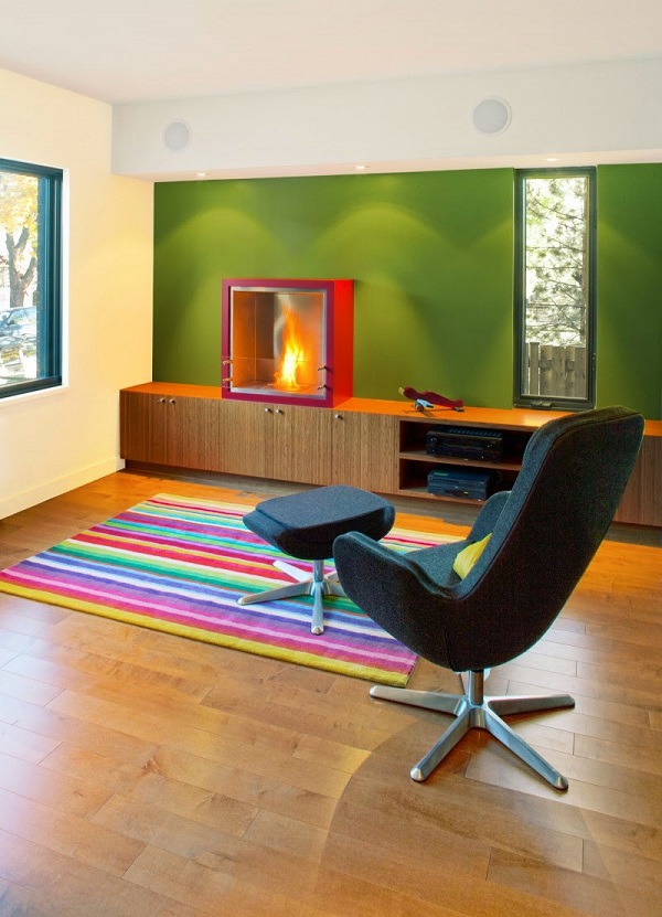
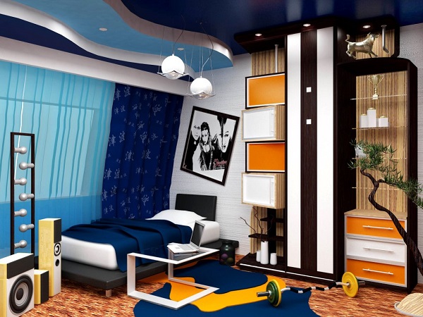
Designing any space starts with color. Deciding on the general style of the room, the designer already presents it in certain colors, since it is they who direct the fantasy in the right direction. The combination of colors in interior design is one of the factors that indicate the style and theme of the room. The country style is dominated by noble rich tones, all shades of wood, white, beige, burgundy, brown. To create the Provence style, pastel colors are used with a slight interspersed with dark shades. Blue, white, gray, light blue and dark wood color indicate the "nautical" style. The classic is characterized by a wide range of beige, chocolate, coffee. Ethnic style plays with contrasts, using brown, bardo, black, red. The choice of color schemes is the most important stage on which the success of interior design as a whole depends.
The joke that all men see only 16 colors, as in the default Windows settings, has real roots: there are many more "color-sensitive" cells in the woman's eye.
However, studies show that the human eye is able to perceive a huge number of colors and their shades: about 250 pure and more than 10 million mixed.
A simple understanding of the colors of the main spectrum will help not to get lost in such a variety.
There are only seven of them: red, orange, yellow, green, blue, blue, purple. Taking these colors as a basis, diluting them or mixing them together, colorists create a huge number of tones and shades for use in the interior. So-called achromatic colors are added to them, that is, they do not carry any color load. There are only three of them: black, white, gray.
All colors can be divided into two groups: warm and cold:
The feeling of warmth is caused by red, orange, yellow, and their various shades. Warm colors are used to make a room cozier, to add light to a poorly lit room, to correct too much empty space.
The feeling of coolness is evoked by blue, purple, blue and their various tones. Cold colors are suitable for well-lit rooms, visually expand the space, give freshness, vigor.
How to choose the right combination of colors in interior design?
The choice of colors and their combinations is a complex process that sometimes baffles even professional designers. But with a versatile, easy-to-use color wheel, getting the color right can now be done by anyone. You just need to remember that inside one room you should combine from three to five colors, no more.
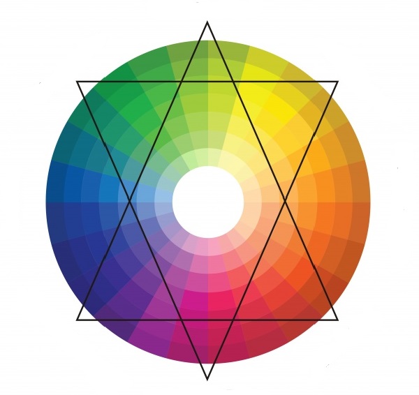
Color circle
1) Several shades of the same color
This is a proven and reliable way for calm natures who are not too fond of taking risks. The room is "filled" with all sorts of shades of the same color: from the deepest, most saturated to the lightest, barely distinguishable. Smooth transitions and a guaranteed successful combination will give the interior peace, harmony, peace.
2) Playing with contrasts
A method radically opposite to the previous one. Two contrasting colors are taken as the basis, located opposite each other on the color wheel. Contrasts are played up in the interior with the help of neutral colors such as black, white, gray.
3) Harmonious combinations
One of the colors in which I would like to decorate the room is taken as a basis. Two more are “attached” to it, located to the left and to the right of it on the color wheel. In this case, the colors will form an original and beautiful combination, without sharp transitions.
4) Three spectacular colors
A slightly more daring move, but without being overly flashy. A triangle is used to identify three successfully combined colors. It can be rotated inside the circle until the angles indicate the most pleasing combination for the eye for each individual case.
Rules for choosing colors for different rooms
The influence of color on the mood and emotions of a person has not been a discovery for a long time. That is why you should carefully select colors for interior decoration, depending on the purpose of the room.
Bedroom
It is not recommended to decorate the bedroom with sharp contrasting tones, as this place is designed to relax and soothe. Pastel colors, soft shades are perfect here. Warm colors are preferred, but cool colors can also be used if the room is small and the windows face south. Properly selected accessories, the addition of white, the correct placement of accents will help bring comfort to cold tones.
Living room
In the interior of the living room, you can be bolder with the choice of colors. Playing with contrasts or using catchy accents will add vivacity and give the interior a stylish, spectacular look. If the windows face north, you should take warm shades as the basis of the interior. If the living room is too small, you can “expand” it a little by using a light cold palette. It is important to consider that cold tones are only good for bright rooms where the sun does not leave the room for a long time.

Colors that are visible under natural conditions are usually the result of mixing primary colors. There are three main ways of such mixing, namely: spatial, mechanical, and also optical.
Optical (additive) color mixing
Optical color mixing is based on the wave nature of light. Optical mixing can be obtained by rotating a circle with sectors painted in certain colors. The main colors in this mixture are green, blue and red. In addition to them, there are two more that give an achromatic gray color. By additively mixing the primary colors, we get white.
To get a multi-color image, you can take three conventional projectors with different primary color filters and cross the beams from them. This way you can get any color on a white screen. An area of the screen, for example, that will be lit green and blue at the same time, and when red and blue rays are added together, we get magenta. By the way, please note that when mixed, the colors are not the same.
Optical color mixing is usually done with more sophisticated instruments. A striking example is a TV, in which various shades also appear as a result of mixing green, red and
Spatial color mixing
Spatial mixing occurs when a person looks at small patches of color touching each other from some distance. These spots merge into one spot - with a new color, which will depend on the mixing of colors in small areas.
Spatial fusion of colors is obtained as a result of light scattering. It is also affected by the structure of the eye and the rules of optical mixing.
The features of such mixing should be taken into account by the artist in his work, since, most likely, the picture will be viewed from a certain distance. So, if you look at a picture painted with small strokes from a distance, they will visually merge, and it will create the impression of a holistic one.
Spatial mixing is the basis for obtaining images of color shades when printing from raster forms. If we consider areas formed by small differently colored dots from a certain distance, a person will not distinguish their colors, but will perceive the color as spatially mixed.
Mechanical color mixing
The third type of mixing - mechanical - occurs when mixing paints on paper, canvas or palette. To better understand its mechanism, you need to draw a clear line between concepts such as "paint" and "color". There are more colors that have an optical nature than paints that have chemical properties.
As a rule, the colors of paints are less saturated than the colors of the objects around us, so young and inexperienced artists are faced with the problem of color reproduction. How to convey the variety of colors in nature with a dozen colors in a set?
However, this problem can be solved if the artist understands color science and knows how to choose the right coloristic and tonal relationships between colors. In principle, if we talk about artists, then sooner or later they all master the technique of mechanical mixing.
Very often, mechanical ink mixing can give results similar to optical mixing, but usually they are different. For example, while optical mixing of all colors produces white, mechanical mixing produces grey, brown, black, or brown. There is one that will tell you what color can be obtained by mixing certain colors or rays.
Optical color mixing (additive, subjunctive).
Example: If you put blue and yellow next to each other, then from a distance their combination will appear green. For the first time in our civilization, the Impressionists began to use this law, passing through a prism a sunbeam decomposes into 3 private colors: red, yellow, blue. Where they mix at the edges, 3 components are formed: green, orange, purple. Painting cannot convey the power of color. If you mix paints on a palette, you get a dirty background, so the Impressionists began to put on the canvas separate strokes of those paints into which the color decomposes (outgoing, reflected from the surface), passing through a prism. And since the lens in the eye of the viewer is the same prism, it sort of combines colors, restoring light. Working in the open, in nature, the Impressionists noticed that the shadows from objects are not black, but are slightly painted in the color of the objects themselves. To work in the impressionistic way, you need to learn a few rules:
1. The palette is limited only to pure colors (spectral), without the so-called earth colors - this is minium, and so on.
2. On the palette, mixing only those colors that are adjacent in the spectrum is allowed. Example: red and orange, blue and purple. It is also allowed to whiten the color. All other mixing is done optically.
3. Paints are applied with small strokes, dots, punctuation, a kind of impressionism. With a clear form, individual strokes do not overlap each other, but are located side by side, called punctuation.
4. The local color of any object is divided into parts according to the lighting conditions. The illuminated part, own shadow, drop shadow, reflex, and so on.
All these parts have their own special color, and the colors of the illuminated and shadow parts usually contrast, this is called color separation.
5. The color of a local large spot is transmitted as the sum of small strokes of different colors, either intensifying or weakening, this is called gradation.
The modern colorist is based on a three-component theory (the principle of 3 primary colors) - this is red 750 nm, green - 546.1 nm, violet - 435.8 nm.
Any color can be expressed mathematically, where C is an arbitrary color, x is red, y is green, z is Purple are the primary colors.
X1, y1, z1 - color coefficients showing the ratio of mixed basic. Chromaticity, which is the derivative of hue and saturation, is more conveniently estimated using relative color coefficients:
X = x1/(x1+y1+z1)
Y = y1/(x1+y1+z1)
Z = z1 (x1+y1+z1)
The sum of the relative coefficients is equal to one: x+y+z=1
We also recommend
 Switching power supply: repair and refinement
 Remote control of light
 Swimming lessons for preschool children
 Notes for the master - home household alarms
 Clock propeller on Atmega8
 Device and relay application examples, how to choose and connect a relay correctly Microcontroller and relay simple switching circuits