Olive color in the interior of the living room. Olive color in the interior - a combination of olive color
Being a derivative between green, yellow and gray, the olive color in the interior of a living space is not used as often as it could. And the reason for this is the intense absorption of light and, as a result, the darkening of the room. If you plan to use this shade of green in the design of the living room, hallway or bedroom, then you cannot do without a thorough study of the topic and techniques that will allow you to create a harmonious interior.
How to use olive color in a living space
We’ll warn you right away if you are not sure that you can use the olive color in the interior without losing the quality of the “picture”, then it is better to abandon this idea at the initial stage and choose shades that are easier to combine. If your decision is firm and not subject to appeal, then our advice will help to give the room organicity and completeness.
First of all, it must be said that this color shades the room and makes it a bit gloomy. To avoid this effect, you need to use two tricks:
- saturate the room with a sufficient number of light sources - moreover, the light should be white, not yellow;
- use light shades in interior design, in particular, olive perfectly refreshes white.
In the first option, equip the room not only with a traditional chandelier in the middle of the ceiling, but also with spotlights and even directional spots and wall sconces. In the second option, use white inserts as accents - these can be white stripes on the walls, white curtains or snow-white bedspreads and tablecloths. Be that as it may, the white color will do its job and dispel the boredom of the muted olive.


What shades are combined with olive color in the interior
As with all plant colors, the combination of olive color in the interior turns out to be the most successful with natural shades - the color of the sky, green grass, yellow leaves and bright flowers. In each case, companion colors are chosen individually, depending on the purpose of the room and its orientation in space.
For example, you should not include bright accents, for example, raspberry color, in the interior of your office - they will simply distract you from work. But this shade will make olive cuisine more cheerful. The same rule applies in other rooms - if the living room can be saturated with fuchsia accents, then in the nursery this color will seem somewhat bright.
The olive color of the walls is especially well combined with chocolate brown and white. You can use them one by one, or all together - then white inserts will perfectly dilute the “dryish” interior.


If such a cardinal contrast does not suit you, then adopt a softer combination of muted olive with “delicious” colors of the caramel palette - soft cream, milk or coffee with milk. In this case, the differences between colors will be smoothed out with pleasant light shades.

Brightness and ambiguity in the olive interior will bring colorful accents in the form of fuchsia chair covers or an orange shelf on the wall. Such cheerful colors go well with olive. Among the others, no less bright, it can be noted: carrot, red, brick, orange, bright yellow. From deep shades, it is good to combine olive with aquamarine, mustard, burgundy. How to use them? It can be a mustard-colored sofa or sea-green curtains - in any case, this combination will not violate the harmony of the interior.

Olive color in your kitchen
Let's see how to use olive color in the interior of the kitchen. Usually in the kitchen space there is one of two types of olive color combination with others (and in some cases they can even be combined in the same room):
- with a brown palette - chocolate, brown, light brown;
- with contrasting colors - light gray, white, yellow, red, purple.
In the first case, we get a peaceful atmosphere, which is more typical for classical interiors, in the second case, the olive kitchen turns out to be dynamic and “live” and fits well into newfangled styles.
How best to use these colors in the interior of the kitchen? You can install olive-colored furniture with a brown countertop, and make the main background light gray. Or, on the contrary, you can paint the walls in olive color, and the kitchen set in the color of baked milk will act as a bright spot. In this case, you can even add bright accents - an orange tablecloth, textile napkins of the same color and a wall picture or clock in a life-affirming orange color.


Living room in olive tones
The living room, decorated with a predominance of olive color and not having bright "flashes", is usually made in a classic style. It is not characterized by fanciful, bright finishes and color contrast, so the olive color in the interior of the living room is not diluted with opposite shades, but is left in a muted range.
Striped sofas or olive wallpaper with a light milky pattern fit well into such interiors. Otherwise, he remains intelligently prim and unflappable.


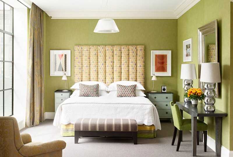
Olive Bedroom: Arrangement Rules
In the interior of the bedroom, olive color is found in a lightweight format, i.e. in its light colors. As a rule, bright color accents are not made in this room. On the contrary, the color scheme remains calm and conducive to relaxation. The combination of light olive color with soft green and milky in the bedroom looks interesting - try combining these shades on curtains or furniture stickers to feel their originality. And to make the room at least a little more fun, you can interspersed with mustard and brick colors, for example, use them on a bedspread or on the lampshade of a floor lamp.
One of the classic color options in interior design is olive or olive. This tone is perfect for decorating a bedroom, kitchen area, living room. Just before agreeing on the design of your apartment or house, when choosing a tone for painting, we advise you to familiarize yourself with the photo of the olive interior in advance. This will help you make the right choice before starting the repair.
Psychological significance
Many of us know that the color of walls and furniture can affect the daily mood, behavior and even health of people. Perception depends on the physiology of your eyes, as well as how strong your nervous system is.
From a psychological point of view, yellow-green is a sign of stability and calmness. Due to the presence of gray in it, yellow-green is considered more mature and conservative. During the Renaissance, at weddings, brides preferred dresses of this particular color.


Beautiful decoration in the house
Olive is a mixture of green, gray and yellow. It is not used very often in monochrome in the design of the interior decoration of an apartment, preferring to dilute it with other tones. By itself, the olive color in the interior is quite dark and can intensively absorb natural light.

Avoid its monochrome in the apartment - in this case, the interior decoration of your walls can have a depressing effect. It is good to dilute and refresh it with white paint - it can extinguish the negative effect of a dark color.

You can dilute with other paints not only on the walls, but also place them in upholstered furniture (upholstery, pillows), curtains.

The use of gray and yellow-green in flooring speaks of your practicality - dust, hair or drops of toothpaste will not be noticeable on such a floor (in case such a floor is in the bathroom).

Where is yellow-green used
When choosing a range of this color, it is necessary to take into account the purpose of the room in advance. For example, to create a cozy and comfortable children's room or bedroom, you can combine yellow-green with blue or blue, gray-green will look perfect with the color of withered leaves.


The interior decoration of the living room or kitchen can be painted olive. You can dilute its monochrome using yellow, brick, carrot, orange or red tone. The combination of olive in the interior with other colors will help to visually ennoble your room - an apartment or a house.

The sleeping yellow-green area can be diluted with accessories in muted brick and mustard shades. Rug, curtains can be milky. You can dilute the gloom of the room by adding live roses, daisies in a vase or hanging bright pictures on the walls.

Lighting in the interior of the room
In order to brighten up a gloomy monochrome olive interior, choose the right lighting in the room. Be aware that using a light source that is blue or slightly yellow can distort the tone you choose.

Pay attention to the lamps with the presence of predominantly white in them - it practically does not distort perception. Do not forget that there can be many light sources - zone or spot lamps are perfect.

Wall sconces or directional spots with lamps will not be superfluous.

Furniture and accessories
If you are afraid to use olive to paint the walls, you can play around with filling the room with accessories or furniture of this color. By hanging olive curtains, you can create a cozy corner in the room where you can read books and relax. The bedspread on the sofa will only emphasize how refined your furniture is.


A light-colored kitchen area can be diluted with olive-colored furniture. This option is ideal for country and Provence styles. The yellow-green set will go well with brown countertops, while it is better to paint the walls with light gray paint.

Olive cuisine in the interior has a positive effect on a person - there is a desire to spend time there. Due to its peculiarity - not a easily soiled shade, it is very good to use it in the part of the kitchen where food is prepared.


Art Deco style can be obtained by placing dark furniture in a room with such a backdrop.

The bathroom can be diversified using yellow-green. Avoid contrasts that visually reduce the volume of your bathroom. It would be ideal to use plumbing fixtures or a furniture set for an olive-toned bathroom. The background can be anything that will go well with our color.

Olive walls in the bathroom can absorb light and reduce space. You can dilute the perception of the room with a yellow sink.

The interior of olive color is a good solution for the design of your apartment. If you follow some simple rules (proper dilution of monochrome, perfectly matched lighting, etc.), you will get the perfect apartment or house.

Some rules for perfect interior decoration:

- avoid dark shades;
- as much light as possible in the room - lighting can be spot or zone;
- dilute with accessories of other shades.

Photo of olive color in the interior


This photo selection is dedicated to interiors in olive color. Olive is a very interesting shade, it is formed by a mixture of green, gray and yellow. The saturation of the olive color depends on the proportion of these colors - from green to pistachio. Olive can be used in the interiors of various rooms. It goes well with other colors and with its help you can create very stylish interiors with a bright, unique design.
Olive color combinations in the interior
Olive + brown
This combination is suitable for spacious living rooms and bedrooms with large windows. Both of these colors absorb light and visually reduce the volume of the room. The lack of light can be compensated for with light decor and accessories - pillows in white, cream and light beige shades, light curtains made in pastel colors, large light floor vases and lamps. Light olive walls perfectly shade expensive natural wood furniture.


Olive + beige
If the combination of olive with brown seems too dark and harsh for you, then you will like the combination of olive with beige, coffee with milk or cream. You can make the ceiling and accessories light. In such an interior, spotlights on the ceiling would be very appropriate, which will focus on the light ceiling and visually make the room brighter.


Olive + white
Olive color perfectly refreshes white. In the interior, you can use white inserts - white stripes on the walls, white curtains or snow-white bedspreads and tablecloths.


Olive + orange or yellow
Combining olive with such bright shades as carrot, orange, yellow, very positive interiors are obtained, uplifting and improving the vitality of the owners. In these shades, you can make armchairs, pouffes, lamps, bedspreads or pillows.


Olive + pastel
Olive color, like any vegetable shade, goes well with all pastel shades - pale blue (heavenly), light green (the color of young foliage), pale yellow (the color of wild flowers), pale pink (the color of tea rose).


Olive + red
Dark red or burgundy furniture upholstery will shade light olive walls, they will look richer and more expressive.

Olive + black
These two colors are perfectly combined in strict, business interiors. In black, leather upholstery of sofas and armchairs is usually made. Against the backdrop of an olive wall, an Art Nouveau bookcase and a single black chair will look great.


Olive + mustard
These two colors complement each other perfectly, forming a gradient from lighter olive to darker mustard. For example, against the backdrop of a light olive wall, you can place a mustard-colored sofa.

Long gone are the days when a calm olive hue was considered boring and uninteresting. Olive color in the interior of today plays a very prominent role. The combination of olive color requires compliance with some rules, but if everything is done correctly, the result will please even the most demanding esthete.
Rules for using olive color in the interior
This color is composite; it is obtained by mixing three components - green, gray and yellow. If we decompose olive into simple components, then it is created by blue, yellow and gray. Depending on the proportions, different shades of olive differ.
- The psychological significance of color is rather modest. Olive is the color of calm and stability. Akin to the vibrant and youthful green, olive is a more mature and conservative shade due to the presence of a stabilizing grey.
- Using it to decorate modern interiors has gained popularity not so long ago. If you decide to try this shade, then it would be useful to familiarize yourself with a few basic rules for creating olive interiors.
- This color absorbs light, which means that the abundance of this shade in the design of the room can make it dark and boring, if not taken additional measures. It is necessary to provide good lighting, and for artificial illumination use warm spectrum lamps. Cold light will make the interior lifeless.
- The presence of white color is very desirable, which helps to highlight the interior, to make it more expressive. The combination of white and olive looks incredibly elegant.

- To create accents, the use of bright and pure color shades is recommended, which will give the room character, emphasize the necessary accents and help the olive color to fully open up.
- The more such juicy and bold contrasts are used, the brighter the room will look. In a room of strict design, the number of contrasting accessories can be minimized by choosing cool shades of lilac, blue, blue-green for them. Golden or bronze can act as a dynamic addition.

This room is very well suited for decoration in olive tones. They provide space for a variety of ideas and color combinations, from strict and cool to original and even playful. It will be very easy to change the mood of an olive living room by simply replacing a set of accessories. What combinations of olive colors can be recommended for the living room?
- Olive and white - the most traditional, and at the same time, a win-win combination. White well illuminates even gloomy shades, gives space and freedom to the interior, while remaining within the boundaries of elegance and good taste.
- A serious advantage of this combination is its high level of combinatoriality. If you add bright orange and red accents, you get a juicy interior in autumn colors. The presence of blue and purple will make the design cool and subtly aristocratic. Brown and golden tones will give comfort and coziness to the room.

- The complex structure of olive color, literally, encourages the selection of the same difficult companions. Dark gray has a special appeal for olive interiors. The result of such a tandem will be a noble, unusual interior, with a complex and ambiguous character.
- Rarely such a duet does without additional colors. As an accent, you can often see beige, cream, brown. Looks good muted terracotta and coral.
- The combination of gray and olive can be chosen if you are firmly confident in your abilities and ability to manage the color element, otherwise this duet will slide into boring static. A textured variety will help in creating a gray-olive interior. Brickwork, raw stone, natural wood structure and coarse linen weaving will ensure the dynamic development of the image of the room.

- One of the warmest and most comfortable combinations for an olive interior is a combination with various shades of orange. These can be bold accessories of a clean and radiant shade, but much more often when creating olive interiors, tones of a muted range are used with a tendency to brown.
- The result of such a connection is the most favorable. Shades of orange add much-needed warmth to the olive, canceling out its excessive formality. On the other hand, olive does not allow the hotness and dynamics of orange tones to unfold too much. The result is a harmonious and comfortable interior picture in all respects. She does not interfere with the traditional white and brown notes, which provide additional depth to the image.

In addition to the very common combination with white, for decorating bedrooms several more successful and very stylish color combinations are actively used.
- Olive and beige. This composition is distinguished by a pleasant feeling of spaciousness and, at the same time, warmth and comfort, which are most appropriate in a bedroom setting. When creating such a design, beige can act as a background. It is especially actively used in textile design.
- If you want to give the bedroom more expressiveness, enliven the interior, make it not only peaceful, but also interesting, you can use expressive color accents. Bright accessories made of glass and metal look especially good, they will dynamically complement any design.

- Olive and brown - another combination that is harmonious by nature. It will remind you of the sun-drenched olive groves of Spain. Within the boundaries of one room, olive and brown are complemented by a light tint color. Most often, white, beige is chosen for this role. Light shades of gray will work too, but they look best if the base olive leans more towards yellow-green. If the mouse-olive tone is taken as the base, then the additional presence of gray will discolor the color scheme.
- Olive goes well with all shades of brown. In the presence of warm and rich amber tones, the olive itself becomes brighter. Such a bedroom seems to carry the reflections of the sun's rays, creating a filled and rich interior.

- Olive and red is a combination that will help create a rich and stylish interior in distinctly warm, autumn colors. As a rule, to create such a bedroom, not a scarlet shade is used, but more muted tones - burgundy, rowan, berry. The density and saturation of such colors is great for emphasizing the shy depth of the olive color.
- To ensure that the created interior does not seem too dark, it is possible and necessary to add light tint tones to it - beige, white, cream. In such combinations, olive is used in warm shades containing more green tones.
- Another frequent companion for red-olive interiors is the coffee shade of brown. It is used as a contrast, creating a clear design image.

Color combinations for the kitchen, in which the main role is played by olive color, became very popular a few years ago. On the basis of combinations of olive, both classic options and cuisines in the Mediterranean, European and even strict Scandinavian style are created.
- Olive and plum. The combination is rather unusual, but practical, original and comfortable for perception. Both composite colors are distinguished by their natural beauty. In combination with a complex and dark plum, it is best to use a delicate shade of olive.
- In this color combination, you can create a stylish retro or classic kitchen. At the same time, horizontal work surfaces can be made in a dark plum tone, which will make them not only original, but also practical to use.

- One of the most popular combinations of olive for the kitchen is its composition with different shades of brown. For those who love the original reading of the images, we can recommend combining yellow-olive with a chocolate tone. If at the same time dark surfaces are made glassy or glossy, then the interior will acquire dynamics and a modern accent.
- For those who prefer comfort, convenience and good mood in the kitchen, a combination of olive and the color of natural wood is suitable. It is pleasant to cook and just be in such a kitchen, so do not be surprised if this room becomes one of the most beloved for all family members.

- The most popular combination is often used to decorate the kitchen - olive and white, it is well suited for decorating small rooms. In modern high-tech kitchens, along with gray and brown, olive is often used as an accent color. The severity and density of this color fits perfectly into the hi-tech style concept.
- In the kitchen design, you can most often find either a pastel shade of olive color, or, on the contrary, a thick and rich one. Gray-olive is used much less, although it can still create a very remarkable design, combining it with berry, maple leaf color or muted tones of orange.
Olive color is often considered difficult to create an interior. This is not entirely true. Successful color combinations help olive reveal its rich potential. This color will make a good background or a wonderful complement, it looks great with achrome colors and shades of warm colors, from red to brown, and even with thick plum and ambiguous lilac, it makes a worthy color duo.
When designing his home, the owner often wants to surprise and create a cozy atmosphere with an unusual color. Which will always allow you to freshly perceive the familiar environment, and at the same time - to surprise guests with the style. One of these possible options is the olive color in the interior, which in itself is a harmonious fusion of three shades. A successful combination of leading green, playing along with yellow and muting gray symbolizes mutual understanding. The psychological properties of olive are well studied and approved by most designers. But at the same time, there are several important nuances, without knowing which you should not start decorating the house. Next, we will talk about them in more detail.
Introduction to Olive
It is no coincidence that the name of the color is associated with the type of olive tree. The noble shades of its fruits are valued all over the world, and their presence in the interior decor fills the atmosphere with a certain mood. Since the color belongs to vegetable tones, its light shades can bring a thirst for life, joy into the house. The dark ones will speak of the maturity of the owner, his experience and wisdom. It is the green shade that gives people a feeling of calmness, self-confidence. Therefore, it is not surprising that people of the age who have already achieved, if not everything, then a lot, turn to its use more often. Some conservatism evokes associations with the classics, so it is successfully used in this style.
It is important to apply the aristocratic color purposefully, to combine it with other natural shades. Since the general atmosphere of the room will depend on the harmony of interaction with partner colors. When choosing a gamma, you should start from the purpose of the room. Depending on where the decor change is planned - in the nursery or bedroom - the gradient will change: from yellow-green in combination with the color of the sky, to gray-green - with withered leaves. The choice is made purely individually, however, before finishing work, it is worth studying the most optimal color combinations, as well as listening to the opinion of professional designers.
Nuances of lighting in an olive interior
If there is no experience with complex colors, it is strongly recommended to seek help from professionals. Olive is quite difficult to design, because there are certain nuances. For example, decorating the interior with a gloomy olive color involves the use of some tricks. Lighting devices are selected according to the principle of white light, since a yellow tint can only aggravate the situation.
Attention! There should be many sources of lighting, point or zone is welcome.
Several wall sconces, a large ceiling chandelier and other lighting fixtures level out the natural dimming. Designers are well aware that olive is able to absorb light, and therefore they advise using only light shades as a partner. The use of white is a universal option in any of its forms, whether it is white drawings on wallpaper or snow-white textiles. White gives freshness to a solid decor, not allowing it to burden a person.
Features of choosing a furniture set
Before buying furniture, you need to decide on the right combination of olive decor and the selected set.
- Conservative monumentality is easily achieved with dark pieces of furniture that can provide the necessary contrast with olive walls. Adherents of such interaction are connoisseurs of strict classics and art deco style;
- Freshness, youth and festive excitement involves the use of light-colored furniture. There are no restrictions on the choice of style. It is good to use such a set for small rooms where you want to visually expand the space;
- An interesting option is light green olive furniture. The absence of any contrast with the surrounding interior contributes to the comfort and efficiency of a person. The soothing properties are successfully used in the kitchen, where an aggressive environment requires some balance for the psyche.
Olive textiles
It is not necessary to paint over all surfaces with a continuous method in order to have olive tones in the interior. It is enough to focus on such an important design component as textiles. Curtains of a given color will look very warm, since the spectrum of lighting will vary depending on the time of day. This is especially appropriate if the window faces south. The soft light that the curtain will let through will allow you to fully relax, so that later you can immerse yourself in work with renewed vigor.
Attention! Olive canvases in the window opening perfectly relieve excess light.
A good option for using olive color in the interior can be a large bedspread or blanket for the sofa. Lampshades for lamps were also used, which is quite common in the cinema. Their ability to dissipate miraculously disposes to intimacy, creates an enveloping atmosphere.
What shades goes with
There are fairly simple rules for making color combinations. Here is an example of the most popular destinations.
Combination with white. Magical harmony is possible with soft olive tones. Both colors will emphasize all the advantages of each other, if mixed in equal proportions. It is uniform use that is the winning code for emphasizing decor. To visually demonstrate a successful sample palette, you can give the following example. Designers combine olive walls with a slight gradient with a glossy white floor. At the same time, professionals can make a neat insertion of red tones. With its use, you must be extremely scrupulous, since red is inherently the opposite of green. This white and olive decor will look great in any room of the house.
With brown. Despite the fact that chefs try to avoid such a combination of colors, experienced designers know the secrets of their successful harmony. One of these nuances is the emphasis on lighting, which should be very much. After all, both of them actively absorb light. Another help can be the glossy surface of a particular plane, as well as snow-white inserts to reflect light. The following palette scheme can serve as a colorful example: a brown furniture set is decorated with white textile pillows, and olive walls set the general tone. The combination of olive color in the interior with brown is recommended when the room faces south. Access to light creates an amazing effect when snow-white accessories begin to play with pleasant reflections. An orange accessory will look curious, acting as a contrast to dark chocolate shades.
With beige. It is softer and suitable for harmony with olives. It can be found on the ceiling surface, various accessories. Noble coffee with milk is a worthy alternative to rich brown. However, the predominance of beige over the leading color should not be allowed. To do this, it is neutralized by a variety of light sources. For example, light bulbs will look beautiful under the stretch fabric of the ceiling covering. It is necessary to use the advantages of daylight in every possible way, since the yellowness of the artificial one can ruin everything. Delicate caramel palette needs smooth transitions.
With green gradient. It is a favorite combination among adherents of a healthy lifestyle. It is called eco-friendly, and often decorates a private house with it. Olive green is strongly associated with the valuable olive oil of the Italian fields. But here it should be remembered that green should be used in doses - as decorative inserts. It should not serve as a background.
With yellow. The use of carrot, hot orange or a bright brick shade is extremely beneficial to emphasize the calm olive color in the living room. The feeling of a bright holiday and unfading life will always accompany such an environment. It's just impossible to get used to it.
If the owner of the house wants to stand out and seem original, then he can use the color blue. The sea wave with its tints of turquoise and light green will bring joy to all household members. Such decor will look especially attractive on curtains.
The use of olive depending on the purpose of the room
In the kitchen
An extremely popular design option is to use olive in the kitchen, as it is a non-staining color. This is important in conditions of high humidity and exposure to various gases. The usual combination is a brown palette with shading inserts. If there are enough of them, then a calm environment can easily become energetic. This style is very fashionable as of today. If the kitchen space is relatively modest in size, then it is recommended to use light solutions. For example, with olive walls, a beige furniture set will look good. Or vice versa - combine light gray walls with olive furniture. At the same time, inserts of orange textiles, fuchsia-colored accessories or carrot dishes will be very successful. Such blotches give the peaceful atmosphere the necessary enthusiasm.
In the living room
A classic-style living room can safely classify olive as one of its standard color options. At the same time, there are certain features: a muted range is maintained, there is no bright finish and defiant contrasts. There should be no flashy tones, because the elegance of the classics does not tolerate impudence. However, this does not mean that the room should be gloomy and tasteless. On the contrary, the volumetric structure of the wallpaper, the patterned ornament of the color of baked milk, soft white accessories are welcome. Everything should play as a team and not distract from the general atmosphere. The aesthetic side of the classic living room confidently comes first.
In the bedroom
When decorating the interior of this room, bright color accents should also be avoided, since the bedroom is designed for relaxing rest. You can only complement the olive decor with small mustard-colored accessories. Otherwise, a light olive gamma is used without bright flashes. The milk insert will look interesting. She puts you to sleep as successfully as a glass of warm milk at night looking. An extraordinary atmosphere can be diluted with a brick-colored floor lamp shade or a woolen oriental rug.
In the bathroom
Quite rarely, olive gamut is used to decorate bathrooms. But this is due only to the inexperience of beginners who cannot make out with the right lighting. Contrasts should be avoided, as they can visually reduce the volume of the room. The most interesting option is the decor, where plumbing or furniture is made in olive color. The background can be any warm tone that is combined with olive.
In the nursery
The use of olive colors in the interior of the nursery causes some controversy. A gray-green palette is considered adult, which is not associated with cheerful children. A noble, solid background simply does not fit with games and young years. However, those who say so forget about yellow, one of the constituent colors. Strengthening its effect fills the space with youth and aspiration for life. And some perseverance never hurts children. In addition, it is not necessary to paint over the walls completely. It is enough to provide olive accessories.
In the hall
And here no one doubts the appropriateness of the color in question. The main thing is not to forget that the hallway is not always rich in light, which suggests a lighter tone leading. The use of olive-colored Venetian plaster is encouraged. Its brilliance, when exposed to light, will appear marble, and the walls will take on a respectable look. The flooring can also be done in olive tones. This coloring hides dirt well, which saves the owner from having to run with a rag every time.
Conclusion
The use of olive color in the interior of the house can be an extremely successful solution. However, it should be remembered that there are certain nuances due to its characteristic properties. It will take a lot of lighting so that the apartment does not seem a little gloomy.
We also recommend
 How to make a healthy banana smoothie
 Harvesting asparagus for the winter recipes for cooking at home
 Chicken pie with zucchini and cottage cheese Dukan's recipes zucchini pie with cottage cheese
 Gingerbread with icing
 How to cook a salad with crab sticks and carrots
 Cabbage salad with bell pepper - the best recipes