Kitchen in orange and green tones. Orange kitchen (40 photos): beautiful interior design and color combinations
We spend a lot of time in the kitchen. Here our morning begins with an invigorating mug of coffee, the day ends with a delicious dinner with relatives. Holidays and fun gatherings with friends do not bypass the kitchen. We also carry out the most daring culinary experiences here. The kitchen is the soul of the apartment, so it should be cozy, positive, stylish.

The psychology of color
Color plays an important role in interior design. To choose it correctly, you need to understand what you want to get as a result. Orange color improves mood, helps to cope with depression, energizes, helps to feel the taste of life. But there is one caveat: the orange color makes food more appetizing. Therefore, for those who are losing weight, it is better to avoid bright colors in the kitchen, and choose a calmer shade - peach.

Only one orange color in the kitchen should not be used. The interior will be heavy and tasteless. You can dilute it with wallpaper or curtains in other colors. Diversity and color will help bring and kitchen furniture.

When developing a design, it is worth considering the fact that the orange color draws all attention to itself. This shade is reminiscent of warm summer, relaxation and carelessness, so it is perfect for a kitchen in the northern part of the house. Orange will help keep you warm. Another orange palette can adjust the space and shape of the kitchen. The elongated room will become wider.

Good lighting will add additional brightness and joy to the orange kitchen. You should not be limited to one orange color, because it has a very wide palette. You can opt for orange, apricot, terracotta, carrot, coral. Each of these shades is able to bring juiciness, originality and brightness.

photos
Organic color combinations
Wallpaper for the kitchen should be selected, focusing on the color of the furniture. Orange headset dictates its own rules. To him you need to choose calm colors. White, blue, pistachio, beige, gray, sandy, milky are suitable here.

For white it is better to choose a warm shade of orange. Dairy wallpaper will soften the interior of the orange kitchen. Lovers of modernity should take a closer look at gray, it will make the kitchen modern and fashionable. In this color version, the kitchen will become even more comfortable. Black should be used carefully, in small quantities, in detail.

green wallpaper it is better to choose calm shades - olive, mint, pistachio. With green, the entire orange palette is very organically combined. The design of such a kitchen will be complemented by floral patterns or an unusual print.

With lettuce shades the interior will be very fresh and energizing.

Suitable for lovers of tranquility beige wallpaper. They will calm the flashy orange color. The kitchen will turn out bright, but not defiant.

For bold and original
Blue - rather strict color because of its cold spectrum. Such wallpapers will make the orange kitchen more serious and presentable. For a simpler and more relaxed interior, blue wallpapers are suitable.

Luxury connoisseurs should choose wallpaper colors for the orange kitchen Ivory. Get a chic, expensive interior. Furniture must match the chosen style and be of high quality.

Eternal summer in the kitchen will allow you to achieve a combination of orange with sandy. Such a warm environment will help to relax and unwind. You can imagine yourself in a small cozy cafe on the seashore.

Do not match
With purple wallpaper, the combination of an orange headset will suit bold and original. This is quite a bold decision for the kitchen. This color scheme will add individuality to the interior. To slightly dilute such active colors, you can add light details. It is important to choose the right shades of orange and purple, otherwise it will turn out not stylish, but tasteless.

To the shiny surface of the headset will not fit matte wallpaper and vice versa. Materials must be of the same texture. Strict red matte wallpapers and shiny orange furniture will look very strange.

For a juicy orange, orange headset, it is better to glue the walls in light gray, yellow or milky. In such a situation, wallpapers of both light and dark shades are suitable. The main thing is that they are not flashy and do not clog the bright color of the kitchen set. Orange can be used to decorate walls, but only in small quantities, as elements and additional details.

Colored photo wallpapers are another not the best option for an orange kitchen. Bright fruits on the photo wallpaper will take all the attention and will only make the interior heavy. In combination with energetic orange, a sad picture will turn out, despite the riot of colors.

Orange in interior styles
Under the brown furniture in the kitchen, orange wall cabinets are perfect. You can use white wallpaper with a large geometric print. Get a style with a reference to futurism. Above the worktop, you can stick structured brown-terracotta wallpaper or tiles in a small square.

For a glossy countertop or mirror table, orange style is a great choice. The kitchen will be light, airy, warm and cozy. This combination is suitable for minimalism or hi-tech.

The Japanese-style kitchen looks very concise and unusual. Dark brown plain wallpaper is suitable for an orange kitchen set. The interior can be diversified with white inserts above the countertop. Furniture can also combine orange, brown and white. A picture with bamboo or sakura will harmoniously complement the interior.

Transparent bar stools, greenery and flowers in rectangular glass containers. Perfectly white ceiling, walls can be made a tone darker. Elongated lamps in metal design. Orange set and a massive white countertop. So you can create the perfect kitchen in a modern style.

Quality and material
When choosing the color of the wallpaper for the orange kitchen, do not forget about their quality. Since the wallpaper is designed for the kitchen, paper ones will definitely not work. It is also worth immediately abandoning fabric, acrylic and liquid. All these models are afraid of dirt and water. You won't be able to clean them.

Vinyl and non-woven wallpaper will be an ideal option for the kitchen. If necessary, they can be washed, it is wear-resistant and resistant to damage. For the kitchen, these are very important qualities. Over time, they will not fade or fade. Vinyl and interlining do not absorb odors, so there will be no unpleasant odors in the kitchen.
Most homeowners design their kitchens in neutral colors. This is a universal option. But if you want to highlight the kitchen, make its interior unique, then you should saturate it with bright colors. One of the popular colors used in the kitchen interior is orange. This invigorating color is not recommended for use in the bedroom, but it is perfect for the kitchen. But what color goes with orange in the interior of the kitchen?
Orange kitchen interior with black apron
Reasons for choosing orange for the kitchen
Orange is a cheerful color associated with the hot sun and juicy oranges. It is intermediate in the spectrum between red and yellow. Orange is the same dynamic and energetic color as red, but it is not as aggressive. Like yellow, citrus is associated with summer, warmth and sun.

Photo printing with the image of an orange on the facades of the kitchen
Reasons why orange is suitable for the kitchen:
- It is always a warm color;
- It invigorates, fills with energy, optimism, uplifting, helps to cope with depression;
- This color increases appetite, therefore it is not recommended for people who are on diets;
- It inspires creativity, so the hostess of the orange kitchen will have a desire to create culinary delights;
- This color is active, it stands out and draws attention to itself;
- A large number of shades: copper, honey, terracotta, apricot, pumpkin, peach, amber and others.
Attention! If there is too much orange in the interior, then it will become annoying.

A calmer shade of orange in the interior of the kitchen
Many do not know what color orange is combined with in the interior of the kitchen. It matches with almost all colors. The main thing is to choose the right shades to harmoniously combine them with each other.

Orange furniture in the interior of a bright kitchen
The combination of orange with cold tones
Cool colors include: purple, blue, blue and some shades of green. They create a fresh atmosphere in the room, but so that the interior does not turn out to be too cold, outwardly uninhabitable, they must be diluted with warm colors, one of which is orange.
Blue
Orange and blue are opposite colors. The warmth of orange compensates for the coldness of blue. Together they form a harmonious combination with natural overtones. These colors symbolize the blue sky or the sea and the hot sun. The blue-orange combination can be used in the design of one headset.

Light blue and blue combined with orange facades
A cool soft blue color combined with a hot "orange" create a balance of color temperature. As a result, the interior of the kitchen looks fresh, not cold or hot. In blue, you can decorate the walls of the kitchen, and in peach tone - pick up a kitchen set with glass doors of the upper modules.

More pastel shades of blue and orange in the interior of the kitchen
All shades of blue and blue are combined with orange: turquoise, mint, sapphire, cobalt, denim. These tones, along with orange and floral patterns, are actively used to create an interior in the Provence style.

Orange and blue in the interior of the Provence kitchen
Green
The green color is associated with grass or tree leaves, which looks very harmonious with summer sunny orange. These colors are pleasing to the eye. Together they create a certain balance, as orange invigorates, and green calms. Against the background of citrus-colored walls, both green pieces of furniture and decorative elements, and especially natural greenery, look spectacular.

Green work wall combined with an orange kitchen set
Light shades of green, such as light green or apple, are suitable for orange. Such combinations are often used in modern or eco-style.

Orange and green MDF facades in the interior of a corner kitchen
Advice! In the interior of an orange kitchen, you should not use more than 3 different colors, so that it does not turn out to be colorful and tasteless.
Purple
Orange and purple is a very aggressive combination, typical for a futuristic style. But this option in the interior can be beaten correctly. To do this, both colors must have the same characteristics: to be equally bright and “violent” in the interior, or muted and as if dusty.

Using orange utensils as decor in a purple kitchen
Orange and other warm colors
Orange is included in the warm range of colors. It blends harmoniously with other colors of this color temperature, especially brown and yellow.
Brown
Brown is the color of natural wood, it is a symbol of stability, harmony and comfort. Its appetizing shades are associated with luxury and prosperity: coffee, chocolate, chestnut, caramel, cappuccino. The wood gives the interior sophistication, but it does not come to the fore and, in combination with orange, becomes the background. So the orange set will look beautiful against the background of parquet or light wood laminate. And peach wallpaper will be a wonderful backdrop for a set of bleached wood in the Provence style.

Orange and brown facades in the kitchen from MDF
The interior of the kitchen looks solid with pumpkin-colored furniture and a deep chocolate-colored wooden floor. Light glossy surfaces should be added to such an interior.

The floor in this orange-brown kitchen is made of wood-effect laminate.
The brown-orange combination creates an atmosphere of natural naturalness in the interior. These colors look so harmoniously together that they can not be diluted with others. Unless you add white as an accent.

The combination of a sunny orange hue with brown wood-like facades
Yellow
Yellow is next to orange in the color scheme. Both colors are warm, sunny and cheerful. It is recommended to combine them not in saturated, but in calmer, muted tones: light lemon and peach, amber and honey. Peach, creamy yellow and coral shades are suitable for a classic-style kitchen. For modern styles, you can use more daring combinations. Egg-yolk-colored walls look beautiful and unobtrusive in the kitchen, modern furniture stands out effectively against their background: a glossy set of pure white with a carrot apron and the same bright chairs with chrome legs.

Art Nouveau kitchen combines orange and yellow cabinet surfaces
Red
Red and orange have a special energy. So that the interior does not turn out to be too aggressive, disturbing the senses, you need to use these two colors together very carefully, unlike in combination with other colors. In the interior of the kitchen in red, as in the photo, orange can only be used in small decorative elements. And vice versa: if, for example, the walls in the kitchen are covered with orange wallpaper, you can highlight the seats of chairs or curtains in red. In this case, it is better to choose shades of raspberry and fuchsia.

Orange upper cabinets paired with red lower cabinets
Pairing orange with neutrals
Neutral colors usually serve as backgrounds for other colors. They can enhance or soothe the vibrant orange coloring. The main neutral colors include white, black and grey.
White
White color is like a blank sheet of paper on which you can draw anything. Against a white background, orange looks brighter, richer, more expressive. The combination of white walls and a bright tangerine suite with glossy facades can be used in many modern styles: minimalism, hi-tech, modern. White furniture looks no less impressive against the backdrop of salmon-colored wall decoration.

Bright linear kitchen with orange fronts and white countertops
The white-orange combination can be called a win-win. This versatile combination can be complemented with any color.

White and orange corner kitchen set against a brown wall
Gray
According to scientists, the combination of gray and orange has a beneficial effect on the psyche. Gray color has a calming effect, it pacifies the disturbing energy of "orange". For example, you can install a set with hot fiery facades and cold metal edging and fittings.

Kitchen in orange and gray tones
This combination looks like a hot flame enclosed in a hearth. Modern household electrical appliances look great with light peach-colored furniture. You can see a similar design in the interior in the style of hi-tech or techno.

Orange and gray in the kitchen in the "modern" style create a great ensemble
The black
The combination of black and orange looks aggressive. These colors in large interior elements should be used only in large rooms. In kitchens with a small area, these colors will eat up the already limited space, make the room cramped, gloomy and uncomfortable. Orange and black together will look great in styles such as hi-tech, art deco and neo-gothic.

Black and orange shades fit perfectly into the interior of a modern kitchen.
So you can install a plain black headset and highlight it with a bright tangerine apron and accessories. The walls and floor in such a room should be white. Black and orange design is chosen by creative individuals or just self-confident people.

Dark facades are favorably set off by an orange, bright apron and stylish handles.
By creating the right combinations of orange with other colors in the interior of the kitchen, you can create a bright, juicy, rich design that will be distinguished by individuality. By combining colorful shades together, you can give the kitchen its own mood, not paying attention to conventions and stereotypes.


https://youtu.be/T7MHELZBM2A
Photo gallery (56 photos)
Energetic and appetizing orange is the choice of no less cheerful and active people who seek to surround themselves with positive things. For the same purpose, the design of the kitchen is also created. Everything here must be subject to the requirements of comfort, ergonomics and, of course, good mood.
If the orange color is not appropriate in the bedroom, then it is here, where the first morning cup of coffee is prepared, the whole family gathers at the table, the kids eat, this shade will give a completely different feeling.
To furnish the interior, it is necessary to carefully select all the details: the choice of wallpaper becomes responsible, and the purchase of cutlery, and even the dining table becomes more important than usual. It is important to calculate what color the top of the headset and the bottom of the room as a whole will be, which details to paint in a bright tone, and which ones to leave neutral.
Orange kitchen interior character
The spectrum of this orange color is close to yellow and red, by mixing which it is obtained, which determines the character of the entire room. But if the fiery shade is quite aggressive, then the orange color, with all its vivacity, is more attractive and soft. This is a warm tone that can visually enlarge objects. Although at the same time neither the furniture of the working area, nor the dining table, nor the decoration seem bulky, which can be seen in the photo.

Harmoniously and effectively, the orange tint will look in spacious rooms where there is not enough comfort; in the kitchen, the windows of which face north. It will become especially warm in such a kitchen if the top of the room is painted orange.
The combination of orange with other shades in the interior of the kitchen
The energy and saturation of the sunny shade requires a calmer companion, which is why the following combinations can be called the most popular and popular:
- A combination of orange and grey. This is a modern solution that reflects the technology and functionality of a well-equipped kitchen. Steel shades are the color of metal in the facades of household appliances, glass and other surfaces, fittings and other details. This combination fits optimally into the high-tech style, where metal and glass are widely used.

- White and orange kitchen is another common design solution. But such an interior will be more energetic than the option with a gray companion. The white palette also has a rather dynamic character, which, together with orange, makes the kitchen lively, but also elegant at the same time. A white table, curtains, or household appliances, as in the photo - all these are just details, but very active.

- The black and orange design deserves special attention. This is at the same time an elegant, strict and extraordinary solution, valid only in spacious rooms. It is usually used in modern minimalist interiors, as in the photo below. When choosing a black and orange palette, you should carefully consider the little things, because busting with such active shades will psychologically crush.

- A combination of rich sunny color with shades of beige, cream, milky will look stylish and elegant. These soft neutral tones will tone down the energy of the orange a bit, adding a calm touch to the kitchen design.

- The combination of an orange palette with natural and bright tones looks organic. Herbal, sky blue, sand, sea blue and azure - any of them will make the kitchen design unique, creating a special atmosphere if such a rich combination is used correctly.

- A composition of orange and chocolate shades will be beautiful. But, of course, one should not abuse a dark brown tone. It is optimal to use this color in its natural form: choose a table and chairs for the dining area or a work set with a wooden top.

Harmonious solutions in various styles
When choosing saturated, dark or bright colors for arranging the kitchen, it should be understood that they cannot be used on a large surface area. Therefore, it is necessary to correctly place accents.
Black and orange design
Studying numerous photos of ready-made interior solutions in such a palette, many seek to repeat such an interesting design. But it should be taken into account that:

 Among the interesting ideas for the implementation of the black-orange combination are the following points:

White and orange kitchen design
An equally popular solution can be called a white-orange interior for the kitchen. The photo shows that this is a less saturated and not as bright environment as in the black-solar palette. But here, too, there are contrasts.
 Options for using a similar combination:

White color in general is often used in the decoration of the kitchen space. In this shade, curtains and decor are usually chosen. Before, it was often white. Today, this color becomes accent when used in gloss on facades.
Bright color combinations
You can not ignore the combination of orange with other bright shades. The interior design will be cheerful in combination with blue, green, blue and even pink or lilac. But in this case, you need to choose the right proportions. Interesting solutions can be found in any duet:
- The blue-orange combination is often associated with the seascape., which is why the combination is played out in this style: using fresh notes, a white and blue ceiling instead of the sky. There must be a lot of light here; the bottom and top of the room should remain light enough, like the dining table, and the pattern of the wallpaper, and the decoration of the furniture. It is better to choose neutral beige or milky tones for this, as white can change the accents.


- can be used in eco style, complementing the interior with natural wood textures in light colors - this is how the table, floor and, possibly, the bottom of the room, that is, the wall decoration, are made. But it will be no less interesting to look at an olive background and a black-orange headset, as in the next photo.

- Against the background of neutral wallpaper, orange and chocolate furniture will be organic, the top of which is made in orange and the bottom in brown. In a spacious kitchen, a dark dining table would also be appropriate if it is made of natural expensive wood. Obviously, this option involves a large budget.

- The extravagant combination of orange and fiery makes the kitchen feel explosive. Therefore, the duet is used extremely rarely. But a few notes of scarlet can add to the friendly orange environment: it can be just a pattern on the facades, furniture edging, wallpaper ornaments and/or curtains. Of course, for such a combination you need to equip a decent background. It can be white or milky - neutral and unobtrusive.
Whatever the bottom and top of the furniture, the dining table and curtains, or the presence of orange in the interior is always the joy of family meetings and the satisfaction of eating in a cozy and positive atmosphere.
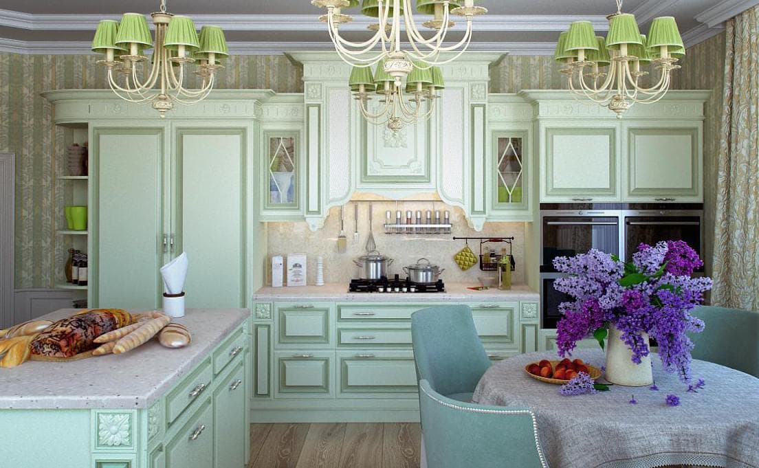
Kitchen in green tones is becoming more and more popular every year. Designers in interior decoration are increasingly resorting to various combinations of green. The advantages of the green scale are indisputable, but the main thing is that this palette makes the kitchen fresher and never gets bored.
The endless possibilities of the green palette have a lot of advantages:
- Green is fine goes with almost any color;
- Rich palette of shades, which significantly expands the possibilities for the play of colors;
- The color is suitable for both large and ;
- It has a beneficial effect on the human psyche;
- Many interior styles look great in green tones..
A relaxing effect will give a kitchen made in shades of olive and pistachio. But if you want to recharge your batteries on the contrary, you should paint the walls of the kitchen in the color of lime or green apple.

don't forget the classics: green and white
How to avoid mistakes when combining two colors
When combining green with various colors, it is important to adhere to certain rules and observe proportions. After all, if green looks peaceful and is perceived positively, an incorrectly used proportion of the second color can act as an irritant and cause aggression. And you can read about the combination of green in the interior of the kitchen.

There are so many shades of green that there is a shade for any interior.
The brightest and favorite combinations of designers are green with blue, red, orange, black. We will talk about them below.
With red
This combination requires some caution. Despite their natural use (red flowers on a green background or red vegetables with green tops), red and green are perceived ambiguously in the interior.

Green-red combination - natural
Red is best used for multiple accents in the kitchen.. It can be a red apron of the work area, a red tablecloth or dishes. You can buy a red set, but only if your kitchen is spacious enough so that the kitchen facades do not interrupt the green.
Option: red walls and green trim is almost never used. If you still intend to experiment, choose shades of green: marsh, olive, khaki.

Bright red looks good against a pale green background.
Light shades of green are combined very well with bright red: mint, light green, green apple.
The correct combination of green and red: this is the proportion of 70:30.

The floor is better to choose in light shades
The floor and ceiling are most often neutral shades: white, beige, sand, vanilla, brown and black (for the floor).

If you use too much red, it will look flashy.
The third color that can act as a link for red and green can be white or beige.
Eco kitchen green colors:
With blue
Combinations of green and blue are not very common. These are colors close in palette, which, if used incorrectly, will make the room boring..
![]()
Green and blue combination looks cool
It is not recommended to use cornflower blue shades for green kitchen.
The olive shade of green with muted blue looks very good. The kitchen will become more spacious, but at the same time it will not lose a cozy atmosphere. This is one of the unusual and winning combinations for a small kitchen if you want to move away from the traditional blue and white colors.

Olive and blue - the best combination for a small kitchen
Blue decor and glossy surfaces with a blue tint make the room elegant
It is better to make the color of the floor light, but not white. Shades of woody color are perfect, which will fill the kitchen with warmth and smooth out the “cold” blue.

But an unusual option if your kitchen has large kitchens
If we talk about decor, then it should be duplicated in a contrasting shade. That is, if the set is blue, then it is better to choose vases, dishes and other items in olive colors. And on the olive walls, hang a few with the image of the sea or the lavender fields of Provence.

Light green decor on a blue background will bring sunshine to the kitchen
Olive and light blue can be used in a 50:50 ratio.

Provence style kitchen looks great in green and blue tones
With orange
The first association is a bright orange tree. But it should be borne in mind that when using juicy green, orange should be used in the same way - pointwise. Mainly for decoration.

Orange-green kitchen looks sunny
But a more common option is a combination of mint or olive green with a muted orange - red.
This combination will fill the kitchen with comfort and autumn warmth. A great option for kitchens with insufficient lighting. In this case, it is recommended to use yellow light lamps in orange or yellow shades.

The third color for such a kitchen is sand
Often a third color is used in this combination: beige, sand, muted yellow. In this case, it becomes the basis on which the details and decor of orange and green are “overlaid” in equal proportions.
This combination an excellent choice for any country style.

Country kitchen in green and red tones
For classic directions, a green tint should prevail.
And here modern high-tech or futurism, on the contrary, are more relevant in orange with elements of green. The main condition is bright orange.

Modern styles in orange and green
- Orange should not prevail (an exception for high-tech kitchens);
- Proportional ratio 50:50;
- Floor and ceiling in light colors;
Kitchen in green tones, design project:
With black
Green and black or dark chocolate for hi-tech, country, Japanese, techno, modern classic is one of the best options.

Black and green kitchen - incredibly stylish
Here, designers offer not to stop at one color and play with shades. Depending on which of these combinations you choose depends on the style of the interior.
It is worth remembering that the black a very graphic color and it turns any object into a certain border of the zone. That is why it is often used in modern styles, or when it is necessary to clearly divide the work area and the lounge area into zones. And you can find out about table setting with autumn fruits and flowers.
When using black and green in a 50:50 ratio, it is better to clearly delimit the color zones vertically or horizontally.

Furniture is always in dark colors
You can use black decor only if the kitchen is dominated by green colors.
Furniture in such a kitchen is more often of this wenge color. But on the contrary, it is better to make the floor light. An excellent option is light gray or smoky ceramic tiles. Light colored parquet board. And you can find out about table setting at home by.

The predominance of black is possible only in a large kitchen
In general, the black-green combination always looks advantageous. She will make the kitchen refined, stylish and elegant. Brings peace of mind and harmony. And you can find out about Viennese chairs in the interior of the kitchen.

If the kitchen has poor lighting, the black-and-green option can make the room dull.
The kitchen in shades of green has no limits. It is suitable for a small, large, combined room. It will be appropriate both in a Khrushchev apartment and in a country house. And it will always look charming and original. We also recommend that you familiarize yourself with the combination of colors in the interior of the kitchen.
Reading 8 min.
Orange cuisine is not such a rare occurrence in the interiors of modern homes. According to polls, this shade is the second most popular among women, right after pink. And this is not surprising.
Orange color can be called the most optimistic and bright, in combination with the right shades, it reveals its full potential. A kitchen decorated in orange tones will never look boring and uninteresting. It is only necessary to take into account some important nuances when creating such an interior.

The influence of orange on the human psyche
Designers say that orange shades are not suitable for decorating living rooms and bedrooms, but this color will be very appropriate in the interior of the kitchen. Since orange is by no means a neutral shade, it should be combined with other tones very carefully, avoiding some combinations.
Saturated orange color is well perceived by the human psyche only in limited quantities. This bright shade attracts attention, while, unlike red, does not cause feelings of anxiety.


Just like yellow, this color improves mood, gives a charge of vivacity and energy. However, you should not create an interior in which the orange tone dominates, otherwise it will cause irritation.
What elements of the kitchen interior should be done in orange
Kitchen set- when choosing this element of the interior, preference should be given to a modern model, with glossy facades, glass and metal details, lighting. The fact is that the orange color is more suitable for high-tech style, so the headset should be appropriate.


If the kitchen is small, use this shade carefully. It is better that only some facades are orange - lower or upper, but not the whole structure.


kitchen apron- it can be completely orange, provided that this color is not dominant in the kitchen set. As a finishing material, you can use ceramic tiles, glass and even brick. An apron made of a mosaic combining orange and black tones will look especially interesting.


Table and chairs- An excellent solution would be to install a dining table and chairs made of special orange transparent plastic. It can be natural wood, it all depends on the chosen interior style.


If the kitchen is equipped in a high-tech or minimalist style, the bases of the table and chairs can be made of metal with a chrome finish, and the top of durable orange plastic.


Curtains- this element of the interior is appropriate only if the kitchen is made in the style of country, Provence, rustic, eclectic or shabby chic.


If the owners have chosen high-tech or minimalism, curtains and curtains will have to be abandoned, replacing them with light orange blinds. In any case, the orange tint on the windows will look very good. It will fill the room with warm light and give it comfort.
Walls- don't make them all orange. You can make only one wall in this bright shade, painting all the rest in light gray or white. As a finishing material, you can also use washable wallpaper, ceramic tiles, plaster, brickwork (for one wall).

Chandelier- this interior element will look very organic in orange, especially in combination with other accessories. In order for there to be enough light in the room, additional lighting with a cold glow should be installed (above work surfaces, above shelves, etc.).


As for the orange chandelier, it can be made of chromed metal and glass. In a small kitchen with a low ceiling, you can install a small orange glass shade.
Since a lot of light is required, it is better to organize spot lighting around the entire perimeter of the kitchen. It is very good if enough daylight enters the room.


Interior styles that go well with orange
High tech- this style is ideally combined with orange color. It is perfect for active and modern people who are not afraid of experiments and prefer innovation to boring traditions.
In a high-tech kitchen, you can install a laconic kitchen set with orange glossy facades and glass inserts. The walls in this interior can be white or light gray, and the floor should be arranged in the same color.


All household appliances should be ultra-modern, preferably from one manufacturer. The best color for her is metallic silver or black. A large orange refrigerator will look very interesting in such an interior.
We must not forget about spot lighting around the entire perimeter of the kitchen. The apron can be made of glossy tiles or mosaics. For the arrangement of work surfaces, it is recommended to use synthetic stone.

It is better to use porcelain stoneware as a floor covering. A black bulk floor will look good. Suspended ceiling white can also be glossy.
Advice! If a rich orange seems too bright and defiant, you can replace it with softer shades - apricot, salmon, pale orange. The snow-white details of the decor - tablecloth, curtains, porcelain will also help to dilute the brightness of this saturated color.


Minimalism- this style will also "make friends" with all shades of orange. The main thing is to make sure that this bright color is not too much in the room.
The kitchen in monochrome neutral colors will be decorated with orange elements: a tall refrigerator, lower or upper facades of a headset, blinds, a chandelier. Surfaces can be glossy or matte. The room should not be overloaded with unnecessary details and accessories.

The use of textiles should be completely refrained from. It is better to hide all dishes and kitchen utensils, and not put them on display. You can put one tall orange vase in the corner of the kitchen.
Classic- a style that is difficult to combine with orange. However, if you still really want to do this, you should replace the bright shade with a calmer peach tone. It can be used in textiles - upholstery of chairs, curtains, tablecloths. The decoration of such a kitchen will be elegant peach-colored dishes.
In general, the interior should meet the classical standard, that is, it is necessary to give preference to smooth lines, natural materials, and exquisite decor. The use of gilding, mirror surfaces and natural stone is welcome (can be replaced with artificial).
Advice! The more modern the style of the interior, the brighter and more saturated shades of orange can be used in it - pumpkin, carrot, orange, as well as the color of cinnabar. For traditional interiors, strict shades of orange are more suitable - mustard, ocher, amber, honey, brick, terracotta, chestnut, rusty.


What shades can be combined with orange color in the interior of the kitchen
A harmonious combination of shades is almost half the success in creating the interior of any room, including the kitchen. Before proceeding with its arrangement, it is necessary to clearly understand the general concept of the premises, and clearly understand what the result should be.
Orange with white This is a classic win-win. This combination of shades will look very stylish and elegant, but at the same time somewhat cold.


The ideal way to decorate the interior is to combine white walls with an orange set. The floor in the kitchen can be beige. One orange wall combined with three completely white walls also looks great.
Advice! Since the orange tone belongs to the warm color scheme, it should be combined with the same warm shades that are located next to it in the color palette.
Orange with black- this combination of shades will help to make the kitchen exclusive and elegant, it will add sophistication and charm to the room.


However, only these two colors should not be present in the interior. They must be diluted with beige or light shades. For example, paint the walls and ceiling white, install a kitchen set in black and orange, and make the self-leveling floor black.


Orange with beige- a wonderful combination of shades, warm and harmonious. A kitchen in this color scheme will look very cozy.


Beige shade significantly smoothes the brightness of orange, making it softer and more pleasant. As additional tones when arranging a beige-orange interior, you can use white, brown and yellow.
Orange with gray- a very elegant and almost perfect combination of tones. Orange color is perfectly combined with all shades of gray, from the palest to the most saturated and dark. Especially often this solution is used when arranging a high-tech kitchen.


The ideal interior: decorate the walls with gray plaster, install a light gray kitchen set with orange glossy facades. Equip a kitchen apron with a mosaic of black, orange and gray tones. Set up a table and chairs with metal bases and a bright orange top.
The use of orange shades when arranging a small kitchen
Orange color has the ability to visually increase objects in size and bring them closer. This means that this shade should be used with caution when arranging a small kitchen.
To make the room look harmonious and comfortable, you should follow some rules:
- If one of the walls is highlighted with orange, and the other three walls are beige, gray or white, then the ceiling in the low kitchen will look higher.
- If the walls to the middle, or a separate section of them (for example, an apron), are painted orange, then the whole room will visually become more spacious and wide.
- In a very cramped and small kitchen, orange color should be present only in small details - for example, in kitchen utensils, accessories, fittings and textiles.
Orange, with all the variety of its shades, can be energetic, soft, warm, and even cold. If you listen to all the advice and draw up a clear plan for the future interior of the kitchen, you can achieve excellent results.


We also recommend
 Switching power supply: repair and refinement
 Remote control of light
 Swimming lessons for preschool children
 Notes for the master - home household alarms
 Clock propeller on Atmega8
 Device and relay application examples, how to choose and connect a relay correctly Microcontroller and relay simple switching circuits