Refinement and harmony of the home interior: stylish and cozy design with gray wallpaper. Beautiful gray wallpaper in the living room, bedroom, hallway Gray wallpaper with pink flowers
The versatility of gray cannot be overestimated. Such a completely neutral background is the best solution for any interior. The achromatic spectrum does not compete with other shades, because it is just a shadow, something between light and dark. Thus, the colors of furniture, decor and textiles will remain just as saturated, but due to the lack of contrast they will be perceived more calmly.
The influence of gray
In nature, gray is the color of a cloudy sky, stones, dry land, morning fog. All these are static phenomena, not fraught with any threats. Gray has a calming effect on the subconscious, reminiscent of the falling twilight and predicting the approach of night. However, without bright inclusions, it can depress and bore, so an achromatic interior should still be supplemented with colorful details.
The gray palette includes a large number of shades - from almost white to barely dusted black. It is also the color of many metals: iron, nickel, cobalt, zinc, mercury, silver. With the quality of a shadow, gray allows you to create optical illusions of volume on flat surfaces. This technique is well known to artists who can draw realistic 3D pictures with just a simple pencil.
By choosing a suitable pattern and texture of gray wallpaper, you can visually expand the space, increase the height of the room, deepen it or divide it into functional zones. Such a finish will last as long as possible without causing irritation, and excellent compatibility with the rest of the spectrum will allow you to change furniture and textiles as much as you like without having to re-glue the walls.


Types of wallpaper
Depending on the manufacturing technique, raw materials used, aesthetic and performance qualities, wallpapers are divided into several categories. When choosing a wall covering, it is worth considering its environmental friendliness, durability, resistance to external factors and, of course, appearance. Having studied the necessary characteristics, it will be much easier to make the right decision in the store.
paper wallpaper
The most affordable and common type of finish. They are single-layer (simplex) and two-layer (duplex). The first ones are cheaper, but at the same time tear faster, the second ones are more expensive and denser, since they have a smooth bottom lining and an embossed top layer. The texture of paper wallpaper can be matte, glossy or mixed, smooth or with a slight relief.


Vinyl wallpapers
They resemble oilcloth, because they are made from the same PVC. Under the decorative "front" film there is a base made of paper or non-woven fabric. Such wallpapers are distinguished by a rich texture - they can be applied with a metallic pattern, silk-screen printing, deep embossing. Thanks to its moisture resistance, vinyl can be washed with a damp sponge, and some can even be painted with water-based acrylic pigment.

Textile wallpapers
Such wallpapers are made from special synthetic fabrics. They look really luxurious, but require special skill when gluing and careful care in everyday life. As a rule, fabric coverings are used to decorate a hall or bedroom in a classic style.


Non-woven wallpaper
They are made from cellulose fibers with a small (about 30%) admixture of polyester. They allow air and moisture to pass through, but are stronger and more durable than paper ones. Interlining quickly adheres to the wall plastered with glue and does not shrink after drying, which makes it one of the most convenient types of finishes.

Liquid wallpaper
This is shredded paper, presented in the form of decorative plaster. Before starting work, the dry cellulose-adhesive mixture is diluted with warm water, then it is applied with a spatula to a dry, clean surface. The advantage of such a coating is the ability to hide wall imperfections, ease of application, the ability to quickly remove and replace damaged areas, and environmental friendliness.

Combination with other colors
To better understand the nature of gray, it is worth considering that its shades are expressed as a percentage, where 0% means pure white, and 100% black. Gradations of light and shadow allow you to accurately convey any image, an example of this is black and white photographs and old films. Being achromatic, gray is perceived quite naturally surrounded by any colors. Even a motley painting in the style of expressionism against its background will look restrained.
In modern interiors, a colorless design is very often used, where only white, gray and black are present. This situation looks very concise and stylish, without a single extra detail. If you want to add colors, you can always do this with the help of decor, textiles or colored lights.
Cool tones seem to be created to complement light gray. The natural palette of water, rocks, winter landscapes is perfectly combined with the wallpaper of the color of the rainy sky. All shades of blue and blue, bleached green, delicate pink, lavender will help soften the severity of gray, adding a little romance to the interior.
Warm colors such as yellow, orange, red, light green, purple, along with their inherent bright spectrum, will instantly bring a cheerful mood to a dull gray room. In addition, graphite shades look very interesting in combination with gold, reminiscent of jewelry made from several precious metals.


Gray wallpaper in the interior - photo
New examples of design using gray wallpaper are collected in the photo gallery on our website. We present to your attention modern creative solutions for stylish and comfortable interiors of various rooms. If you like, you can use the ideas you like when drawing up a repair plan in your own apartment or house.
Gray wallpaper in the living room
Gray undertones are one of the best options for decorating a modern living room. In a small room, it is worth stopping at a steel, mother-of-pearl, mouse color without sharp contrasts. It is good if the wallpaper visually deepens the space, but the main thing is that the eyes do not get tired of the print. One of the walls can be decorated with black and white photo wallpapers, for example, depicting a city landscape. So that an achromatic living room does not seem boring, you can purchase a sofa with bright upholstery, several colored frames or paintings, hang curtains to match.


Gray wallpaper in the bedroom
Since gray is the color of twilight, it in itself contributes to a quick fall asleep and rest. But it is important not to turn the sleeping room into a gloomy basement: if the walls are dark, the furniture should be white, as well as the ceiling and, if possible, the curtains. You should also avoid sharp contrasts, preferring a smooth game of halftones. A bedroom with gray wallpaper will seem cozier if you complement it with soft textures - a velvety blanket, a high pile carpet, pillows, pouffes, and also provide good lighting.


Gray wallpaper in the children's room
The children's room is the place where wallpaper is most often at risk. Given this fact, you can choose special "coloring" with a printed black and white pattern. So the child will get an interesting and developing activity, and parents will not have to worry about how to remove marks from the felt-tip pen from the walls. For schoolchildren, gray wallpapers will also be a good option, not distracting from study and relaxation, but in this case it is better to purchase colored furniture.


Gray wallpaper in the hallway
Given the small area of the hallway, the most successful is the neutral interior design. As a rule, in such rooms, plain light gray wallpapers or textures like brickwork, stone, bleached wood are used. All types of coatings are suitable for the corridor, but vinyl will be the most practical solution - in case of contamination, it can be washed off, drops from outerwear and umbrellas will not leave marks, and there will be less harm from pets. In addition, on a few square meters, the difference in the price of a roll will be almost imperceptible.
Not everyone is ready to choose gray - blue wallpaper in the interior. It seems to some property owners that such shades will bring gloom into the room, deprive it of home comfort and coziness. For other homeowners, gray wallpaper in the interior seems to be a manifestation of the “official” style, inappropriate in a home environment.
The photo shows a light blue silver wallpaper that will add real harmony and comfort to your home interior.
Attention! The selection of gray wallpapers in the urban interior and additional shades will allow you to create a complete and harmonious image.

Choosing the right accents and additional accessories allows you to achieve the desired goal.
Curtain design options
Professional interior designers are convinced that they help emphasize the exclusivity and individuality of the designed living space, regardless of its original size.

Advice! In order for the used gray wallpaper in the interior to look appropriate and harmonious, it is important to choose the right accents and accessories.
Any small detail should be thought out in the room for which light gray wallpaper in the interior is chosen. The color hue involves finding a balance between bright and rather delicate colors, which is complemented by a gray background. There is no need to have special design skills to bring any unusual ideas into reality.

Advice! After reviewing the websites of interior specialists, you can choose the best option for your house or apartment using silver wallpaper in the interior (you see the photo below).
How to saturate the interior with bright colors
Let's talk about how to choose details for decoration if dark gray wallpaper is used in the interior. A variety of shades of gray are perceived by professionals in completely different ways. It all depends on the degree of illumination of the room, as well as on the presence of additional shades. For example, we note that gray wallpapers can be supplemented with bright textiles.

Advice! An interesting solution would be a combination of silver color with other tones and shades.
Matching matte silver wallpaper with large black flowers can create an accent on one wall while maintaining a strict and discreet overall style.
Light blue wallpaper (pictured option) goes well with dark shades. Dark blue canvases can be complemented with pastel shades.

Advice! In order to understand whether a combination of light gray with other tones is possible, you need to pay special attention to the brightness of the chosen shade.
Dark gray wallpaper in the interior (photo below), professionals recommend "dilute" with light shades.
Attention! Cloths of light gray tones are undesirable to complement with dark and gloomy colors.

Fragments of brown, blue, burgundy, black colors can be used as minor patterns, otherwise the silver-colored wallpaper in the interior (pictured) will make the room insufficiently lit, “steal” square meters.

Interesting tips on how to correctly combine light gray wallpapers in the interior, photos of finished interiors can be found in the video fragment
What goes with light gray
Let's try to identify win-win options for combining gray (pictured) with other colors when combining several finishing materials for walls.
Let's start with the traditional palette of black and white. Matte silver wallpapers will match perfectly in such a situation. Given that the result will be too mundane, devoid of luxury and pathos, professional designers advise adding additional shades to this combination.

For example, gray wallpapers can be chosen with a small geometric pattern so that the interior being created is appropriate not only for minimalism, but also in a classic style. The photo shows a combination of white, gray, black colors in a modern interior. Such a tandem would be appropriate in offices, hallways.

Gray materials (pictured) look harmonious with white stripes, colors, patterns. This combination option is suitable for recreating an old (classic) interior.
If you bring red or purple tones into the interior, combining them with gray colors will make the interior more emotional and lively.

Attention! You should not overload the created residential interior with gray tones, you can limit yourself to minor inserts.
Pink elements in gray (pictured) will help create a harmonious and romantic atmosphere. Psychologists are convinced that it is the combination of pink and gray that allows a person to tune in to relaxation and rest. That is why such a tandem of colors can be used in the interior design of a living room or bedroom.

It is better to choose light pink shades, in which case the room will not look dull and faded. If you decide to give your preference to decorative materials with an intricate pattern, you can take gray canvases with green and pink flowers. This option will help you achieve freshness in the created design, emphasize the taste of the owner of the room.
Gray-blue canvases in the interior are suitable for those homeowners who do not like bright environments.

By combining soft blue tones with a gray background, you can enjoy a harmonious contrast. The room will be filled with lightness, freshness, some mystery.
The choice of decorative materials for gray walls with orange or yellow elements allows you to make the room more emotional, saturated with vitality. Combinations of this kind are mainly used when decorating living rooms, kitchens, since the combination of such tones stimulates the appearance of additional appetite.

Silver and gray wallpapers, chosen for decorating the room, can be supplemented with green, golden, olive, brown.
Advice! When choosing such a palette, it is advisable to use beige or white as an auxiliary color.
When choosing furniture for a room decorated with gray wallpaper, other details must be taken into account. For example, a white furniture set is suitable for a cold gray shade. With the predominance of wooden furniture in the interior, it is advisable to choose light shades. In this case, you can bring freshness into the room and eliminate the excessive coldness of the gray tone.

For modern design, interior design professionals advise purchasing glossy furniture with milky and white facades.
It must be remembered that the color of additional accessories and textiles should be selected taking into account furniture, wallpaper. Depending on taste preferences, you can think about the design of window openings, the color of pillows for the sofa, armchairs. The gray plain walls of the room can be complemented with bright patterned textiles.

Kitchen design option
If you decide to try gray wallpaper as your main wall decoration option, do not forget to take into account the amount of sunlight in this room. For example, in a dark kitchen, gray canvases with a large pattern will be out of place, they will make the room narrower. In order to avoid getting a gloomy room, you need to choose pale pink, green, yellow inserts for the walls in the kitchen. They will make it possible to perform zoning of space, make the kitchen spacious and bright.

If desired, you can use the patterned coverings on the wall to highlight the dining area in this room. For example, a combination of gray wallpaper with large and bright colors will look very original in the interior of a modern kitchen. To create a complete harmonious image, you can choose a pattern on the curtains to match the pattern used when decorating the walls.

It is better to choose light furniture in the kitchen in order to maximize this room. In a kitchen with gray walls, green, red, yellow inserts look great. They bring life and harmony to the room.
Bedroom in dark color
In the bedroom, light gray wallpapers have a harmonious look. They help you relax after a hard day at work. If you complement the gray tone with light pink shades, in this case the interior will be conducive to philosophical thoughts, it will become a real “refuge” for its owner.
Attention! The dark gray tone is only suitable for decorating the bedside area. Otherwise, the room will have a gloomy look, it will be impossible to rest and relax in it after a hard day's work.

In a spacious bedroom, you can purchase coatings with large ornaments and drawings. For example, grayish canvases with lines, colors, prints, geometric shapes, abstract images look interesting.

Conclusion
Dark color with the right selection of additional shades, accessories, will be an excellent option for decorating living rooms, corridors, offices. Professionals advise not to limit yourself to such tones, to “dilute” them with soft shades, softening the roughness of the tone, bringing a soft homely atmosphere into the room.
5629 0 0
Gray wallpapers: 6 pluses and 35 boring design options
Many people associate gray with blues and facelessness, which is why it is so rarely chosen to decorate their homes. In this article I will try to break this stereotype. Namely, I will prove that gray wallpapers can exist both in combination and independently, and I will give successful examples of interior design in this color.
Advantages of gray walls

As a wall solution for living spaces, gray has the following advantages:
- Neutrality- against its background, both bright objects and furniture of muted shades look advantageous;
- Originality- due to the rarity of use, the interior in gray tones will not look like the situation in the neighbors' apartment;
- Available in a wide range of shades- the human eye distinguishes about 720 shades of gray, therefore, you can experiment with color saturation, bringing the parameters of your home closer to ideal;
- Counterweight- when there are rich colors in the surroundings, in their pure form capable of causing aggression, they must be balanced;
- Relevance- different shades of gray do not go out of fashion and are used in different styles of interior design;
- Durability- in case the surroundings are tired, there is no need for repairs, but it is enough to change the furniture and accessories, and the new room is ready.

Gray wallpaper will become a lifeline for all zealous owners who do not want to spend money on regular repairs once again.
Possible combinations

Due to its ability to adapt to other tones, the gray palette is organically combined with both flashy shades and calm ones. The combination of gray wallpaper with other colors dictates the character of the room. And vice versa, based on design goals, you can correctly choose the shade of the wallpaper, and to them - the right companion color.
With white

The combination with white is very common. The choice of shades for this combination depends on the purpose of the room. For a comfortable environment, light gray tones in tandem with white are suitable.

To create a dynamic environment, pay attention to dark shades. Due to the similarity with black, they are able to add drama to the room.
With black

Dark gray walls combined with black objects or accessories improve brain performance. Such a tandem is ideal for a study, home library or teenager's room.
With beige

The union with beige helps to create a serene environment. Both tones are neutral and complement each other perfectly. However, to enliven the room, it is recommended to use bright elements - orange, green, blue or purple.
With blue

Gray wallpaper in combination with blue or decor items will add brightness to a monotonous entourage. The same applies to canvases with a blue pattern. The warmer the shade of blue, the more cheerful the atmosphere will be.
with green

Green also has many nuances - from "flashy" to noble.
- To refresh the room in gray tones, it is enough to apply light green or mint shades;
- To give sophistication to the interior, it is necessary to appeal to deep variations of green.
with purple

The union with purple is very fruitful, because it carries a lot of decor options. When choosing a light finish for the walls, you can give preference to both delicate and medium varieties of purple. Dark walls are in harmony with various shades of purple - from medium to saturated.

This tandem can be diluted with white or black, without violating the harmony of this combination.
With red and orange

The combination with warm tones enlivens the room.
- Orange adds brightness and improves mood;
- Red brings emotions and awakens temperament.
Do not overload the room with bright colors. Use them only as inserts, not dominant elements.
With pink

In combination with pink, you can achieve a variety of effects - from delicate to spicy. Gray wallpapers with pink flowers look especially fresh. Take this example into service if you are the owner of a dwelling with insufficient lighting.
with yellow

The union with sunny yellow will make the surroundings more emotional and awaken the vitality of those present. Actively use this combination in the kitchen and dining room, but do not overdo it with the amount of bright color.
With hints of wood

One of the most colorful options is the combination of gray wallpaper in the interior with wooden surfaces. It can be a beautiful wooden floor or exquisite solid wood furniture.
To make the room seem warmer, give preference to a tree with a bright color, for example: cherry, rowan, alder, walnut, mahogany, rosewood, teak.
With gray

The simultaneous use of several shades, from light to dark, makes it possible to model the space. Thus, you can correct the shortcomings of the room. For example, a narrow room can be expanded by decorating long walls in light colors, and short walls in dark ones.
Kitchen finishing options

Based on the features and parameters of the kitchen, gray wallpaper in its design should be used with caution. For example, in a small or poorly lit room, wall decoration with dark-colored canvases is unacceptable. It is also recommended to avoid large patterns.

Fragmentally connect juicy shades to decorate the walls. Green, yellow, orange blotches in some parts of the room will make it more cheerful. Bright colors will also help to realize the zoning of space.

To highlight the dining area, use canvases with a pattern. The most popular stripes and floral motifs.

Wallpaper with text looks original, especially if the message is humorous or has something to do with the residents.
Bedroom design

Light gray wallpaper in the interior of the bedroom will come in handy if you set out to decorate it in a classic or Provencal style.

If you prefer modern styles, go for dark gray wallpapers. A prerequisite for such a design is the presence of several light sources.

If you are the owner of a spacious bedroom, feel free to paste over the walls with canvases with a large print. It can be floral ornaments, geometric shapes, abstractions, classical patterns. Curtains for the bedroom can repeat these patterns or contrast with them - in a large space, both techniques are acceptable.

The monotonous wall covering in the bedroom can be diluted with small bright patches. These can be pillows, bed covers, nightlights and floor lamps, bedside tables and bedside poufs.
Living room decoration

Wall decoration in gray is a great solution for a living room of any style. If until now your living room could be classified as “typical” or “unremarkable”, then in this design it will take on a luxurious look.

Walls in light shades are an excellent backdrop for paintings or panels.
Cold tones can be used in the living room if it is sufficiently provided with lighting. Ideally, this is the presence of huge windows with natural light. Warm variations of gray will fit perfectly into a small space.

The saturation of shades and the presence of patterns in the decoration of the walls depend on the style of your living room. For example, modern trends (minimalism, loft, modern, high-tech) do not allow accents on the walls. Thus, shades can be chosen both light and dark, but a large print will be out of place here.

Others (Provence, country, classic, art deco), on the contrary, welcome large details and various patterns. In this context, gray wallpapers will be in light colors and with a large pattern.

The living room should look both concise and chic, utilitarian and cheerful. And if wall coverings often act as a background, the rest of the functionality should be achieved in other ways. Namely, with the help of furniture, accessories and textiles.
How to choose curtains for gray wallpaper

Deciding on the choice of curtains will not be difficult. The color of the wallpaper, due to its versatility, allows the use of materials and colors of any kind.


So, which curtains are suitable for gray wallpaper depends on your goals:
| Type of curtains | Pursued goal |
|
|
|
|
|
|
|
|

As for the shape and size of the curtains, you will have to reckon with the style of the room. Classic, Roman or English, cropped or hanging down to the floor - it all depends on the look you are going to create in the room.

Conclusion
I hope you are convinced that gray wallpapers can make the interior harmonious if you follow the rules for combining with other tones. Now you have live samples before your eyes and it will be easier for you to decide on such experiments at home. Share your experience in the comments to the post.
December 11, 2016If you want to express gratitude, add a clarification or objection, ask the author something - add a comment or say thanks!
Not all owners of residential premises are ready to see gray wallpaper in the living room. Designers and ordinary people refer to gray in absolutely different ways.
Gray and brown wallpapers in the living room are a rarity. Let's try to find out if the gray and brown wallpapers are suitable for decorating the walls in this room, to find out the opinion of professionals on this issue.

Features of light and brown shades
In the photo - a living room with gray wallpaper, complemented by original details. By thinking through all the nuances of using gray, yellow, brown, you can create a cozy and homely atmosphere in your living room.

Attention! Psychologists do not advise people who are prone to depression to abuse gray and brown shades.

The gray shade is nondescript and dull if additional accessories and details are not matched to it. For example, when combining gray wallpaper with yellow ornaments, choosing golden textiles for furniture and windows, the living room will become homely and beautiful.
Attention! In interior art, asphalt color is considered a manifestation of wealth and aristocratic restraint.

How to choose the right wallpaper color for a room designed for a good rest after a hard day's work? This question worries all homeowners. Designers offer interesting solutions that harmoniously combine gray, yellow, purple, brown wallpapers.
The photo shows a living room with gray wallpaper, harmoniously complemented by furniture and textiles.


Attention! The correct placement of accents will create a harmonious atmosphere in the room.
Color Features
It is the asphalt color of the wallpaper in the living room that makes it possible for creative experiments. With it, you can create whimsical interiors in the living room that will become the “calling card” of your apartment.

About how to choose the right one, photos of finished wall decorations with brown, charcoal canvases are presented in the video fragment
Among the varieties of shades of boring asphalt color, mother-of-pearl options can be distinguished that can make positive changes to the look of any living room.
Advice! The charcoal color of the wallpaper in the living room has a graceful look. Its neutrality allows designers to use the shade as a base, "diluting" it with yellow, blue, white colors.

The classic combination of asphalt, white, black tones, where the base color is gray, is suitable for any interior style. Such wallpapers, which have a beautiful mother-of-pearl sheen, will favorably emphasize the furniture chosen for the living room, and will create a harmonious atmosphere in the room.

Relaxation and peace can be obtained by combining charcoal and orange colors. This combination is the best option for fans of luxury and nobility.
Attention! Care must be taken when choosing gray for decorating vertical surfaces.

Psychological features of the use of asphalt shades in a modern interior
Most of the residents of large metropolitan areas are convinced that the asphalt color has a depressing effect on the psyche. That is why they prefer instead of gray colors to use bright tapestries to decorate the walls of the living room. With the correct inscribing of such shades, there is no question of any of their negative effects on the health status of the owners of the apartment.

Subtleties of application in the interior
To obtain the desired result, it is important to know the main features of the interior styles chosen for the interior of the living room.
For example, asphalt shades are suitable for minimalism, futurism, loft. But in Provence, Empire, it is categorically not appropriate. With a symbiosis of such a tone with other colors, instead of a negative impact on the human psyche, it is possible to achieve a beneficial effect.

What shades of asphalt color are suitable for decorating living rooms in country houses and city apartments? First of all, professional designers advise choosing finishing materials in light shades. But it should not be the only color chosen for decorating a room.

Advice! Professionals suggest taking charcoal as the basic basis for interior design of living rooms.
If you limit yourself to only graphite color, in this case the room will have a lifeless and dull look. Professionals consider the choice of shiny gray tapestries to be an interesting solution, or the selection of such finishing materials that, in addition to gray, also have bright ornaments or patterns.

Attention! The attractiveness of gray wallpapers is directly related to the expressiveness of their texture.

Shades of gray for the living room

In a living room that is filled with natural sunlight, dark gray tones would be quite appropriate. For a small room in which there is no window opening, such a design option is not acceptable, since the living room will resemble a dungeon, and not a cozy place for joint leisure activities.

A normal (medium) shade is suitable for wall use only if it is complemented by bright patterns. For example, on a gray background there can be beautiful roses, daisies, twigs of orchids. Such a design technique will allow you to avoid the dull look of the living room, the negative impact on the psyche from the walls.

Interior professionals consider the light gray version to be the optimal shade for decorating the living room walls. Of course, he should not be in "proud solitude." Only with the right selection of numerous additional accessories and details, it will be possible to talk about getting a chic and harmonious interior in the living room.

Conclusion
Analyzing the use of gray in the interior of modern living rooms, we note that the fears of property owners about the negative effect of gray colors on their psyche are absolutely in vain. With the right addition of this shade, you can become the proud owner of a beautiful and unusual room in which both guests and the owner of the apartment will be comfortable.

Among the latest fashion trends in interior fashion, the leading positions belong to gray tones. Designers advise choosing wallpaper for living rooms that has a beautiful metallic sheen, complementing them with bright decorative elements: textiles, furniture upholstery, wall panels.

In addition, an interesting option is to decorate the room with several types of wallpaper at once, highlight the accent wall with bright tapestries, and glue the remaining walls in the room with gray canvases.
At first, inexperienced, look, gray wallpaper in the interior is boring, and even depressing, but in fact it is a great backdrop with great potential for creating an “unhackneyed” room design.
To design an unusual and spectacular, but at the same time, beautiful and very cozy interior, you need to know in which rooms and how to use gray correctly, what to combine with, when it is better to stick a striped or patterned canvas, and further in the article, we will introduce you with the most interesting design solutions that use gray wallpapers and other shades of this color.


The role of gray in the perception of the interior
Gray wallpaper in the interior is a restrained elegance, sophistication and nobility, this color fills the space with stability and peace, and in combination with pastel colors this psychological effect only intensifies. The interior, in which there is gray, is conducive to relaxation and confidence.

Gray-blue wallpapers for walls belong to a cold palette of shades, in such a room it will seem cool even on a sunny day.
Dominant gray can be a sophisticated backdrop for rich reds, burgundy, purple, bright yellow and turquoise. Of course, other colors tinted with gray wallpaper look more advantageous, expressive.
On a note: Gray delicately muffles unnatural, flashy colors and makes the interior more comfortable for perception.
The interior with gray wallpaper, the photo demonstrates well how the main color delicately muffles too bright shades
What goes with gray
Gray is multifaceted, and is combined with such extraordinary colors in the interior as pink, olive, pale green, turquoise, deep, but muted yellow, etc. Today you can buy wall coverings of various shades, these are very light gray-white wallpapers, and dark, almost black, and not only with a blue tint, but also with yellow, purple and even green. Such a huge range of shades allows you to choose gray wallpapers for any room: living room, bedroom, nursery, kitchen, etc.

Gray wallpaper in the bedroom, a photo example of how to revive the interior with small bright spots
Monochromatic gray is a neutral background that pairs perfectly with other colors and can be a great base for decorating with bright elements. For example, in the kitchen in combination with a white or colored set, or in the bedroom - to highlight the accent wall, in the hall - to combine with other wallpapers and zoning the room, or in the nursery, as a canvas for colored stickers.

Accent details should not be too much
In the bedroom
Very relevant light gray wallpaper in the interior of the bedroom, they create an atmosphere of calm and relaxation, which contributes to rest and good sleep. Here you can combine all shades of gray, combining the color of the wallpaper with textiles and accessories.

Photo of gray wallpaper combined with white furniture that refreshes the interior
Gray wallpapers in the bedroom in combination with white look especially impressive, the room seems to be filled with cleanliness and freshness. Often in this room they resort to a design technique with an accent wall near the head of the bed, such a solution helps to “dilute” the subdued interior, but at the same time, makes the design more expressive.

Cold gray-blue wallpaper in the interior of the bedroom is recommended to be balanced with warm tones.
In the living room
For the hall, you can choose gray of any shade, not only plain, but also with a bright ornament or textured. Do not be afraid that the dark color will make the room visually smaller, this can be easily fixed with the right light scenario.

A room with gray wallpaper, a photo idea on how to shift the focus from dark walls to bright accessories
Dark gray wallpaper in the interior is best used for large rooms; for a typical living room, preference should still be given to a medium gray shade of wallpaper. Plain and textured canvases for walls look original if you add a few bright details.

Bright spots will dilute the gray palette
Canvases with matching ornaments, or with an expressive, contrasting pattern, are also relevant here, but such wallpapers should be used with caution, on one wall, or balanced with monochrome textiles and pieces of furniture.

Gray with large ornaments should be balanced with other interior elements.
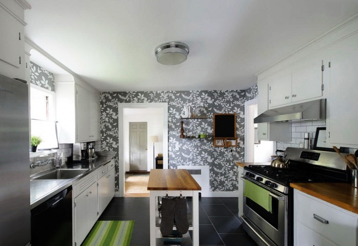
Gray wallpaper in the kitchen and bathroom
The kitchen is a specific room of the apartment, as well as the bathroom, with its own microclimate, so it is recommended to use non-woven and vinyl cloth or liquid wallpaper here. The price for them is very democratic, but somewhat higher than for paper ones.
Monochrome textured wallpapers are suitable for the kitchen and bathroom, they advantageously set off small interior items, of which these rooms are in abundance.

Gray of a cold shade looks great in tandem with wood furniture with a natural, warm, honey tint.
If the kitchen set is of an unusual color or design, then you should choose a restrained one-color “clothes” for the walls, which will become a discreet background and will not overload the interior.

Gray wallpaper in the kitchen, photo of a competent combination of textures and shades
The dining area is often highlighted with gray floral or patterned wallpaper, which not only helps to zone the space, but also adds zest to the design.

In a small room, it is better to use gray wallpapers and furniture of the same tone, and accents should flow smoothly into the overall finish.
In the bathroom, gray is well combined with decorative brick, stone or tile.

If a dark gray segment is chosen for the bathroom, use more light so as not to obscure the room
Textured wallpapers will favorably emphasize the chrome shine of taps, and striped or patterned wallpapers will help to correct the geometry of the space.

Dark striped wallpaper will visually change the size of the wall
Corridor
In the corridor, the choice of gray should be treated very carefully: on the one hand, it is a practical color that will hide minor defects and even dirt, and on the other hand, it is better not to use the dark spectrum of this color so as not to narrow the already small space.

Gray combined with stone is ideal for interior design in the hallway
If the monochrome textured gray wallpaper in the hallway is diluted with a glossy ceiling or a mirrored cabinet front, then the hallway will seem somewhat larger. The same effect will be obtained if you use a combined gray canvas with silver or gold.

Wallpaper with a metallic sheen will reflect surfaces, making the room appear larger.
Each wallpaper catalog has in its arsenal several interesting proposals for combining canvases with different textures or ornaments, as well as options for using borders, moldings, and decor. But there are a few rules in design that will help you create the perfect interior on your own.


Shades of red should not dominate the interior
The olive color will enliven the gray wallpaper, and if the walls are divided vertically, the room will become larger, it is recommended to supplement this solution with small colored elements.

Gray with olive - the personification of calm and comfort
Coral shades will soften the interior, fill it with energy and holiday atmosphere.

Bright spots will enliven the interior
Monochromatic stripes alternating with gray ornaments completely change the idea of the shape and size of the room, but in such an interior it is better to choose simple and plain furniture.

A different combination of textures, textures and ornaments breaks the boundaries of space
On a note: A wide vertical strip should be used on one wall, otherwise the finish will seem too colorful. Gray combined with light stripes will expand a narrow wall.
Striped wallpaper should not be too much
Gray-yellow wallpaper will make the room warmer, especially effectively; against the general bright background, wallpaper with floral ornaments framed by moldings looks.

Yellow in combination with gray fill the house with positive and good mood
Gray-violet wallpapers are suitable for decorating rooms for brutal men, this combination looks a little hard, so it is recommended to think over several types of light in the room. If such a combination is planned in the hall or bedroom, the interior should be softened by diluting the finish with lighter and warmer shades.

If purple is used in the interior, then gray wallpapers should be of a warm spectrum
Now it is very fashionable to paste over one of the walls with wallpaper with large colors, it should be noted that the gray tone of the wallpaper is an excellent base, it delicately highlights the pattern and helps to smooth out contrasts.

Canvas with large flowers use only on one wall
Gray wallpaper for walls is a great opportunity to use the whole palette of colors in the design, do not be afraid to combine even seemingly incompatible shades. To design an exclusive interior, show your creativity, and gray will help you create a harmonious composition.

Non-standard combinations of materials lead to original ideas for interior design