Basic compositional elements in design. Fundamentals of composition in graphic design
Design and composition in design. Design- a type of design, interdisciplinary artistic and technical activity for the formation of the subject environment. The purpose of design is to create a harmonious subject environment that most fully satisfies the material and spiritual needs of a person. The most important two components of design: functionality and aesthetics.
Main types of design:
1) Graphic design. The objects of design are: fonts, pictograms, corporate identity, various visual communications, etc. This is flat work.
2) Industrial design. The object of design are: machines, appliances, equipment, furniture, utensils, clothing. Here we are already working with volume.
3)Architectural design. The object is: buildings and their complexes, including interior design. Space is being worked on.
4) Architectural environment design. The object of design is a complex-dynamic system of the human environment, the optimal subject-spatial organization and imagery of various environmental objects
New kinds of design. There are two groups:
1)Sphere design: ecodesign, ergodesign (the main condition is to meet ergonomic requirements, i.e. ease of use), futuristic design (design of future projects that for some reason cannot be applied in the present), applied design, exposition design (exhibitions), engineering design (various technical structures, such as bridges).
2)Design focused on the result of the work: art design (single design objects as an art object), computer design and web design.
Important! Before proceeding with the design of an object, it is necessary to determine its formal qualities: appearance features, structural connections of objects, purpose of the object. After that, the content of the work is determined, and only after that it is possible to start working on the form.
Composition in design
2. Composition in design. The essence of the concept of "composition". The essence of the concept of "harmony". The essence of the concept of "formality". formal composition.
Composition in design. This is the construction (structure) of the work, design, location and connection of its parts, due to their layout, corresponding to the purpose and technical idea of the work and its artistic and figurative design, reflecting the emotional and sensory expectations of the consumer of the design product.
The essence of the work on the composition lies in the expansion of the artistic side of the product, the achievement of complex unity and orderliness through the use of compositional means.
The essence of the concept of "composition". Composition is the connection of various parts into a single whole, in accordance with an idea. These parts, taken together, make up a certain shape. The term "composition" is used in two aspects: 1) it is a purposeful construction of a work of art, due to its content, nature and purpose. 2) it is the most important organizing element of the artistic form, giving the work of harmonious unity and integrity, subordinating its components to each other and to the whole, acting as an attribute of a work of art.
The essence of the concept of "harmony". Harmony, translated from Greek, is consonance, concord, the opposite of chaos. Harmony means a high level of order and meets the aesthetic criteria of perfection and beauty. Regarding composition, harmony is understood as its formal characteristic.
The essence of the concept of "formality".Formal composition. The form is interconnected with the content, but it is possible to separate the form from the content by replacing realistic objects with formal (or abstract) ones, but in such a way that the formal composition expresses the idea and artistic design through:
Characteristics and properties of composition elements
Through the structural organization of composition elements
I present to your attention the following article from the cycle on the basics of graphic design. In it I want to talk about basic laws of composition. Very often these laws are called design principles, but in my opinion, design is a rather vast science, and it has completely different principles. Their description can be found in books on the basics of the theory and methodology of design.
So, first of all, I propose to recall the concept of composition.
Composition is the organization, arrangement and connection of various graphic elements, the art of their placement, the most important component of the art form, the heart of graphic design. When there is no composition, there is no design.
The arrangement of elements occurs in a logical sequence that determines the perception of the work as a whole.
The most important the laws of composition I consider the following:
- Equilibrium
This law tells us that every composition must be sustainable. That is, the location of the elements should not cause doubts and the desire to move them somewhere.
Look at the picture below:In the figure on the left, two circles are in a state of equilibrium, if we separate them, then separately they will look already unbalanced. In the figure on the right, the same pair of circles, but shifted relative to the axes of the square, looks unbalanced.
The most obvious example of a balanced composition is symmetry, and the balance is not always symmetrical. As you can probably guess, achieving balance in asymmetry is more difficult.
Take a look at an example: - Unity
The law of unity (or integrity) of the composition is considered to be observed if, when the image is covered with a glance, it is perceived as a single whole and does not fall into separate parts. There should be a sense of "attraction" between the elements, they should "fit" to each other. The semantic center of the composition should also be clearly distinguished.In relation to composition in graphic design, integrity can be checked as follows: if you close part of the image, then the message that it carries should change. If it changes, then the composition is complete.
- subordination
This law says that the composition must have a dominant, which is the semantic center. The main element immediately catches the eye, the role of the secondary ones is to set off, emphasize, highlight the dominant and direct the viewer's eye when viewed.I want to immediately warn against a possible misunderstanding: the semantic center is in no way connected with the geometric center of the composition. Also, there may be more than one compositional center.
For more complete knowledge, I advise you to turn to books where the basic laws of composition are most fully understood (in relation to fine arts). In you will find a couple of such books.
Good composition skills are very important for a graphic designer. I would like to emphasize the word skills“because Knowledge that you do not know how to put into practice is not worth anything. Therefore, be sure to exercise, give it from 20 minutes to 1 hour every day, and the result will be obvious!
As usual, I wish you success in your endeavors, more perseverance and patience!
From the author: today we will talk about what is composition in web design, which photographers, artists and web designers love to talk about. It may seem to a beginner in this area that this is some kind of secret knowledge, accessible only to the elite. But today you are in luck: I will help you understand this issue, so much so that you can influence not only the mood of site visitors, but also their purchase decision. Here we go?
Surely, you often have to visit sites that, at first glance, seem to be nothing - both the pictures are beautiful and the text is collapsible, however, they lack some kind of logic, completeness, or something. And all because the owners of such sites, most likely, did not bother with the observance of the laws of composition - the art of organizing the elements of the site, combining and placing them in their places.
Oh that brain...
Our brains have the ability to instantly take in information and create visual connections. I will explain with examples. Below you see two circles.
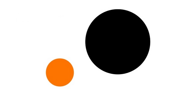
You immediately found a way to distinguish them, didn't you? And here's a harder problem for you.

Despite such a variety of objects, you can definitely describe any of them.
What does web design, balance, basics of composition have to do with it? - you ask. The thing is that our brain has a unique ability to instantly classify information. It can group visually similar objects into groups. Using the simplest visual tools, you can convey a wealth of information to users and manage their attention.
Composition is a specific combination of website elements
Harmony in the ratio of parts of the whole, beauty and logic of construction are inherent not only in human creations. Signs of composition can be found in the structure of the universe, animal organisms and plants, natural forms. Therefore, the term "composition" can be equally applied to the structure of a website, the description of a flower, and the characteristics of oratory.
It's easiest to talk about composition in web design when it's not respected. Each of us intuitively feels its presence / absence: whether the elements are in harmonious interaction, whether they are subordinate to the main idea of the site, picture, photograph.
In order for the design of your site to look natural and harmonious, without falling apart into separate components, follow the basic principles of design, which I describe in this article.
Choosing the right colors
The choice of color determines how people perceive your site, and at the same time, your product. Muted colors seem to us relaxed and calm, while bright and contrasting colors seem cheerful and energetic.

Think about what emotion you want to evoke in your site visitor, and then choose the right color scheme. A good example is the fresh design of the Orangina website, which emphasizes the brand image:

Color accents should be used to attract attention. In contrasting colors, for example, you can decorate the most important buttons - "Buy" and "Contact us". I will introduce you to some of the most important principles for choosing and combining colors.
1. Complementary colors. All opposites on the color wheel create a strong contrast, so they can be used, but only carefully.

2. Analog colors. Such "neighbors" on the color wheel do not have a strong contrast.

3. Triad. An almost win-win combination is an isosceles triangle.

4. Tetrad. Two pairs of complementary colors should be used very carefully so as not to create chaos in warm-coldness.

Rule of thirds - what to put where?
The rule of thirds refers to the fundamentals of composition in web design. It arose as a result of the interpretation of the golden section rule (maybe, you remember, Leonardo da Vinci also used it in his paintings).
At first, I wanted to show you the painting “Vitruvian Man” as an example, but because of his overly revealing outfit, or rather, his absence, I decided that I would not. Suddenly, here the children are reading an article. Therefore, admire the Madonna:

Mentally draw two vertical and two horizontal lines on the page, dividing the area into nine equal parts. It is believed that most people focus their eyes precisely on the points of intersection of these lines. Remember the rule of thirds every time you think about where to place, for example, a call to action button.
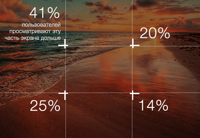
Actually, it's pretty funny that such a mathematical rule applies to something as subjective as web design. It's an aesthetic compromise that creates a sense of balance on the screen without overwhelming it, but without making it too static either.
Clearing space
Surely as a child, your parents asked you to clean up your room, because (quote) “there is no free place.” Eh, golden words… White space, or, as designers say, “air” is the foundation of web design composition. Sometimes it is even more important than the content. Therefore, if there is not enough free space, do a general "cleaning" and resist the temptation to add as much text, icons, pictures, etc. as possible.

The site should not be overloaded, otherwise people will have ripples in their eyes, and they will not be able to “catch” the idea that you were trying to convey to them. Limit yourself to text strictly to the point, a couple of pictures and a clearly structured menu.
Control the user's gaze
There is a wealth of research on exactly how people browse websites to help you understand how to direct the visitor's eye to the most important elements. As a result of these studies, it turned out that people scan the screen along a trajectory that resembles either the letter Z or the letter F, that is, from top to bottom and from left to right.
With this knowledge, you can effectively take advantage of visual hierarchy by designing your pages for maximum profit and return.
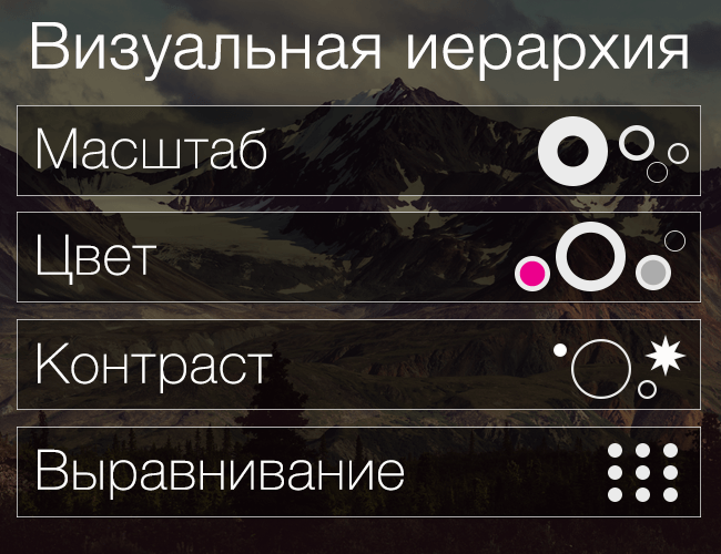
Place pictures, color combinations, fonts, horizontal, diagonal, and vertical lines according to visual standards, and your users will be happy to follow the path you have blazed, looking at the essentials first, and then the secondary ones.
Do you want visitors not to miss a specific button? Highlight it with a contrasting color and place it where the eye immediately seeks. Want to show off your awesome products? Highlight them against the general background and place them according to the F-Z rule or the rule of thirds discussed above.
Thus, the theory of composition in website design is not a secret knowledge available to a few, and everyone can create a beautiful and functional website on their own, without resorting to expensive specialists. On the Internet, there are many video courses on creating websites from scratch. Dare, and you will succeed!
On this I will finish this fascinating, I hope lesson. Subscribe to our blog updates, and see you in the next articles!
Hello dear visitors of the school of interior design site! Today I want to talk about architectural composition, why it is a very important component of a harmonious interior, and why, and most importantly, how to use it in interior design.
In general, knowledge of the laws of composition is not a certain stage of interior design (interior design steps) - it is the fundamental basis for successful work in any activity related to art, and as a result - interior design.
The process of interior design is closely related to the knowledge of the laws of architectural composition. Without knowing the basics of composition, it is impossible to create a beautiful interior. Building interiors according to the laws of artistic composition is what distinguishes the interiors of professionals from the interiors created by amateurs.
For people who do not have an art education, the composition causes great difficulties and misunderstanding what it is for and how to work with it. However, there are people who intuitively feel the basic laws of composition, which allows them to dress or furnish their home with taste, but such people are very few. The rest, including many eminent architects and designers, had and still have to comprehend the basics of composition, first in theory (training in various specialized institutions), and then improve in practice.
It may also seem to beginners that the architectural composition and its laws are something intangible and difficult to understand and explain, and even worse: the composition is complete nonsense, they say, everyone has their own taste and he knows better how best to furnish his apartment or house. However, this is not at all the case, and “beauty” (and beauty is created according to the laws of artistic composition) has its own rules and laws by which it is created.
So, let's try to deal with this "composition", and find out what it is.
architectural composition- this is a compositional relationship of composition elements arranged in a certain, from an artistic point of view, order, and having certain quantitative and qualitative characteristics, aimed at achieving overall harmony, integrity and expressiveness of an architectural work.
With regard to interior design, the room, as the main unit of design, with all the furniture, equipment, decoration elements (paintings, lamps, candlesticks) located in it, is considered by interior designers to be nothing more than a composition. At the same time, the plan of floors, ceilings, and the development of each individual wall of the room is its own separate composition, which must be worked on in order to achieve overall harmony of the entire composition of the room, apartment or house.
Now let's look at the basic rules for creating a harmonious composition:
1. In any composition there must be composition center. It can be any piece of furniture, a decorative panel, a fireplace, etc.

The center of the composition (center of attention) should immediately catch your eye as soon as you enter a room or room. He must dominate and subjugate all other elements of the interior, and most importantly, organize the space of the room. And if there is a center in the composition, then, accordingly, there should be complementary elements subordinate to the center. Those. if there is one element in the composition, then the formation of a harmonious composition will not occur.
Now that you know what elements should be in any composition, you need to know how these elements are located relative to each other. Any composition has its own definite boundaries, whether it is a picture frame, a wall sweep or the volume of the entire room. Accordingly, the center of the composition is usually located approximately in the center. The remaining (additional) elements of the composition are grouped around it (the center).
Elements around the center of the composition can be located (grouped) according to the laws of symmetry or asymmetry. When grouping elements of an architectural composition by means of symmetry, an axis is drawn through the compositional center. Elements subordinate to the center of the composition are grouped on both sides of the axis of symmetry. Moreover, the elements must necessarily be the same in shape and color, or at least similar to each other.

With an asymmetric grouping of composition elements, it is impossible to draw a clear axis of symmetry. Such a composition is based on the principles of balance of elements. The asymmetric grouping of composition elements looks like this:
 At the same time, the elements of the composition are always arranged in a certain rhythm (through strictly fixed distances from each other) or freely (without the same distance between the elements).
The asymmetrical arrangement of composition elements is considered a more complex way of grouping elements, and requires some preparation and experience, so master the symmetry well at the first stage. When you do not take experience in building symmetrical compositions, then it will not be difficult for you to create an asymmetric composition in the interior.
2. The composition must be balanced. Ideally, all elements of the composition should be evenly spaced throughout the volume within their boundaries. There should be no kinks in any one direction (one side is filled with elements, the other is empty). If the elements are unevenly concentrated in the composition, then its important requirements are accordingly violated: balance and stability.
3. All elements of the composition must be interconnected. It should not contain random elements. This relationship is based on similarity of elements. Elements can be similar to each other (identity), slightly different (nuance) and very different (contrast) from each other.
In practice, this can be achieved in several ways: by applying the same unifying color on different elements, by uniformity in the shape of elements, by using similar and repeating elements.

4. Compositional contrast
The creation of harmonious, aesthetically valuable interiors is based on the principle of combining compositional contrasts. This means that interior elements should be divided into main and secondary elements, richly decorated and concise elements, elements with a complex and simple form.

Through the use of the principles of compositional contrast, beautiful interiors are created.
And on this lesson on architectural composition and its application in the interior is over. See you soon at the next lessons of the interior design school.
P.S. If you have any questions regarding the topic of today's lesson, ask them in your comments on this topic.
Related content:
If you liked this article, please click the button of your favorite social network.
Composition (from the Latin word "compositio" means "to connect", "to arrange", "to compose", "to add")- this is a harmonious arrangement of various elements, combined into a single image. There are five laws of composition: the law of integrity, the law of proportions, the law of symmetry, the law of rhythm, the law of the main thing as a whole. These laws create a single harmonious system of composition. Let's consider these laws, using them as methods for constructing a composition.
In a general composition, some of these methods are more important, some less, but you need to understand that in a properly built composition there are no superfluous (unnecessary) elements. All elements in the composition are interconnected and work on a common compositional structure. If some elements are clearly superfluous, then the integrity of the composition is violated. Compositional techniques can be learned, and the construction of a composition can be calculated in advance.
Perceptual Form Properties
1. Geometric view.
This is a property of the form, determined by the ratio of its dimensions in three spatial coordinates, as well as the configuration of the surface of the form. Depending on the predominance of one of the three dimensions, three main types of form are distinguished: three-dimensional, flat, linear.
2. Value.
3. Value is a relative concept. A person, evaluating the size of a form, correlates it with himself or with neighboring forms.
Position in space. The property of this form is determined by the location among other forms relative to the observer in a three-dimensional coordinate system. In a two-dimensional field of a sheet or on a monitor screen, we can actually move an object in the direction of verticals, horizontals and diagonals. Effects can be achieved with just a slight shift of the figures in any of these directions.
visual mass. The visual assessment of the visual mass consists in the volume of the substance enclosed in a given form. The greatest mass is possessed by forms approaching the geometry of a cube and a ball, the minimum visual mass is in linear forms (point, line). This must be taken into account when determining the main and secondary elements in the work.
Texture and texture
Texture- a property that characterizes the external structure of the surface of the form (for example, whether it is rough or smooth).
Texture - The material that an object is made of is called a texture. For example, wood and polished stone are almost the same to the touch (this is texture), but their material pattern is completely different (this is texture). Texture and texture- the most powerful means of expression. Their influence can be more active than the influence of the form itself. Emphasize or, conversely, distort the proportions, bring together or break the form, tear it away from the background or merge with it - all this can be done with the magic of textures.
Color and tone
One of the most important properties of forms that has a certain color and tone. The expressiveness of color is manifested in bright, saturated colors and contrasting combinations.
Chiaroscuro. Thanks to the play of chiaroscuro, any composition can be made voluminous; chiaroscuro adds realism to the forms of the composition.
Composition techniques
Statics- a means of conveying a sense of peace in the composition.
The vertical arrangement of elements (along imaginary vertical lines) can optically balance and weight the composition. Even a small logo can be given monumentality (this must be taken into account when developing a particular sign, if you need to add “weight”, “heaviness”, “significance”).
A clear contour, symmetry, an increase in complexity towards the center, fullness of space, multi-element - all these are signs of a closed type of composition. It is logical to use this type of composition to convey real estate, monumentality, oppression, stability, stability, and so on. Often it is in closed compositions that statics with internal dynamics are used.
Dynamics- elements located along diagonal lines enhance visual movement. Gives an expressive character to the image and, accordingly, we use this when developing a specific task. For example, for an open composition, it is mainly built from the center, several compositional nodes are established, around which the elements develop, a rhythmic series is used. Used to create a sense of space.
Symmetry- properties of figures in a composition located on the same perpendicular to a given plane (or straight line), on opposite sides of it and at the same distance from it. These figures are symmetrical about this plane or line. Symmetry can be complete or incomplete. Incomplete symmetry creates correlation between the masses of the right and left parts, but not identity.
Asymmetry- lack of symmetry. With an asymmetric composition, most of the elements are shifted away from the imaginary axis of symmetry (or from the center). With the help of symmetry, we can give a static image, and asymmetry, on the contrary, enhances the dynamics. And I want to note that asymmetry and dynamics do not mean chaos in the composition. In asymmetric compositions, it is more difficult to achieve balance. It is achieved by balancing the masses in color and shape, location in space. Properly arranged elements bring harmony and stability to the composition.
Proportions(translated from Latin means "correlation", "proportionality"). In composition, proportions are the ratio of the sizes of elements and the entire image as a whole. The simplest proportions are based on short and integer 1:2 ratios; 3:4, etc. My advice to you - when placing a composition block on a sheet, observe this type of proportion. For example, the top indent from the edge of the sheet is 1 unit, and the bottom is 2 (1:2), etc. So it does not “fall down” and “fly up”. The most famous proportional relation is "golden section". The human figure is tied up with a belt, then the distance from the belt to the feet is measured - this value is proportional to the distance from the body to the top of the head, and the entire height of a person refers to the length from the belt to the feet. "Fibonacci series" - each number is the sum of the previous two - 1,1,2,3,5,8, 13, 21. Proportions harmoniously hold dynamic and static compositions. Dynamics is always determined by two different ratios of smaller and larger values (3:4), and statics (1:1).
Patterns of compositional structures
Rhythm- alternation of different elements in the composition and intervals. It is difficult to imagine a composition without rhythm. The interaction of elements with each other - this is the rhythm. The rhythm can be vertical - the alternation of individual elements in the vertical direction. Alternation in the horizontal direction - a horizontal rhythm, it usually makes the composition static, slows it down.
Meter is the repetition of identical elements and intervals.
Rhythmic patterns of the composition:
Contrast- a pronounced opposition of elements in the rhythmic structure. Contrast can be tone, color, size, shape, position.
Nuance- a weakly expressed change in the elements in the rhythmic structure relative to each other. Nuance allows us to make the elements unobtrusive, which helps to create harmony in the composition.
Traffic- a gradual change in the elements in the rhythmic structure within a given range.
Sometimes it is simply necessary to create a dynamic composition in order to "make its elements move." To do this, we distribute free space along the guides for the movement of elements. The space through which the element "moves" can either fit into the compositional boundaries, or visually go beyond it.
Accent- from the Latin "accent". The element that we especially emphasize in the composition, emphasize it, focus the viewer's attention on it. We achieve this by changes in compositional patterns already familiar to us: color, tone, shape, size, position. It happens that the emphasis is placed on a small element of the composition, but at the same time it literally “explodes” it.
There are also qualities that change the structure: color, tone, shape, size, position.
Dominant- the predominance of one part of the structure over another.
For example, the predominance of a certain color or elements of a certain shape, etc.
There are also qualities that change the structure: color, tone, shape, size, position.
There is such a feature of human psychology that he does not strive for monotony and repetition, but, on the contrary, for development, improvement, movement. And we strive to make the same composition visually very interesting, to bring dynamics, to somehow attract the attention of the viewer.
And this is achieved by applying the above methods. Moreover, there are no strict rules for the use of any one of them. They can be combined with each other. The main thing is not to forget about a harmoniously built composition and not to "clog" it with unnecessary "special effects".
We also recommend
 How to answer the question "Why are you not married yet"?
 What is it - proper nutrition for weight loss, menus and recipes for cooking at home How to eat right to lose weight quickly
 Vitamin B2. Vitamin B2 (Riboflavin). Description, functions and sources of vitamin B2 Vitamin B2 for what the female body needs
 Notifications Where messages come from
 Unequal marriage: when a woman is older Couples where a man is younger than a woman
 Is it possible to lose weight with cognac and lemon?